SAS for Job Interviews

SAS Institute, Solutions
Image via Wikipedia

Yeah. I hope someone wrote a book like that.

Basically,

  1. Libname
  2. Proc Datasets
  3. Proc Import
  4. Proc Contents
  5. Proc Freq
  6. Proc Means
  7. Proc Univariate
  8. Proc Reg
  9. Proc Logistic
  10. Proc Export (to excel where you do the graphs)
  11. ODS
  12. Proc Tabulate

(note – it would be interesting to do a proc freq on all procs say used say on SAS On Demand)

Any thing else is not needed for a entry level job for a fresh grad student or job for a veteran re-trained worker.

Just like society needs science and commerce as twin pillars, analytics needs SAS (great Marketing) and R (great research) for expanding the pie of analytics which is woefully underutilized and stupidly overcapitalized by jazzy-copy-paste-data-from-query- software disguised as “intelligent software”.  R has no certification and no formal training for jobs (as yet) though this should change. SAS looks great (still) for getting jobs for grad students. R looks great (yup) for getting research jobs probably not corporate analytics jobs ?What do you think?


SAS announcement in education initiatives

From the Research Triangle, some pleasant and positive news- http://triangle.bizjournals.com/triangle/stories/2010/10/04/daily27.html

“As a high tech company, SAS depends on a strong educational system for its long-term success,” said SAS CEO Jim Goodnight. “Beyond that, STEM education – developing skills for a knowledge economy – is critical to American competitiveness. Without emphasis on STEM, we sacrifice innovation and export our knowledge jobs to other countries.”

Goodnight and SAS have been active in education for years. The SAS co-founder and his wife, Ann Goodnight, launched college prep school Cary Academy in 1996, and the SAS inSchool program has developed educational software for schools since the mid-1990s. In 2008, Jim Goodnight made SAS Curriculum Pathways available free to all U.S. educators. The web-based service provides content in English, mathematics, social studies, science and Spanish.

SAS is the only Triangle-based company among the Change the Equation corporate partners, but the group includes several other companies with a significant Raleigh-Durham presence: chief among them IBM (NYSE: IBM), GlaxoSmithKline (NYSE: GSK), and Cisco Systems (Nasdaq: CSCO).

Read the full article at http://triangle.bizjournals.com/triangle/stories/2010/10/04/daily27.html

————————————————————————————————–

Read more: SAS joins IBM, GlaxoSmithKline, Cisco Systems in Obama education effort – Triangle Business Journal


Interfaces to R

This is a fairly long post and is a basic collection  of material for a book/paper. It is on interfaces to use R. If you feel I need to add more on a  particular R interface, or if there is an error in this- please feel to contact me on twitter @decisionstats or mail ohri2007 on google mail.

R Interfaces

There are multiple ways to use the R statistical language.

Command Line- The default method is using the command prompt by the installed software on download from http://r-project.org
For windows users there is a simple GUI which has an option for Packages (loading package, installing package, setting CRAN mirror for downloading packages) , Misc (useful for listing all objects loaded in workspace as well as clearing objects to free up memory), and Help Menu.

Using Click and Point- Besides the command prompt, there are many Graphical User Interfaces which enable the analyst to use click and point methods to analyze data without getting into the details of learning complex and at times overwhelming R syntax. R GUIs are very popular both as mode of instruction in academia as well as in actual usage as it cuts down considerably on time taken to adapt to the language. As with all command line and GUI software, for advanced tweaks and techniques, command prompt will come in handy as well.

Advantages and Limitations of using Visual Programming Interfaces to R as compared to Command Line.


Advantages Limitations
Faster learning for new programmers Can create junk analysis by clicking menus in GUI
Easier creation of advanced models or graphics Cannot create custom functions unless you use command line
Repeatability of analysis is better Advanced techniques and custom flexibility of data handling R can be done in command line
Syntax is auto-generated Can limit scope and exposure in learning R syntax


A brief list of the notable Graphical User Interfaces is below-

1) R Commander- Basic statistics
2) Rattle- Data Mining
3) Deducer- Graphics (including GGPlot Integration) and also uses JGR (a Jave based  GUI)
4) RKward- Comprehensive R GUI for customizable graphs
5) Red-R – Dataflow programming interface using widgets

1) R Commander- R Commander was primarily created by Professor John Fox of McMaster University to cover the content of a basic statistics course. However it is extensible and many other packages can be added in menu form to it- in the form R Commander Plugins. Quite noticeably it is one of the most widely used R GUI and it also has a script window so you can write R code in combination with the menus.
As you point and click a particular menu item, the corresponding R code is automatically generated in the log window and executed.

It can be found on CRAN at http://cran.r-project.org/web/packages/Rcmdr/index.html


Advantages of Using  R Commander-
1) Useful for beginner in R language to do basic graphs and analysis and building models.
2) Has script window, output window and log window (called messages) in same screen which helps user as code is auto-generated on clicking on menus, and can be customized easily. For example in changing labels and options in Graphs.  Graphical output is shown in seperate window from output window.
3) Extensible for other R packages like qcc (for quality control), Teaching Demos (for training), survival analysis and Design of Experiments (DoE)
4) Easy to understand interface even for first time user.
5) Menu items which are not relevant are automatically greyed out- if there are only two variables, and you try to build a 3D scatterplot graph, that menu would simply not be available and is greyed out.

Comparative Disadvantages of using R Commander-
1) It is basically aimed at a statistical audience( originally students in statistics) and thus the terms as well as menus are accordingly labeled. Hence it is more of a statistical GUI rather than an analytics GUI.
2) Has limited ability to evaluate models from a business analysts perspective (ROC curve is not given as an option) even though it has extensive statistical tests for model evaluation in model sub menu. Indeed creating a Model is treated as a subsection of statistics rather than a separate menu item.
3) It is not suited for projects that do not involve advanced statistical testing and for users not proficient in statistics (particularly hypothesis testing), and for data miners.

Menu items in the R Commander window:
File Menu – For loading script files and saving Script files, Output and Workspace
It is also needed for changing the present working directory and for exiting R.
Edit Menu – For editing scripts and code in the script window.
Data Menu – For creating new dataset, inputting or importing data and manipulating data through variables. Data Import can be from text,comma separated values,clipboard, datasets from SPSS, Stata,Minitab, Excel ,dbase,  Access files or from url.
Data manipulation included deleting rows of data as well as manipulating variables.
Also this menu has the option for merging two datasets by row or columns.
Statistics Menu-This menu has options for descriptive statistics, hypothesis tests, factor analysis and clustering and also for creating models. Note there is a separate menu for evaluating the model so created.
Graphs Menu-It has options for creating various kinds of graphs including box-plot, histogram, line, pie charts and x-y plots.
The first option is color palette- it can be used for customizing the colors. It is recommended you adjust colors based on your need for publication or presentation.
A notable option is 3 D graphs for evaluating 3 variables at a time- this is really good and impressive feature and exposes the user to advanced graphs in R all at few clicks. You may want to dazzle a presentation using this graph.
Also consider scatterplot matrix graphs for graphical display of variables.
Graphical display of R surpasses any other statistical software in appeal as well as ease of creation- using GUI to create graphs can further help the user to get the most of data insights using R at a very minimum effort.
Models Menu-This is somewhat of a labeling peculiarity of R Commander as this menu is only for evaluating models which have been created using the statistics menu-model sub menu.
It includes options for graphical interpretation of model results,residuals,leverage and confidence intervals and adding back residuals to the data set.
Distributions Menu- is for cumulative probabilities, probability density, graphs of distributions, quantiles and features for standard distributions and can be used in lieu of standard statistical tables for the distributions. It has 13 standard statistical continuous distributions and 5 discrete distributions.
Tools Menu- allows you to load other packages and also load R Commander plugins (which are then added to the Interface Menu after the R Commander GUI is restarted). It also contains options sub menu for fine tuning (like opting to send output to R Menu)
Help Menu- Standard documentation and help menu. Essential reading is the short 25 page manual in it called Getting “Started With the R Commander”.

R Commander Plugins- There are twenty extensions to R Commander that greatly enhance it’s appeal -these include basic time series forecasting, survival analysis, qcc and more.

see a complete list at

  1. DoE – http://cran.r-project.org/web/packages/RcmdrPlugin.DoE/RcmdrPlugin.DoE.pdf
  2. doex
  3. EHESampling
  4. epack- http://cran.r-project.org/web/packages/RcmdrPlugin.epack/RcmdrPlugin.epack.pdf
  5. Export- http://cran.r-project.org/web/packages/RcmdrPlugin.Export/RcmdrPlugin.Export.pdf
  6. FactoMineR
  7. HH
  8. IPSUR
  9. MAc- http://cran.r-project.org/web/packages/RcmdrPlugin.MAc/RcmdrPlugin.MAc.pdf
  10. MAd
  11. orloca
  12. PT
  13. qcc- http://cran.r-project.org/web/packages/RcmdrPlugin.qcc/RcmdrPlugin.qcc.pdf and http://cran.r-project.org/web/packages/qcc/qcc.pdf
  14. qual
  15. SensoMineR
  16. SLC
  17. sos
  18. survival-http://cran.r-project.org/web/packages/RcmdrPlugin.survival/RcmdrPlugin.survival.pdf
  19. SurvivalT
  20. Teaching Demos

Note the naming convention for above e plugins is always with a Prefix of “RCmdrPlugin.” followed by the names above
Also on loading a Plugin, it must be already installed locally to be visible in R Commander’s list of load-plugin, and R Commander loads the e-plugin after restarting.Hence it is advisable to load all R Commander plugins in the beginning of the analysis session.

However the notable E Plugins are
1) DoE for Design of Experiments-
Full factorial designs, orthogonal main effects designs, regular and non-regular 2-level fractional
factorial designs, central composite and Box-Behnken designs, latin hypercube samples, and simple D-optimal designs can currently be generated from the GUI. Extensions to cover further latin hypercube designs as well as more advanced D-optimal designs (with blocking) are planned for the future.
2) Survival- This package provides an R Commander plug-in for the survival package, with dialogs for Cox models, parametric survival regression models, estimation of survival curves, and testing for differences in survival curves, along with data-management facilities and a variety of tests, diagnostics and graphs.
3) qcc -GUI for  Shewhart quality control charts for continuous, attribute and count data. Cusum and EWMA charts. Operating characteristic curves. Process capability analysis. Pareto chart and cause-and-effect chart. Multivariate control charts
4) epack- an Rcmdr “plug-in” based on the time series functions. Depends also on packages like , tseries, abind,MASS,xts,forecast. It covers Log-Exceptions garch
and following Models -Arima, garch, HoltWinters
5)Export- The package helps users to graphically export Rcmdr output to LaTeX or HTML code,
via xtable() or Hmisc::latex(). The plug-in was originally intended to facilitate exporting Rcmdr
output to formats other than ASCII text and to provide R novices with an easy-to-use,
easy-to-access reference on exporting R objects to formats suited for printed output. The
package documentation contains several pointers on creating reports, either by using
conventional word processors or LaTeX/LyX.
6) MAc- This is an R-Commander plug-in for the MAc package (Meta-Analysis with
Correlations). This package enables the user to conduct a meta-analysis in a menu-driven,
graphical user interface environment (e.g., SPSS), while having the full statistical capabilities of
R and the MAc package. The MAc package itself contains a variety of useful functions for
conducting a research synthesis with correlational data. One of the unique features of the MAc
package is in its integration of user-friendly functions to complete the majority of statistical steps
involved in a meta-analysis with correlations.
You can read more on R Commander Plugins at http://wp.me/p9q8Y-1Is
—————————————————————————————————————————-
Rattle- R Analytical Tool To Learn Easily (download from http://rattle.togaware.com/)
Rattle is more advanced user Interface than R Commander though not as popular in academia. It has been designed explicitly for data mining and it also has a commercial version for sale by Togaware. Rattle has a Tab and radio button/check box rather than Menu- drop down approach towards the graphical design. Also the Execute button needs to be clicked after checking certain options, just the same as submit button is clicked after writing code. This is different from clicking on a drop down menu.

Advantages of Using Rattle
1) Useful for beginner in R language to do building models,cluster and data mining.
2) Has separate tabs for data entry,summary, visualization,model building,clustering, association and evaluation. The design is intuitive and easy to understand even for non statistical background as the help is conveniently explained as each tab, button is clicked. Also the tabs are placed in a very sequential and logical order.
3) Uses a lot of other R packages to build a complete analytical platform. Very good for correlation graph,clustering as well decision trees.
4) Easy to understand interface even for first time user.
5) Log  for R code is auto generated and time stamp is placed.
6) Complete solution for model building from partitioning datasets randomly for testing,validation to building model, evaluating lift and ROC curve, and exporting PMML output of model for scoring.
7) Has a well documented online help as well as in-software documentation. The help helps explain terms even to non statistical users and is highly useful for business users.

Example Documentation for Hypothesis Testing in Test Tab in Rattle is ”
Distribution of the Data
* Kolomogorov-Smirnov     Non-parametric Are the distributions the same?
* Wilcoxon Signed Rank    Non-parametric Do paired samples have the same distribution?
Location of the Average
* T-test               Parametric     Are the means the same?
* Wilcoxon Rank-Sum    Non-parametric Are the medians the same?
Variation in the Data
* F-test Parametric Are the variances the same?
Correlation
* Correlation    Pearsons Are the values from the paired samples correlated?”

Comparative Disadvantages of using Rattle-
1) It is basically aimed at a data miner.  Hence it is more of a data mining GUI rather than an analytics GUI.
2) Has limited ability to create different types of graphs from a business analysts perspective Numeric variables can be made into Box-Plot, Histogram, Cumulative as well Benford Graphs. While interactivity using GGobi and Lattiticist is involved- the number of graphical options is still lesser than other GUI.
3) It is not suited for projects that involve multiple graphical analysis and which do not have model building or data mining.For example Data Plot is given in clustering tab but not in general Explore tab.
4) Despite the fact that it is meant for data miners, no support to biglm packages, as well as parallel programming is enabled in GUI for bigger datasets, though these can be done by R command line in conjunction with the Rattle GUI. Data m7ining is typically done on bigger datsets.
5) May have some problems installing it as it is dependent on GTK and has a lot of packages as dependencies.

Top Row-
This has the Execute Button (shown as two gears) and which has keyboard shortcut F2. It is used to execute the options in Tabs-and is equivalent of submit code button.
Other buttons include new Projects,Save  and Load projects which are files with extension to .rattle an which store all related information from Rattle.
It also has a button for exporting information in the current Tab as an open office document, and buttons for interrupting current process as well as exiting Rattle.

Data Tab-
It has the following options.
●        Data Type- These are radio buttons between Spreadsheet (and Comma Separated Values), ARFF files (Weka), ODBC (for Database Connections),Library (for Datasets from Packages),R Dataset or R datafile, Corpus (for Text Mining) and Script for generating the data by code.
●        The second row-in Data Tab in Rattle is Detail on Data Type- and its apperance shifts as per the radio button selection of data type in previous step. For Spreadsheet, it will show Path of File, Delimiters, Header Row while for ODBC it will show DSN, Tables, Rows and for Library it will show you a dropdown of all datasets in all R packages installed locally.
●        The third row is a Partition field for splitting dataset in training,testing,validation and it shows ratio. It also specifies a Random seed which can be customized for random partitions which can be replicated. This is very useful as model building requires model to be built and tested on random sub sets of full dataset.
●        The fourth row is used to specify the variable type of inputted data. The variable types are
○        Input: Used for modeling as independent variables
○        Target: Output for modeling or the dependent variable. Target is a categoric variable for classification, numeric for regression and for survival analysis both Time and Status need to be defined
○        Risk: A variable used in the Risk Chart
○        Ident: An identifier for unique observations in the data set like AccountId or Customer Id
○        Ignore: Variables that are to be ignored.
●        In addition the weight calculator can be used to perform mathematical operations on certain variables and identify certain variables as more important than others.

Explore Tab-
Summary Sub-Tab has Summary for brief summary of variables, Describe for detailed summary and Kurtosis and Skewness for comparing them across numeric variables.
Distributions Sub-Tab allows plotting of histograms, box plots, and cumulative plots for numeric variables and for categorical variables Bar Plot and Dot Plot.
It also has Benford Plot for Benford’s Law on probability of distribution of digits.
Correlation Sub-Tab– This displays corelation between variables as a table and also as a very nice plot.
Principal Components Sub-Tab– This is for use with Principal Components Analysis including the SVD (singular value decomposition) and Eigen methods.
Interactive Sub-Tab- Allows interactive data exploration using GGobi and Lattice software. It is a powerful visual tool.

Test Tab-This has options for hypothesis testing of data for two sample tests.
Transform Tab-This has options for rescaling data, missing values treatment, and deleting invalid or missing values.
Cluster Tab-It gives an option to KMeans, Hierarchical and Bi-Cluster clustering methods with automated graphs,plots (including dendogram, discriminant plot and data plot) and cluster results available. It is highly recommended for clustering projects especially for people who are proficient in clustering but not in R.

Associate Tab-It helps in building association rules between categorical variables, which are in the form of “if then”statements. Example. If day is Thursday, and someone buys Milk, there is 80% chance they will buy Diapers. These probabilities are generated from observed frequencies.

Model Tab-The Model tab makes Rattle one of the most advanced data mining tools, as it incorporates decision trees(including boosted models and forest method), linear and logistic regression, SVM,neural net,survival models.
Evaluate Tab-It as functionality for evaluating models including lift,ROC,confusion matrix,cost curve,risk chart,precision, specificity, sensitivity as well as scoring datasets with built model or models. Example – A ROC curve generated by Rattle for Survived Passengers in Titanic (as function of age,class,sex) This shows comparison of various models built.

Log Tab- R Code is automatically generated by Rattle as the respective operation is executed. Also timestamp is done so it helps in reviewing error as well as evaluating speed for code optimization.
—————————————————————————————————————————-
JGR- Deducer- (see http://www.deducer.org/pmwiki/pmwiki.php?n=Main.DeducerManual
JGR is a Java Based GUI. Deducer is recommended for use with JGR.
Deducer has basically been made to implement GGPLOT in a GUI- an advanced graphics package based on Grammer of Graphics and was part of Google Summer of Code project.

It first asks you to either open existing dataset or load a new dataset with just two icons. It has two initial views in Data Viewer- a Data view and Variable view which is quite similar to Base SPSS. The other Deducer options are loaded within the JGR console.

Advantages of Using  Deducer
1.      It has an option for factor as well as reliability analysis which is missing in other graphical user interfaces like R Commander and Rattle.
2.      The plot builder option gives very good graphics -perhaps the best in other GUIs. This includes a color by option which allows you to shade the colors based on variable value. An addition innovation is the form of templates which enables even a user not familiar with data visualization to choose among various graphs and click and drag them to plot builder area.
3.      You can set the Java Gui for R (JGR) menu to automatically load some packages by default using an easy checkbox list.
4.      Even though Deducer is a very young package, it offers a way for building other R GUIs using Java Widgets.
5.      Overall feel is of SPSS (Base GUI) to it’s drop down menu, and selecting variables in the sub menu dialogue by clicking to transfer to other side.SPSS users should be more comfortable at using this.
6.      A surprising thing is it rearranges the help documentation of all R in a very presentable and organized manner
7.      Very convenient to move between two or more datasets using dropdown.
8.      The most convenient GUI for merging two datasets using common variable.

Dis Advantages of Using  Deducer
1.      Not able to save plots as images (only options are .pdf and .eps), you can however copy as image.
2.      Basically a data viualization GUI – it does offer support for regression, descriptive statistics in the menu item Extras- however the menu suggests it is a work in progress.
3.      Website for help is outdated, and help documentation specific to Deducer lacks detail.


Components of Deducer-
Data Menu-Gives options for data manipulation including recoding variables,transform variables (binning, mathematical operation), sort dataset,  transpose dataset ,merge two datasets.
Analysis Menu-Gives options for frequency tables, descriptive statistics,cross tabs, one sample tests (with plots) ,two sample tests (with plots),k sample tests, correlation,linear and logistic models,generalized linear models.
Plot Builder Menu- This allows plots of various kinds to be made in an interactive manner.

Correlation using Deducer.

————————————————————————————————————————–
Red-R – A dataflow user interface for R (see http://red-r.org/

Red R uses dataflow concepts as a user interface rather than menus and tabs. Thus it is more similar to Enterprise Miner or Rapid Miner in design. For repeatable analysis dataflow programming is preferred by some analysts. Red-R is written in Python.


Advantages of using Red-R
1) Dataflow style makes it very convenient to use. It is the only dataflow GUI for R.
2) You can save the data as well as analysis in the same file.
3) User Interface makes it easy to read R code generated, and commit code.
4) For repeatable analysis-like reports or creating models it is very useful as you can replace just one widget and other widget/operations remain the same.
5) Very easy to zoom into data points by double clicking on graphs. Also to change colors and other options in graphs.
6) One minor feature- It asks you to set CRAN location just once and stores it even for next session.
7) Automated bug report submission.

Disadvantages of using Red-R
1) Current version is 1.8 and it needs a lot of improvement for building more modeling types as well as debugging errors.
2) Limited features presently.
———————————————————————————————————————-
RKWard (see http://rkward.sourceforge.net/)

It is primarily a KDE GUI for R, so it can be used on Ubuntu Linux. The windows version is available but has some bugs.

Advantages of using RKWard
1) It is the only R GUI for time series at present.
In addition it seems like the only R GUI explicitly for Item Response Theory (which includes credit response models,logistic models) and plots contains Pareto Charts.
2) It offers a lot of detail in analysis especially in plots(13 types of plots), analysis and  distribution analysis ( 8 Tests of normality,14 continuous and 6 discrete distributions). This detail makes it more suitable for advanced statisticians rather than business analytics users.
3) Output can be easily copied to Office documents.

Disadvantages of using RKWard
1) It does not have stable Windows GUI. Since a graphical user interface is aimed at making interaction easier for users- this is major disadvantage.
2) It has a lot of dependencies so may have some issues in installing.
3) The design categorization of analysis,plots and distributions seems a bit unbalanced considering other tabs are File, Edit, View, Workspace,Run,Settings, Windows,Help.
Some of the other tabs can be collapsed, while the three main tabs of analysis,plots,distributions can be better categorized (especially into modeling and non-modeling analysis).
4) Not many options for data manipulation (like subset or transpose) by the GUI.
5) Lack of detail in documentation as it is still on version 0.5.3 only.

Components-
Analysis, Plots and Distributions are the main components and they are very very extensive, covering perhaps the biggest range of plots,analysis or distribution analysis that can be done.
Thus RKWard is best combined with some other GUI, when doing advanced statistical analysis.


GNU General Public License
Image via Wikipedia

GrapherR

GrapheR is a Graphical User Interface created for simple graphs.

Depends: R (>= 2.10.0), tcltk, mgcv
Description: GrapheR is a multiplatform user interface for drawing highly customizable graphs in R. It aims to be a valuable help to quickly draw publishable graphs without any knowledge of R commands. Six kinds of graphs are available: histogram, box-and-whisker plot, bar plot, pie chart, curve and scatter plot.
License: GPL-2
LazyLoad: yes
Packaged: 2011-01-24 17:47:17 UTC; Maxime
Repository: CRAN
Date/Publication: 2011-01-24 18:41:47

More information about GrapheR at CRAN
Path: /cran/newpermanent link

Advantages of using GrapheR

  • It is bi-lingual (English and French) and can import in text and csv files
  • The intention is for even non users of R, to make the simple types of Graphs.
  • The user interface is quite cleanly designed. It is thus aimed as a data visualization GUI, but for a more basic level than Deducer.
  • Easy to rename axis ,graph titles as well use sliders for changing line thickness and color

Disadvantages of using GrapheR

  • Lack of documentation or help. Especially tips on mouseover of some options should be done.
  • Some of the terms like absicca or ordinate axis may not be easily understood by a business user.
  • Default values of color are quite plain (black font on white background).
  • Can flood terminal with lots of repetitive warnings (although use of warnings() function limits it to top 50)
  • Some of axis names can be auto suggested based on which variable s being chosen for that axis.
  • Package name GrapheR refers to a graphical calculator in Mac OS – this can hinder search engine results

Using GrapheR

  • Data Input -Data Input can be customized for CSV and Text files.
  • GrapheR gives information on loaded variables (numeric versus Factors)
  • It asks you to choose the type of Graph 
  • It then asks for usual Graph Inputs (see below). Note colors can be customized (partial window). Also number of graphs per Window can be easily customized 
  • Graph is ready for publication


Related Articles


Summary of R GUIs


Using R from other software- Please note that interfaces to R exist from other software as well. These include software from SAS Institute, IBM SPSS, Rapid Miner,Knime  and Oracle.

A brief list is shown below-

1) SAS/IML Interface to R- You can read about the SAS Institute’s SAS/ IML Studio interface to R at http://www.sas.com/technologies/analytics/statistics/iml/index.html
2) Rapid  Miner Extension to R-You can view integration with Rapid Miner’s extension to R here at http://www.youtube.com/watch?v=utKJzXc1Cow
3) IBM SPSS plugin for R-SPSS software has R integration in the form of a plugin. This was one of the earliest third party software offering interaction with R and you can read more at http://www.spss.com/software/statistics/developer/
4) Knime- Konstanz Information Miner also has R integration. You can view this on
http://www.knime.org/downloads/extensions
5) Oracle Data Miner- Oracle has a data mining offering to it’s very popular database software which is integrated with the R language. The R Interface to Oracle Data Mining ( R-ODM) allows R users to access the power of Oracle Data Mining’s in-database functions using the familiar R syntax. http://www.oracle.com/technetwork/database/options/odm/odm-r-integration-089013.html
6) JMP- JMP version 9 is the latest to offer interface to R.  You can read example scripts here at http://blogs.sas.com/jmp/index.php?/archives/298-JMP-Into-R!.html

R Excel- Using R from Microsoft Excel

Microsoft Excel is the most widely used spreadsheet program for data manipulation, entry and graphics. Yet as dataset sizes have increased, Excel’s statistical capabilities have lagged though it’s design has moved ahead in various product versions.

R Excel basically works at adding a .xla plugin to
Excel just like other Plugins. It does so by connecting to R through R packages.

Basically it offers the functionality of R
functions and capabilities to the most widely distributed spreadsheet program. All data summaries, reports and analysis end up in a spreadsheet-

R Excel enables R to be very useful for people not
knowing R. In addition it adds (by option) the menus of R Commander as menus in Excel spreadsheet.


Advantages-
Enables R and Excel to communicate thus tieing an advanced statistical tool to the most widely used business analytics tool.

Disadvantages-
No major disadvatage at all to a business user. For a data statistical user, Microsoft Excel is limited to 100,000 rows, so R data needs to be summarized or reduced.

Graphical capabilities of R are very useful, but to a new user, interactive graphics in Excel may be easier than say using Ggplot ot Ggobi.
You can read more on this at http://rcom.univie.ac.at/ or  the complete Springer Book http://www.springer.com/statistics/computanional+statistics/book/978-1-4419-0051-7

The combination of cloud computing and internet offers a new kind of interaction possible for scientists as well analysts.

Here is a way to use R on an Amazon EC2 machine, thus renting by hour hardware and computing resources which are scaleable to massive levels , whereas the software is free.

Here is how you can connect to Amazon EC2 and run R.
Running R for Cloud Computing.
1) Logging onto Amazon Console http://aws.amazon.com/ec2/
Note you need your Amazon Id (even the same id which you use for buying books).Note we are into Amazon EC2 as shown by the upper tab. Click upper tab to get into the Amazon EC2
2) Choosing the right AMI-On the left margin, you can click AMI -Images. Now you can search for the image-I chose Ubuntu images (linux images are cheaper) and latest Ubuntu Lucid  in the search .You can choose whether you want 32 bit or 64 bit image. 64 bit images will lead to  faster processing of data.Click on launch instance in the upper tab ( near the search feature). A pop up comes up, which shows the 5 step process to launch your computing.
3) Choose the right compute instance- – there are various compute instances and they all are at different multiples of prices or compute units. They differ in terms of RAM memory and number of processors.After choosing the compute instance of your choice (extra large is highlighted)- click on continue-
4) Instance Details-Do not  choose cloudburst monitoring if you are on a budget as it has a extra charge. For critical production it would be advisable to choose cloudburst monitoring once you have become comfortable with handling cloud computing..
5) Add Tag Details- If you are running a lot of instances you need to create your own tags to help you manage them. It is advisable if you are going to run many instances.
6) Create a key pair- A key pair is an added layer of encryption. Click on create new pair and name it (note the name will be handy in coming steps)
7) After clicking and downloading the key pair- you come into security groups. Security groups is just a set of instructions to help keep your data transfer secure. You want to enable access to your cloud instance to certain IP addresses (if you are going to connect from fixed IP address and to certain ports in your computer. It is necessary in security group to enable  SSH using Port 22.
Last step- Review Details and Click Launch
8) On the Left margin click on instances ( you were in Images.>AMI earlier)
It will take some 3-5 minutes to launch an instance. You can see status as pending till then.
9) Pending instance as shown by yellow light-
10) Once the instance is running -it is shown by a green light.
Click on the check box, and on upper tab go to instance actions. Click on connect-
You see a popup with instructions like these-
· Open the SSH client of your choice (e.g., PuTTY, terminal).
·  Locate your private key, nameofkeypair.pem
·  Use chmod to make sure your key file isn’t publicly viewable, ssh won’t work otherwise:
chmod 400 decisionstats.pem
·  Connect to your instance using instance’s public DNS [ec2-75-101-182-203.compute-1.amazonaws.com].
Example
Enter the following command line:
ssh -i decisionstats2.pem root@ec2-75-101-182-203.compute-1.amazonaws.com

Note- If you are using Ubuntu Linux on your desktop/laptop you will need to change the above line to ubuntu@… from root@..

ssh -i yourkeypairname.pem -X ubuntu@ec2-75-101-182-203.compute-1.amazonaws.com

(Note X11 package should be installed for Linux users- Windows Users will use Remote Desktop)

12) Install R Commander on the remote machine (which is running Ubuntu Linux) using the command

sudo apt-get install r-cran-rcmdr


Interview Michael J. A. Berry Data Miners, Inc

Here is an interview with noted Data Mining practitioner Michael Berry, author of seminal books in data mining, noted trainer and consultantmjab picture

Ajay- Your famous book “Data Mining Techniques: For Marketing, Sales, and Customer Relationship Management” came out in 2004, and an update is being planned for 2011. What are the various new data mining techniques and their application that you intend to talk about in that book.

Michael- Each time we do a revision, it feels like writing a whole new book. The first edition came out in 1997 and it is hard to believe how much the world has changed since then. I’m currently spending most of my time in the on-line retailing world. The things I worry about today–improving recommendations for cross-sell and up-sell,and search engine optimization–wouldn’t have even made sense to me back then. And the data sizes that are routine today were beyond the capacity of the most powerful super computers of the nineties. But, if possible, Gordon and I have changed even more than the data mining landscape. What has changed us is experience. We learned an awful lot between the first and second editions, and I think we’ve learned even more between the second and third.

One consequence is that we now have to discipline ourselves to avoid making the book too heavy to lift. For the first edition, we could write everything we knew (and arguably, a bit more!); now we have to remind ourselves that our intended audience is still the same–intelligent laymen with a practical interest in getting more information out of data. Not statisticians. Not computer scientists. Not academic researchers. Although we welcome all readers, we are primarily writing for someone who works in a marketing department and has a title with the word “analyst” or “analytics” in it. We have relaxed our “no equations” rule slightly for cases when the equations really do make things easier to explain, but the core explanations are still in words and pictures.

The third edition completes a transition that was already happening in the second edition. We have fully embraced standard statistical modeling techniques as full-fledged components of the data miner’s toolkit. In the first edition, it seemed important to make a distinction between old, dull, statistics, and new, cool, data mining. By the second edition, we realized that didn’t really make sense, but remnants of that attitude persisted. The third edition rectifies this. There is a chapter on statistical modeling techniques that explains linear and logistic regression, naive Bayes models, and more. There is also a brand new chapter on text mining, a curious omission from previous editions.

There is also a lot more material on data preparation. Three whole chapters are devoted to various aspects of data preparation. The first focuses on creating customer signatures. The second is focused on using derived variables to bring information to the surface, and the third deals with data reduction techniques such as principal components. Since this is where we spend the greatest part of our time in our work, it seemed important to spend more time on these subjects in the book as well.

Some of the chapters have been beefed up a bit. The neural network chapter now includes radial basis functions in addition to multi-layer perceptrons. The clustering chapter has been split into two chapters to accommodate new material on soft clustering, self-organizing maps, and more. The survival analysis chapter is much improved and includes material on some of our recent application of survival analysis methods to forecasting. The genetic algorithms chapter now includes a discussion of swarm intelligence.

Ajay- Describe your early career and how you came into Data Mining as a profession. What do you think of various universities now offering MS in Analytics. How do you balance your own teaching experience with your consulting projects at The Data Miners.

Michael- I fell into data mining quite by accident. I guess I always had a latent interest in the topic. As a high school and college student, I was a fan of Martin Gardner‘s mathematical games in in Scientific American. One of my favorite things he wrote about was a game called New Eleusis in which one players, God, makes up a rule to govern how cards can be played (“an even card must be followed by a red card”, say) and the other players have to figure out the rule by watching what plays are allowed by God and which ones are rejected. Just for my own amusement, I wrote a computer program to play the game and presented it at the IJCAI conference in, I think, 1981.

That paper became a chapter in a book on computer game playing–so my first book was about finding patterns in data. Aside from that, my interest in finding patterns in data lay dormant for years. At Thinking Machines, I was in the compiler group. In particular, I was responsible for the run-time system of the first Fortran Compiler for the CM-2 and I represented Thinking Machines at the Fortran 8X (later Fortran-90) standards meetings.

What changed my direction was that Thinking Machines got an export license to sell our first machine overseas. The machine went to a research lab just outside of Paris. The connection machine was so hard to program, that if you bought one, you got an applications engineer to go along with it. None of the applications engineers wanted to go live in Paris for a few months, but I did.

Paris was a lot of fun, and so, I discovered, was actually working on applications. When I came back to the states, I stuck with that applied focus and my next assignment was to spend a couple of years at Epsilon, (then a subsidiary of American Express) working on a database marketing system that stored all the “records of charge” for American Express card members. The purpose of the system was to pick ads to go in the billing envelope. I also worked on some more general purpose data mining software for the CM-5.

When Thinking Machines folded, I had the opportunity to open a Cambridge office for a Virginia-based consulting company called MRJ that had been a major channel for placing Connection Machines in various government agencies. The new group at MRJ was focused on data mining applications in the commercial market. At least, that was the idea. It turned out that they were more interested in data warehousing projects, so after a while we parted company.

That led to the formation of Data Miners. My two partners in Data Miners, Gordon Linoff and Brij Masand, share the Thinking Machines background.

To tell the truth, I really don’t know much about the university programs in data mining that have started to crop up. I’ve visited the one at NC State, but not any of the others.

I myself teach a class in “Marketing Analytics” at the Carroll School of Management at Boston College. It is an elective part of the MBA program there. I also teach short classes for corporations on their sites and at various conferences.

Ajay- At the previous Predictive Analytics World, you took a session on Forecasting and Predicting Subsciber levels (http://www.predictiveanalyticsworld.com/dc/2009/agenda.php#day2-6) .

It seems inability to forecast is a problem many many companies face today. What do you think are the top 5 principles of business forecasting which companies need to follow.

Michael- I don’t think I can come up with five. Our approach to forecasting is essentially simulation. We try to model the underlying processes and then turn the crank to see what happens. If there is a principal behind that, I guess it is to approach a forecast from the bottom up rather than treating aggregate numbers as a time series.

Ajay- You often partner your talks with SAS Institute, and your blog at http://blog.data-miners.com/ sometimes contain SAS code as well. What particular features of the SAS software do you like. Do you use just the Enterprise Miner or other modules as well for Survival Analysis or Forecasting.

Michael- Our first data mining class used SGI’s Mineset for the hands-on examples. Later we developed versions using Clementine, Quadstone, and SAS Enterprise Miner. Then, market forces took hold. We don’t market our classes ourselves, we depend on others to market them and then share in the revenue.

SAS turned out to be much better at marketing our classes than the other companies, so over time we stopped updating the other versions. An odd thing about our relationship with SAS is that it is only with the education group. They let us use Enterprise Miner to develop course materials, but we are explicitly forbidden to use it in our consulting work. As a consequence, we don’t use it much outside of the classroom.

Ajay- Also any other software you use (apart from SQL and J)

Michael- We try to fit in with whatever environment our client has set up. That almost always is SQL-based (Teradata, Oracle, SQL Server, . . .). Often SAS Stat is also available and sometimes Enterprise Miner.

We run into SPSS, Statistica, Angoss, and other tools as well. We tend to work in big data environments so we’ve also had occasion to use Ab Initio and, more recently, Hadoop. I expect to be seeing more of that.

Biography-

Together with his colleague, Gordon Linoff, Michael Berry is author of some of the most widely read and respected books on data mining. These best sellers in the field have been translated into many languages. Michael is an active practitioner of data mining. His books reflect many years of practical, hands-on experience down in the data mines.

Data Mining Techniques cover

Data Mining Techniques for Marketing, Sales and Customer Relationship Management

by Michael J. A. Berry and Gordon S. Linoff
copyright 2004 by John Wiley & Sons
ISB

Mining the Web cover

Mining the Web

by Michael J.A. Berry and Gordon S. Linoff
copyright 2002 by John Wiley & Sons
ISBN 0-471-41609-6

Non-English editions available in Traditional Chinese and Simplified Chinese

This book looks at the new opportunities and challenges for data mining that have been created by the web. The book demonstrates how to apply data mining to specific types of online businesses, such as auction sites, B2B trading exchanges, click-and-mortar retailers, subscription sites, and online retailers of digital content.

Mastering Data Mining

by Michael J.A. Berry and Gordon S. Linoff
copyright 2000 by John Wiley & Sons
ISBN 0-471-33123-6

Non-English editions available in JapaneseItalianTraditional Chinese , and Simplified Chinese

A case study-based guide to applying data mining techniques for solving practical business problems. These “warts and all” case studies are drawn directly from consulting engagements performed by the authors.

A data mining educator as well as a consultant, Michael is in demand as a keynote speaker and seminar leader in the area of data mining generally and the application of data mining to customer relationship management in particular.

Prior to founding Data Miners in December, 1997, Michael spent 8 years at Thinking Machines Corporation. There he specialized in the application of massively parallel supercomputing techniques to business and marketing applications, including one of the largest database marketing systems of the time.

IBM SPSS 19: Marketing Analytics and RFM

What is RFM Analysis?

Recency Frequency Monetization is basically a technique to classify your entire customer list. You may be a retail player with thousands of customers or a enterprise software seller with only two dozen customers.

RFM Analysis can help you cut through and focus on the real customer that drives your profit.

As per Wikipedia

http://en.wikipedia.org/wiki/RFM

RFM is a method used for analyzing customer behavior and defining market segments. It is commonly used in database marketing and direct marketing and has received particular attention in retail.

RFM stands for

  • Recency – How recently a customer has purchased?
  • Frequency – How often he purchases?
  • Monetary Value – How much does he spend?

To create an RFM analysis, one creates categories for each attribute. For instance, the Recency attribute might be broken into three categories: customers with purchases within the last 90 days; between 91 and 365 days; and longer than 365 days. Such categories may be arrived at by applying business rules, or using a data mining technique, such asCHAID, to find meaningful breaks.

—————————————————————————————————-

Even if you dont know what or how to do a RFM, see below for an easy to do way.

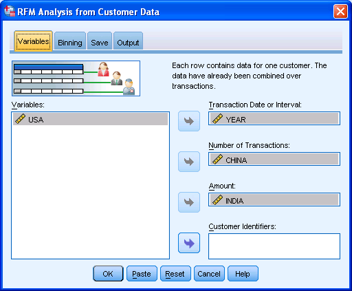
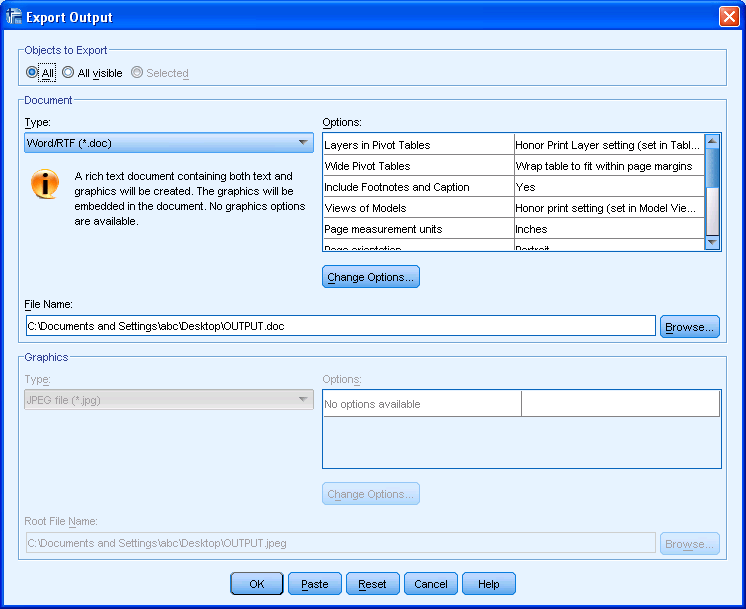
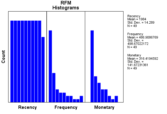
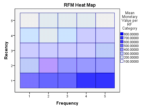
I just got myself an evaluation copy of a fully loaded IBM SPSS 19 Module and did some RFM Analysis on some data- the way SPSS recent version is it makes it very very useful even to non statistical tool- but an extremely useful one to a business or marketing user.

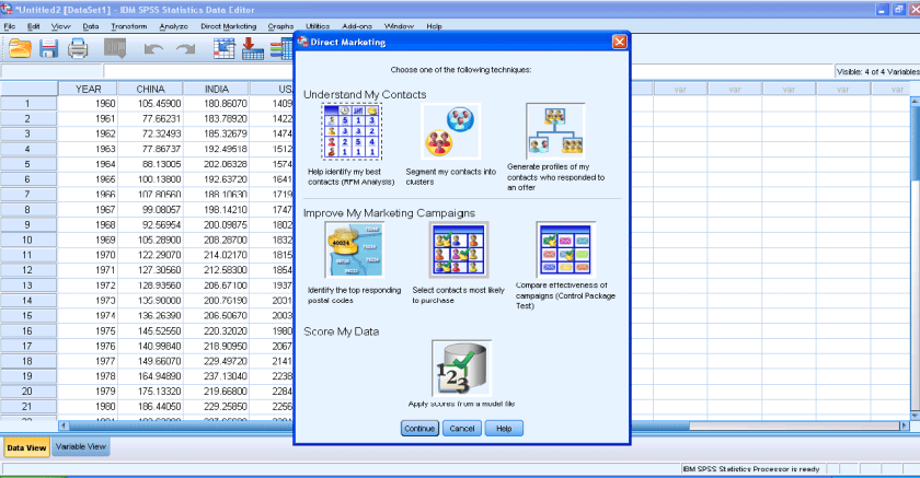
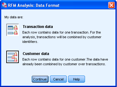
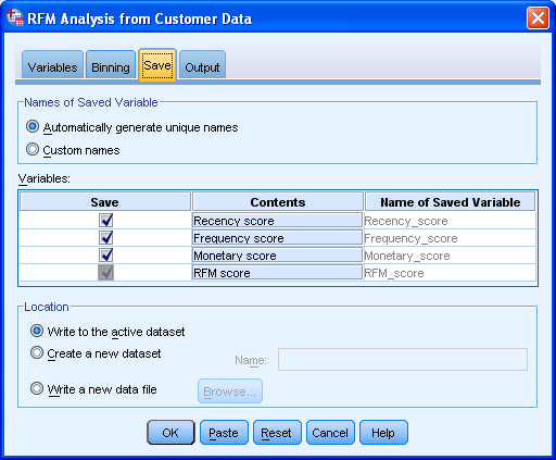
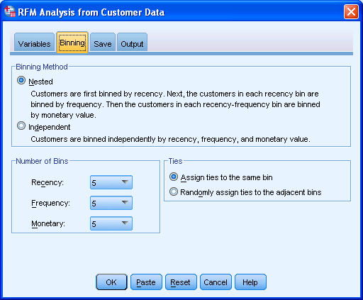
Here are some screenshots to describe the features.

1) A simple dashboard to show functionality (with room for improvement for visual appeal)

2) Simple Intuitive design to inputting data3) Some options in creating marketing scorecards4) Easy to understand features for a business audiences

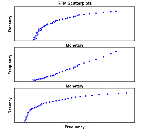
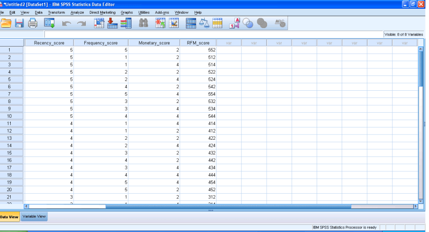
rather than pseudo techie jargon5) Note the clean design of the GUI in specifying data input type6) Again multiple options to export results in a very user friendly manner with options to customize business report7) Graphical output conveniently pasted inside a word document rather than a jumble of images. Auto generated options for customized standard graphs.8) An attractive heatmap to represent monetization for customers. Note the effect that a scale of color shades have in visual representation of data.9) Comparative plots placed side by side with easy to understand explanation (in the output word doc not shown here)10) Auto generated scores attached to data table to enhance usage. 

Note here I am evaluating RFM as a marketing technique (which is well known) but also the GUI of IBM SPSS 19 Marketing Analytics. It is simple, and yet powerful into turning what used to be a purely statistical software for nerds into a beautiful easy to implement tool for business users.

So what else can you do in Marketing Analytics with SPSS 19.

IBM SPSS Direct Marketing

The Direct Marketing add-on option allows organizations to ensure their marketing programs are as effective as possible, through techniques specifically designed for direct marketing, including:

• RFM Analysis. This technique identifies existing customers who are most likely to respond to a new offer.

• Cluster Analysis. This is an exploratory tool designed to reveal natural groupings (or clusters) within your data. For example, it can identify different groups of customers based on various demographic and purchasing characteristics.

• Prospect Profiles. This technique uses results from a previous or test campaign to create descriptive profiles. You can use the profiles to target specific groups of contacts in future campaigns.

• Postal Code Response Rates. This technique uses results from a previous campaign to calculate postal code response rates. Those rates can be used to target specific postal codes in future campaigns.

• Propensity to Purchase. This technique uses results from a test mailing or previous campaign to generate propensity scores. The scores indicate which contacts are most likely to respond.

• Control Package Test. This technique compares marketing campaigns to see if there is a significant difference in effectiveness for different packages or offers.

Click here to find out more about Direct Marketing.

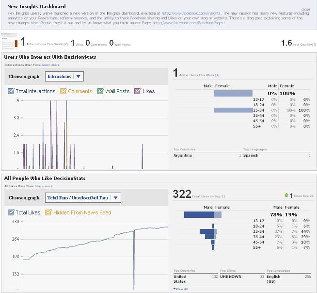
Using Facebook Analytics (Updated)

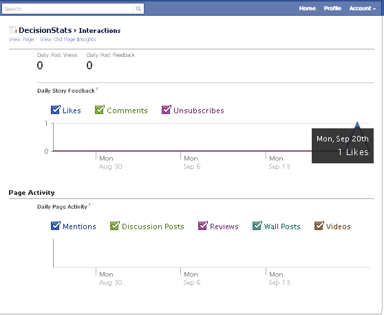
People sceptical of any analytical value of Facebook should see the nice embedded analytics, which is a close rival and even more to Google Analytics for websites. It has recently been updated as well.

It is right there on the button called Insights on left margin of your Facebook Page

Like for the Facebook Page

http://facebook.com/Decisionstats

You can also use Export Data function to run customized analytical and statistical testing on your Corporate Page.

Older View———————————————————————————-

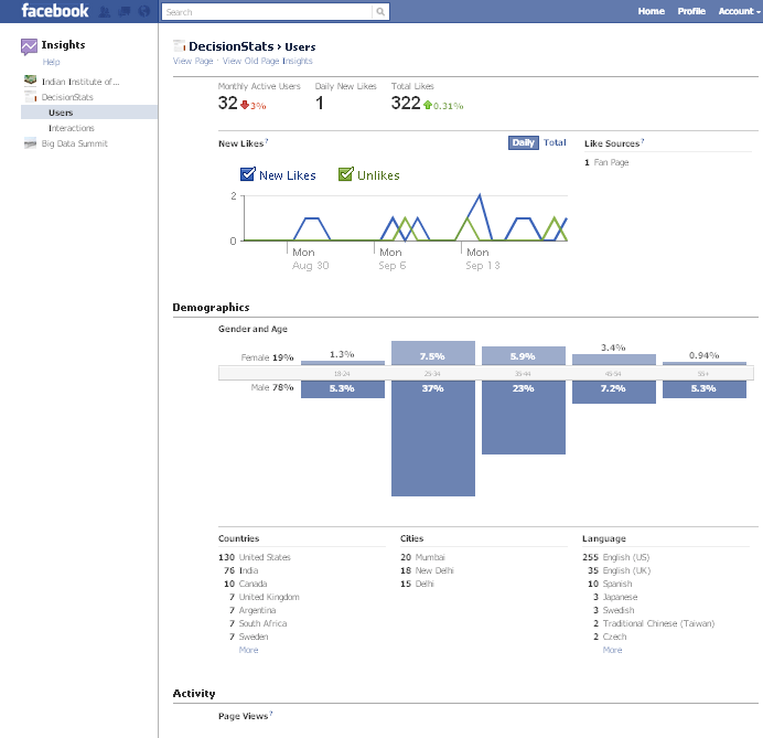
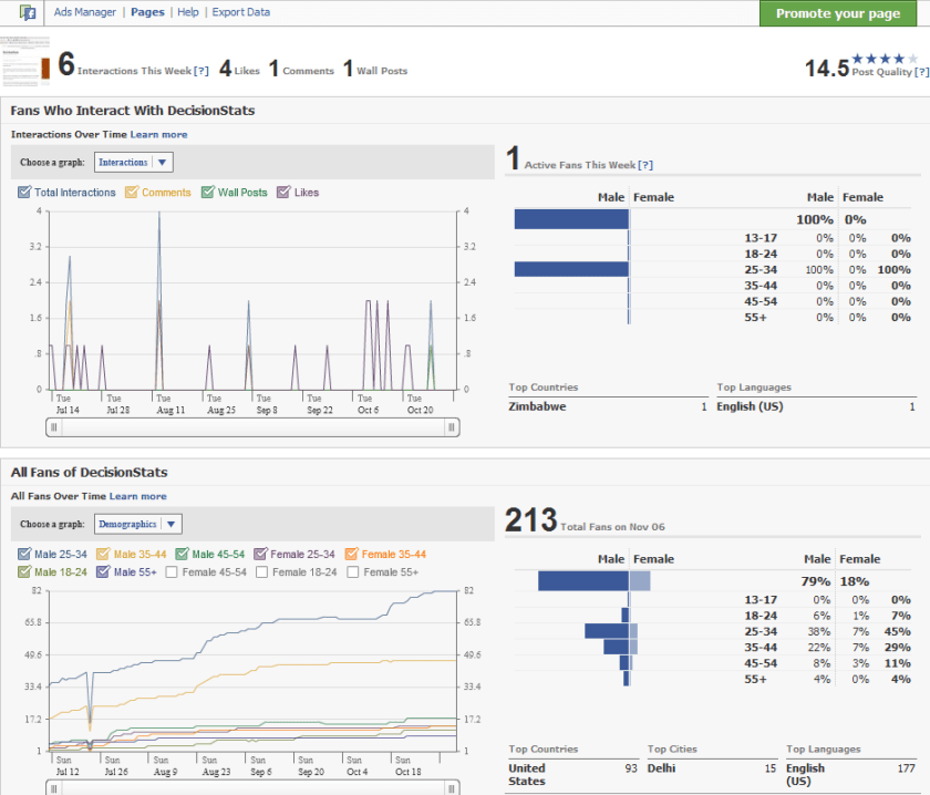
see screenshot of Demographics of 213 Decisionstats fans on Facebook ( FB doesnot allow individual views but only aggregate views for Privacy Reasons)

fb