Top 10 Graphical User Interfaces in Statistical Software

Here is a list of top 10 GUIs in Statistical Software. The overall criterion is based on-

  • User Friendly Nature for a New User to begin click and point and learn.
  • Cleanliness of Automated Code or Log generated.
  • Practical application in consulting and corporate world.
  • Cost and Ease of Ownership (including purchase,install,training,maintainability,renewal)
  • Aesthetics (or just plain pretty)

However this list is not in order of ranking- ( as beauty (of GUI) lies in eyes of the beholder). For a list of top 10 GUI in R language only please see –

https://rforanalytics.wordpress.com/graphical-user-interfaces-for-r/

This is only a GUI based list so it excludes notable command line or text editor submit commands based softwares which are also very powerful and user friendly.

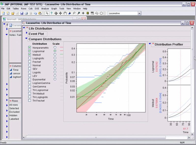
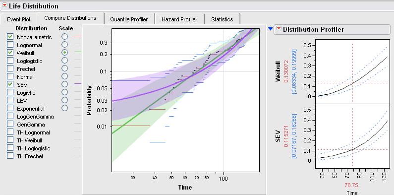
  1. JMP –

While critics of SAS Institute often complain on the premium pricing of the basic model (especially AFTER the entry of another SAS language software WPS from http://www.teamwpc.co.uk/products/wps – they should try out JMP from http://jmp.com – it has a 1 month free evaluation, is much less expensive and the GUI makes it very very easy to do basic statistical analysis and testing. The learning curve is surprisingly fast to pick it up (as it should be for well designed interfaces) and it allows for very good quality output graphics as well.

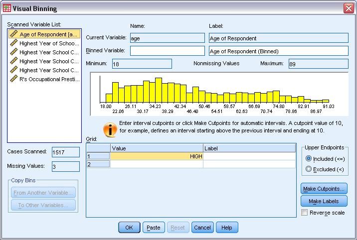
2.SPSS

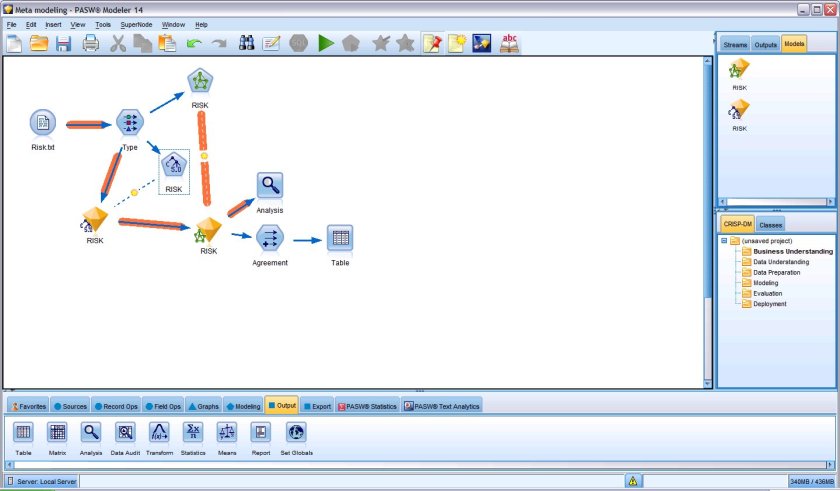
The original GUI in this class of softwares- it has now expanded to a big portfolio of products. However SPSS 18 is nice with the increasing focus on Python and an early adoptee of R compatible interfaces, SPSS does offer a much affordable solution as well with a free evaluation. See especially http://www.spss.com/statistics/ and http://www.spss.com/software/modeling/modeler-pro/

the screenshot here is of SPSS Modeler
3. WPS

While it offers an alternative to Base SAS and SAS /Access software , I really like the affordability (1 Month Free Evaluation and overall lower cost especially for multiple CPU servers ), speed (on the desktop but not on the IBM OS version ) and the intuitive design as well as extensibility of the Workbench. It may look like an integrated development environment and not a proper GUI, but with all the menu features it does qualify as a GUI in my opinion. Continue reading “Top 10 Graphical User Interfaces in Statistical Software”

Norman Nie: R GUI and More

Here is an interview from Norman Nie, SPSS Founder and CEO, REvolution Computing (R Platform).

Some notable thoughts

For example, SPSS was really among the first to deliver rich GUIs that make it easier to use by more people. This is why one of the first things you’ll see from REvolution is a GUI for R – to make R more accessible and hereby further accelerate adoption.

This is good news if executed- I have often written (in agony actually because I use it) for the need for GUIs for R. My last post on that was here. Indeed the one reason SPSS was easily adopted by business school students (like me) in India in 2001-3 was the much better GUI over SAS ‘s GUIs.

However some self delusion/ PR / cognitive dissonance seems at play at Dr Nie’s words

If you look at the last 40 years of university curriculum, SPSS – the product I helped build – has been the dominant player, even becoming the common thread uniting a diverse range of disciplines, which have in turn been applied to business. Data is ubiquitous: tools and data warehouses allow you to query a given set of data repeatedly. R does these things better than the alternatives out there; it is indeed the wave of the future.

SPSS has been a strong number 2- but it has never overtaken SAS. Part of that is SAS handles much bigger datasets much more easily than SPSS did ( and that is where R’s RAM only size can be a concern). Given the decreasing prices of RAM memory, the BIG-LM like packages, and the shift for cloud based computing(with rampable memory on demand) this can be less of an issue- but analysts generally like to have a straight way of handling bigger datasets. Indeed SAS with vertical focus and the recent social media analytics continues to innovate both itself as well as through its alliance partnerships in the Enterprise software world- and REvolution Computing would further need to tie up or sew these analytical partners especially data warehousing or BI providers to ensure R’s analytical functions can be used where there is maximum value for their usage to the corporate customer as well as the academic customer.

Part 2 of Nie’s interview should be interesting .

2010-2011 would likely see

Round 2 : Red Corner ( Nie)                             Gray Corner (Goodnight)

if

Norman Nie can truly deliver a REvolution in Computing

or else

he becomes number two again the second time around to Jim Goodnight’s software giant.

Analyzing Indian – Chinese Relationships

I was reading a couple of articles about India and China ‘s position in the existing world as well as the projected rise of power of both and the tensions inherent in that. For some one completely new to this- Indian-Chinese relationships can be summarized till today at a Governmental level as following-

1) No history of war in ancient times. The Mongols who eventually became the Mughals came to India via Afghanistan. India exported Buddhism and imported silk mainly during this era. In between, the Himalayas stood to give them a distinct culture and boundary.

2) Post 1947- Indo Chinese relationships were initially fine as they both freed themselves from colonialism. This however steadily disintegrated following border troubles leading to the 1962 war which led to loss of territory to China and a traumatic setback for Indian geo-political ambitions in Asia. The conflict defines Indian mistrust of Chinese government till today and was responsible for Indo-China skirmishes in the 1980’s.

3) India’s support for TIbet and Dalai Lama and Chinese support for Pakistan complicates any sign of allying themselves too closely. Both their respective allies have costs more than benefits for China and India- yet the traditional real politik continues. This extends to other relationships like Vietnam and Burma also.

4) Hardly any people contact. Indian and Chinese students are much more likely to meet in the United States than in each other countries. Trade tends to be import of cheap Chinese goods and export of mineral sources. Almost all higher value trade ends up being facilitated by the Western or third party companies.

5) The corruption prone Indian  democracy is more similar to the controlled Chinese communism than Western countries realize. The press in India is not that free from corporate or political pressures and China does have positive internal checks and balances for safeguarding it’s administration and governance.

6) Indian and Chinese attitudes to diplomacy and negotiation are markedly different- with India oscillating between periods of Western/Russian neo- colonialism to bouts of skepticism while China  continues a cautious yet increasingly belligerent focus on it’s own interests. Due to linguistic reasons India is more susceptible to Western influence than the Chinese.

Looking forward, as the purchasing power of the huge demographics of both countries increases they will end up with more focus of the World- and it would be tragic if they fall to the ancient roman rule of Divide and Conquer- to squander away any benefits they can get from a collective bargaining position.

Indeed if China and India can find a realistic way to end their differences and be allies they will find that this relationship can be the most profitable to each other in terms of return on diplomatic time and effort. Enabling direct people to people contact and more fraternal ties in education and socio-cultural arts could be an interesting low risk first step towards such relationships.

Interesting Data Visualization:Friendwheels

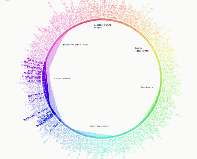
Here is an interesting Facebook Application that I used to generate clusters among my 900( or 400 top) Facebook Connections. What is interesting is the way it drew lines in a circle showing which friends I am most connected with – a bit like analysis of my own social network. It could be interesting if we could apply this to business cases like organizational resource planning or even client relationship management ( or quite traditionally even credit card fraud or risk /marketing analysis)

Thats my network

and this is the main clusters I could draw ( note the number represents the number of common friends/connections)

The FB app was at http://apps.facebook.com/friendwheel/

Book Review- Laws of Simplicity -John Maeda

Simple Review- Simple 100 Page Book Expounding on Ten Laws of Simplicity with Profound Applications in Design.

Complex Review-An excellent book by MIT Design Guru, John Maeda, it talks of the essential process in thinking in simplified manner and the tremendous edge that product and service strategists can gain from it. Essential reading for any strategist and can be read in an hour or two as well.

The Ten Laws are-

  1. Reduce
  2. Organize
  3. Time- Reduce time to do things
  4. Learn
  5. Differences
  6. Context- Appropriate
  7. Emotion- More
  8. Trust-
  9. Failure- What we cant simplify
  10. The One- Subtract obvious and add the meaningful

Three Keys

  1. Away-More appears like less by simply moving it far, far away.
  2. Open- Openness simplifies complexity.
  3. Power- Use less, gain more.

An abstract video on the same is here

or you can watch the TED talk yourself at

http://video.ted.com/talks/podcast/JohnMaeda_2007_480.mp4

Towards better Statistical Interfaces

I was just walking about the U Tenn campus thinking about my next month departure from the school back to India when I ran into Bob Muenchen , head of the Stats consulting centre and more famously the author of ” R for SAS and SPSS users” . Bob mentioned that the edition for R for Stata should be ready for next month. It was also his idea for the article on Red R.

In fact what perplexes users of statistical software like me is why complex softwares like R or SAS choose interfaces that are clearly not as well designed in simplicity as they are in statistical rigor. I think SPSS to some extent and JMP to a much greater extent represent well designed user interfaces. While Rattle , R Commander , R Analytical Flow and Red R are examples for R interfaces SAS also invested in the Enterprise class interfaces.

On all these I belive there is a much greater need for say a Pro UI designer and clean it up. I was reading Prof Maeda’s laws of simplicity ( see http://lawsofsimplicity.com ) and just comparing and contrasting that with some of the softwares I end up using.

The Principles of Reduce ( Shrink, Hide , Embody ) and Organize ( Sort , Label , Integrate and Priortize ) need to be looked into by the Chief Software Interface designers for analytics and BI. While attempts to create more and more robust and faster algorithms and prettier dashboards are important is it not important to simplify the process and procedures to do so . The software which is easier to learn and pick up will tend to have an edge over less visually designed softwares. Keeping it simple helped Apple in the retail electronics and software , it needs to be seen who or which enterprise BI or BA software will make attempts to do the same. An ideal stats or BI interface should be simple and powerful enough to be used by decision makers directly on occasion rather rely on the middleware of analysts and consultants solely.