Here is a brief interview with Alain Chesnais ,Chief Scientist Trendspottr.com. It is a big honor to interview such a legend in computer science, and I am grateful to both him and Mark Zohar for taking time to write these down.
Ajay- Describe your career from your student days to being the President of ACM (Association of Computing Machinery http://www.acm.org/ ). How can we increase the interest of students in STEM education, particularly in view of the shortage of data scientists.
Alain- I’m trying to sum up a career of over 35 years. This may be a bit long winded…
I started my career in CS when I was in high school in the early 70’s. I was accepted in the National Science Foundation’s Science Honors Program in 9th grade and the first course I took was a Fortran programming course at Columbia University. This was on an IBM 360 using punch cards.
The next year my high school got a donation from DEC of a PDP-8E mini computer. I ended up spending a lot of time in the machine room all through high school at a time when access to computers wasn’t all that common. I went to college in Paris and ended up at l’Ecole Normale Supérieure de Cachan in the newly created Computer Science department.
My first job after finishing my graduate studies was as a research assistant at the Centre National de la Recherche Scientifique where I focused my efforts on modelling the behaviour of distributed database systems in the presence of locking. When François Mitterand was elected president of France in 1981, he invited Nicholas Negroponte and Seymour Papert to come to France to set up the Centre Mondial Informatique. I was hired as a researcher there and continued on to become director of software development until it was closed down in 1986. I then started up my own company focusing on distributed computer graphics. We sold the company to Abvent in the early 90’s.
After that, I was hired by Thomson Digital Image to lead their rendering team. We were acquired by Wavefront Technologies in 1993 then by SGI in 1995 and merged with Alias Research. In the merged company: Alias|wavefront, I was director of engineering on the Maya project. Our team received an Oscar in 2003 for the creation of the Maya software system.
Since then I’ve worked at various companies, most recently focusing on social media and Big Data issues associated with it. Mark Zohar and I worked together at SceneCaster in 2007 where we developed a Facebook app that allowed users to create their own 3D scenes and share them with friends via Facebook without requiring a proprietary plugin. In December 2007 it was the most popular app in its category on Facebook.
Recently Mark approached me with a concept related to mining the content of public tweets to determine what was trending in real time. Using math similar to what I had developed during my graduate studies to model the performance of distributed databases in the presence of locking, we built up a real time analytics engine that ranks the content of tweets as they stream in. The math is designed to scale linearly in complexity with the volume of data that we analyze. That is the basis for what we have created for TrendSpottr.
In parallel to my professional career, I have been a very active volunteer at ACM. I started out as a member of the Paris ACM SIGGRAPH chapter in 1985 and volunteered to help do our mailings (snail mail at the time). After taking on more responsibilities with the chapter, I was elected chair of the chapter in 1991. I was first appointed to the SIGGRAPH Local Groups Steering Committee, then became ACM Director for Chapters. Later I was successively elected SIGGRAPH Vice Chair, ACM SIG Governing Board (SGB) Vice Chair for Operations, SGB Chair, ACM SIGGRAPH President, ACM Secretary/Treasurer, ACM Vice President, and finally, in 2010, I was elected ACM President. My term as ACM President has just ended on July 1st. Vint Cerf is our new President. I continue to serve on the ACM Executive Committee in my role as immediate Past President.
(Note-
About ACM
ACM, the Association for Computing Machinery
www.acm.org, is the world’s largest educational and scientific computing society, uniting computing educators, researchers and professionals to inspire dialogue, share resources and address the field’s challenges. )
Ajay- What sets Trendspotter apart from other startups out there in terms of vision in trying to achieve a more coherent experience on the web.
Alain- The Basic difference with other approaches that we are aware of is that we have developed an incremental solution that calculates the results on the fly as the data streams in. Our evaluators are based on solid mathematical foundations that have proven their usefulness over time. One way to describe what we do is to think of it as signal processing where the tweets are the signal and our evaluators are like triggers that tell you what elements of the signal have the characteristics that we are filtering for (velocity and acceleration). One key result of using this approach is that our unit cost per tweet analyzed does not go up with increased volume. Using more traditional data analysis approaches involving an implicit sort would imply a complexity of N*log(N), where N is the volume of tweets being analyzed. That would imply that the cost per tweet analyzed would go up with the volume of tweets. Our approach was designed to avoid that, so that we can maintain a cap on our unit costs of analysis, no matter what volume of data we analyze.
Ajay- What do you think is the future of big data visualization going to look like? What are some of the technologies that you are currently bullish on?
Alain- I see several trends that would have deep impact on Big Data visualization. I firmly believe that with large amounts of data, visualization is key tool for understanding both the structure and the relationships that exist between data elements. Let’s focus on some of the key things that are pushing in this direction:
- the volume of data that is available is growing at a rate we have never seen before. Cisco has measured an 8 fold increase in the volume of IP traffic over the last 5 years and predicts that we will reach the zettabyte of data over IP in 2016
- more of the data is becoming publicly available. This isn’t only on social networks such as Facebook and twitter, but joins a more general trend involving open research initiatives and open government programs
- the desired time to get meaningful results is going down dramatically. In the past 5 years we have seen the half life of data on Facebook, defined as the amount of time that half of the public reactions to any given post (likes, shares., comments) take place, go from about 12 hours to under 3 hours currently
- our access to the net is always on via mobile device. You are always connected.
- the CPU and GPU capabilities of mobile devices is huge (an iPhone has 10 times the compute power of a Cray-1 and more graphics capabilities than early SGI workstations)
Put all of these observations together and you quickly come up with a massive opportunity to analyze data visually on the go as it happens no matter where you are. We can’t afford to have to wait for results. When something of interest occurs we need to be aware of it immediately.
Ajay- What are some of the applications we could use Trendspottr. Could we predict events like Arab Spring, or even the next viral thing.
Alain- TrendSpottr won’t predict what will happen next. What it *will* do is alert you immediately when it happens. You can think of it like a smoke detector. It doesn’t tell that a fire will take place, but it will save your life when a fire does break out.
Typical uses for TrendSpottr are
- thought leadership by tracking content that your readership is interested in via TrendSpottr you can be seen as a thought leader on the subject by being one of the first to share trending content on a given subject. I personally do this on my Facebook page (http://www.facebook.com/alain.chesnais) and have seen my klout score go up dramatically as a result
- brand marketing to be able to know when something is trending about your brand and take advantage of it as it happens.
- competitive analysis to see what is being said about two competing elements. For instance, searching TrendSpottr for “Obama OR Romney” gives you a very good understanding about how social networks are reacting to each politician. You can also do searches like “$aapl OR $msft OR $goog” to get a sense of what is the current buzz for certain hi tech stocks.
- understanding your impact in real time to be able to see which of the content that you are posting is trending the most on social media so that you can highlight it on your main page. So if all of your content is hosted on common domain name (ourbrand.com), searching for ourbrand.com will show you the most active of your site’s content. That can easily be set up by putting a TrendSpottr widget on your front page
Ajay- What are some of the privacy guidelines that you keep in mind- given the fact that you collect individual information but also have government agencies as potential users.
Alain- We take privacy very seriously and anonymize all of the data that we collect. We don’t keep explicit records of the data we collected through the various incoming streams and only store the aggregate results of our analysis.
About–
Alain Chesnais is immediate Past President of ACM, elected for the two-year term beginning July 1, 2010.Chesnais studied at l’Ecole Normale Supérieure de l’Enseignement Technique and l’Université de Paris where he earned a Maîtrise de Mathematiques, a Maitrise de Structure Mathématique de l’Informatique, and a Diplôme d’Etudes Approfondies in Compuer Science. He was a high school student at the United Nations International School in New York, where, along with preparing his International Baccalaureate with a focus on Math, Physics and Chemistry, he also studied Mandarin Chinese.Chesnais recently founded Visual Transitions, which specializes in helping companies move to HTML 5, the newest standard for structuring and presenting content on the World Wide Web. He was the CTO of SceneCaster.com from June 2007 until April 2010, and was Vice President of Product Development at Tucows Inc. from July 2005 – May 2007. He also served as director of engineering at Alias|Wavefront on the team that received an Oscar from the Academy of Motion Picture Arts and Sciences for developing the Maya 3D software package.
Prior to his election as ACM president, Chesnais was vice president from July 2008 – June 2010 as well as secretary/treasurer from July 2006 – June 2008. He also served as president of ACM SIGGRAPH from July 2002 – June 2005 and as SIG Governing Board Chair from July 2000 – June 2002.
As a French citizen now residing in Canada, he has more than 20 years of management experience in the software industry. He joined the local SIGGRAPH Chapter in Paris some 20 years ago as a volunteer and has continued his involvement with ACM in a variety of leadership capacities since then.
About Trendspottr.com
TrendSpottr is a real-time viral search and predictive analytics service that identifies the most timely and trending information for any topic or keyword. Our core technology analyzes real-time data streams and spots emerging trends at their earliest acceleration point — hours or days before they have become “popular” and reached mainstream awareness.
TrendSpottr serves as a predictive early warning system for news and media organizations, brands, government agencies and Fortune 500 companies and helps them to identify emerging news, events and issues that have high viral potential and market impact. TrendSpottr has partnered with HootSuite, DataSift and other leading social and big data companies.

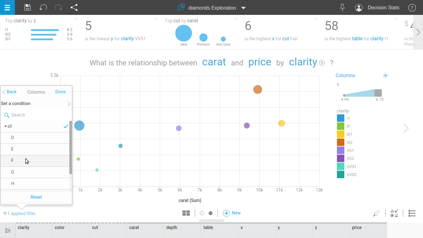
 Step 2
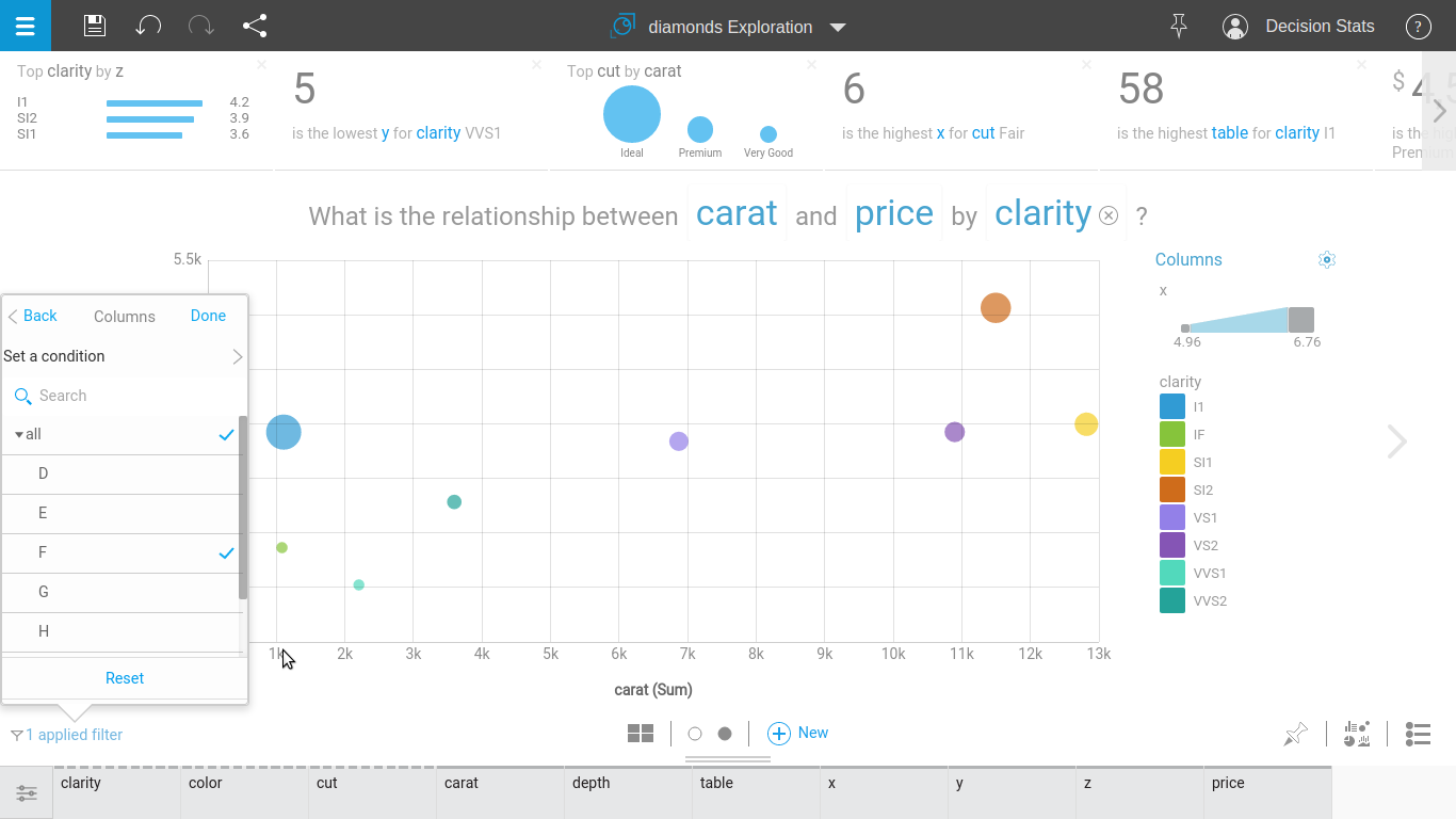
 Step 3