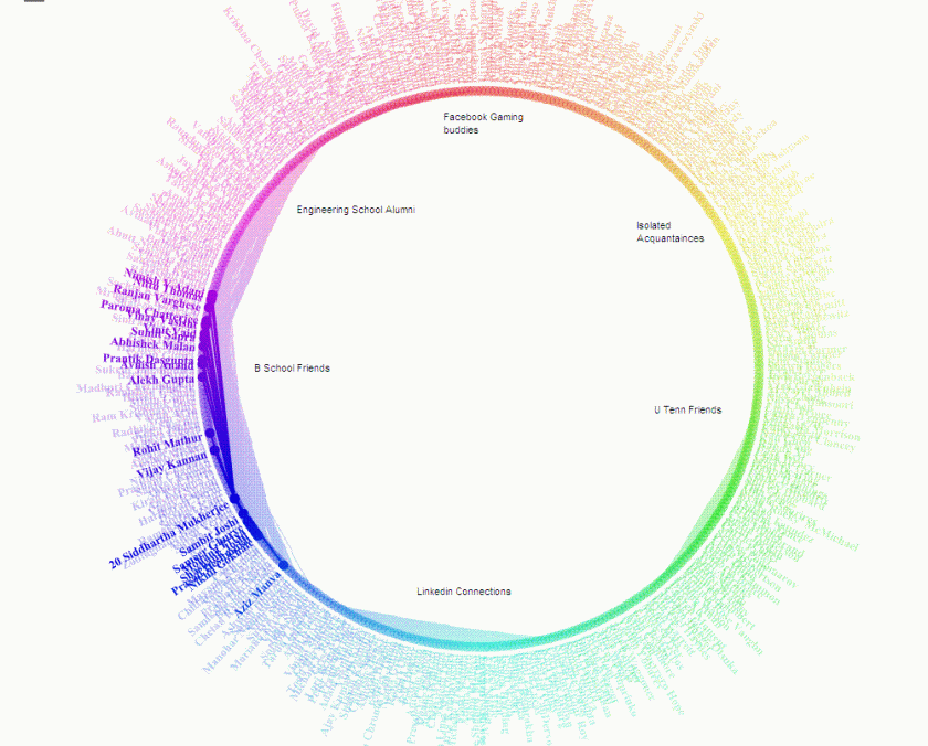
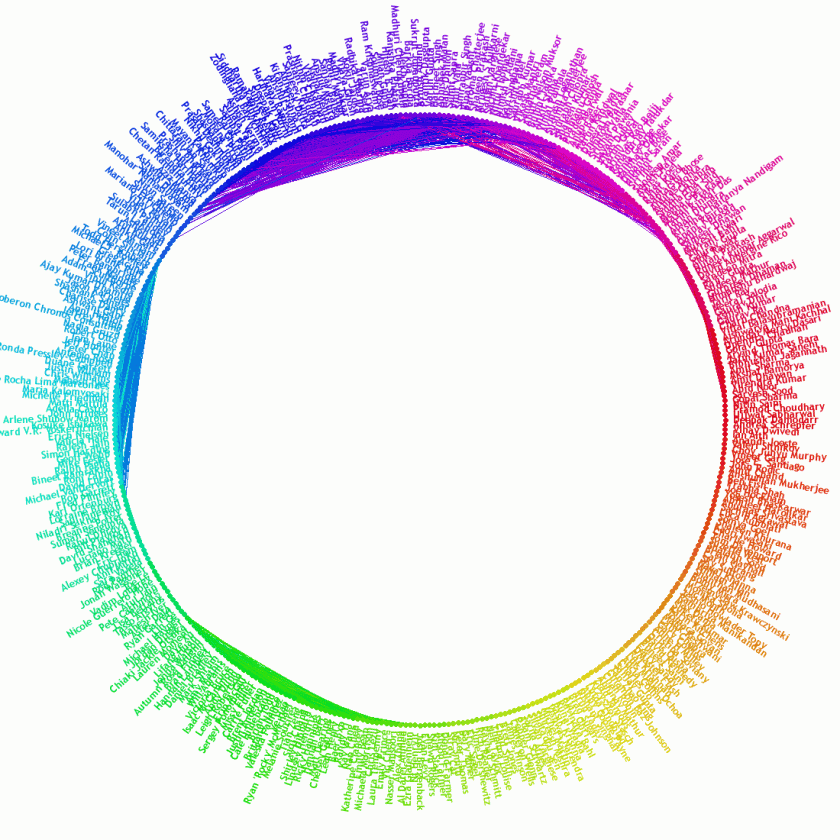
Here is an interesting Facebook Application that I used to generate clusters among my 900( or 400 top) Facebook Connections. What is interesting is the way it drew lines in a circle showing which friends I am most connected with – a bit like analysis of my own social network. It could be interesting if we could apply this to business cases like organizational resource planning or even client relationship management ( or quite traditionally even credit card fraud or risk /marketing analysis)
and this is the main clusters I could draw ( note the number represents the number of common friends/connections)
 The FB app was at http://apps.facebook.com/friendwheel/

