Common Analytical Tasks

WorldWarII-DeathsByCountry-Barchart
Image via Wikipedia


Some common analytical tasks from the diary of the glamorous life of a business analyst-

1) removing duplicates from a dataset based on certain key values/variables
2) merging two datasets based on a common key/variable/s
3) creating a subset based on a conditional value of a variable
4) creating a subset based on a conditional value of a time-date variable
5) changing format from one date time variable to another
6) doing a means grouped or classified at a level of aggregation
7) creating a new variable based on if then condition
8) creating a macro to run same program with different parameters
9) creating a logistic regression model, scoring dataset,
10) transforming variables
11) checking roc curves of model
12) splitting a dataset for a random sample (repeatable with random seed)
13) creating a cross tab of all variables in a dataset with one response variable
14) creating bins or ranks from a certain variable value
15) graphically examine cross tabs
16) histograms
17) plot(density())
18)creating a pie chart
19) creating a line graph, creating a bar graph
20) creating a bubbles chart
21) running a goal seek kind of simulation/optimization
22) creating a tabular report for multiple metrics grouped for one time/variable
23) creating a basic time series forecast

and some case studies I could think of-


As the Director, Analytics you have to examine current marketing efficiency as well as help optimize sales force efficiency across various channels. In addition you have to examine multiple sales channels including inbound telephone, outgoing direct mail, internet email campaigns. The datawarehouse is an RDBMS but it has multiple data quality issues to be checked for. In addition you need to submit your budget estimates for next year’s annual marketing budget to maximize sales return on investment.

As the Director, Risk you have to examine the overdue mortgages book that your predecessor left you. You need to optimize collections and minimize fraud and write-offs, and your efforts would be measured in maximizing profits from your department.

As a social media consultant you have been asked to maximize social media analytics and social media exposure to your client. You need to create a mechanism to report particular brand keywords, as well as automated triggers between unusual web activity, and statistical analysis of the website analytics metrics. Above all it needs to be set up in an automated reporting dashboard .

As a consultant to a telecommunication company you are asked to monitor churn and review the existing churn models. Also you need to maximize advertising spend on various channels. The problem is there are a large number of promotions always going on, some of the data is either incorrectly coded or there are interaction effects between the various promotions.

As a modeller you need to do the following-
1) Check ROC and H-L curves for existing model
2) Divide dataset in random splits of 40:60
3) Create multiple aggregated variables from the basic variables

4) run regression again and again
5) evaluate statistical robustness and fit of model
6) display results graphically
All these steps can be broken down in little little pieces of code- something which i am putting down a list of.
Are there any common data analysis tasks that you think I am missing out- any common case studies ? let me know.


2010 in review and WP-Stats

The following is an auto generated post thanks to WordPress.com stats team- clearly they have got some stuff wrong

1) Defining the speedometer quantitatively

2) The busiest day numbers are plain wrong ( 2 views ??)

3) There is still no geographic data in WordPress -com stats (unlike Google Analytics) and I cant enable Google Analytics on a wordpress.com hosted site.


The stats helper monkeys at WordPress.com mulled over how this blog did in 2010, and here’s a high level summary of its overall blog health:

Healthy blog!

The Blog-Health-o-Meter™ reads Wow.

Crunchy numbers

Featured image

The Louvre Museum has 8.5 million visitors per year. This blog was viewed about 97,000 times in 2010. If it were an exhibit at The Louvre Museum, it would take 4 days for that many people to see it.


In 2010, there were 367 new posts, growing the total archive of this blog to 1191 posts. There were 411 pictures uploaded, taking up a total of 121mb. That’s about 1 pictures per day.

The busiest day of the year was September 22nd with 2 views. The most popular post that day was Top 10 Graphical User Interfaces in Statistical Software.

Where did they come from?

The top referring sites in 2010 were r-bloggers.com, reddit.com, rattle.togaware.com, twitter.com, and Google Reader.

Some visitors came searching, mostly for libre office, facebook analytics, test drive a chrome notebook, test drive a chrome notebook., and wps sas lawsuit.

Attractions in 2010

These are the posts and pages that got the most views in 2010.

1

Top 10 Graphical User Interfaces in Statistical Software April 2010
8 comments and 1 Like on WordPress.com,

2

Wealth = function (numeracy, memory recall) December 2009
1 Like on WordPress.com,

3

Matlab-Mathematica-R and GPU Computing September 2010
1 Like on WordPress.com,

4

About DecisionStats July 2008

5

The Top Statistical Softwares (GUI) May 2010
1 comment and 1 Like on WordPress.com,

Tale of Two Analytical Interfaces

Occam’s razor (or Ockham’s razor[1]) is often expressed in Latin as the lex parsimoniae(translating to the law of parsimonylaw of economy or law of succinctness). The principle is popularly summarized as “the simplest explanation is more likely the correct one.

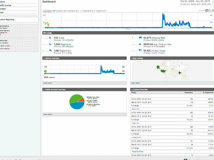
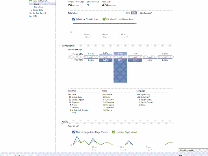
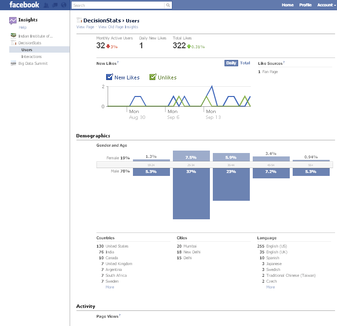
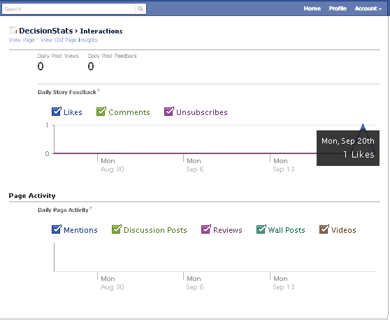
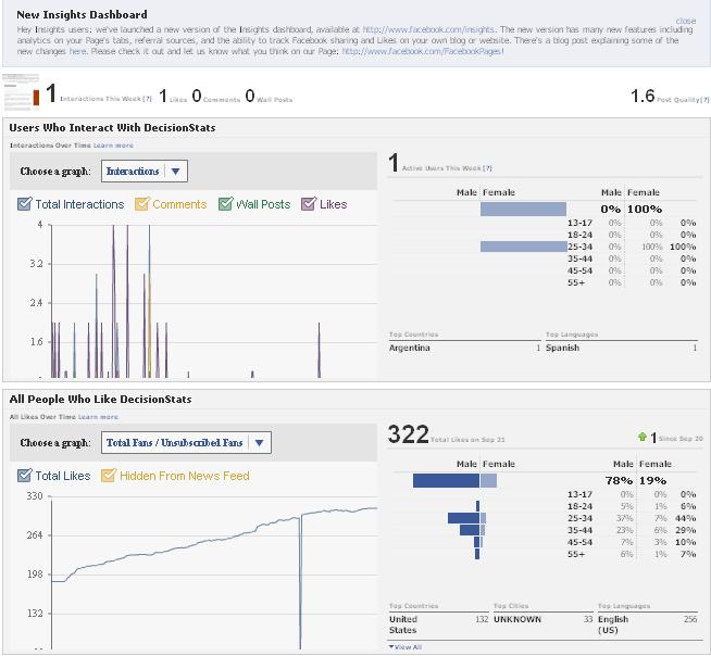
Using a simple screenshot- you can see Facebook Analytics for a Facebook page is simpler at explaining who is coming to visit rather than Google Analytics Dashboard (which has not seen the attention of a Visual UI or Graphic Redesign)

And if Facebook is going to take over the internet, well it is definitely giving better analytics in the process. What do you think?

Which Interface is simpler- and gives you better targeting. Ignore the numbers and just see the metrics measured and the way they are presented. Coincidently R is used at Facebook a lot (which has given the jjplot package)- and Google has NOT INVESTED MAJOR MONEY in creating Premium R Packages or Big Data Packages. I am talking investment at the scale Google is known for- not measly meetups.

(the summer of code dont count- it is for students mostly)

(but thanks for the Pizza G Men- and maybe revise that GA interface by putting a razor to some metrics)

GA vs Facebook Analytics


New Google Ad Planner

Dusan's User Interface challenge
Image by moggs oceanlane via Flickr

The new Google Ad Planner is really nice-seems better than old Adwords interface, though needs a UI redesign before it can complete with the clean cut slice and dice of Facebook Ad Planner.

It’s the interface, stupid that makes an Iphone sell more than the Symbian even with 90% functionality. Same reasons why Google Storage is okay but Google Prediction API gets slower liftoff than Amazon Console (now with FREE instances) – though the R interface to Prediction API sure helps.

Prediction API is a terrific tool dying for oxygen out there (and will end up like Wave- I hope not)

Sometimes you need artists as well as engineers to design query tools, G Men- and guess the Double Click anti trust rumours have quietened down enough because why the heck did double click interface integration take so loooong.

( and btw why cant Google just get into the multi billion dashboard business if they can manage ALL the data IN THE INTERNET ——they sure can do it for specific companies- – but wait-

they are probably waiting for AsterData to stop sucking thumbs ,chanting on MapReduce SQL,  MapReduce SQL nursery rhymes and start inventing NEW STUFF again (or atleast creating two product brands from nCluster (when you and I were in school together giggle)

Btw the time Google make up their mind to enter BI or wait for Aster to finish- IBM would have gulped and burped all there it is- and thats the way that market rolls.

Back to Ad s and Mad Men.

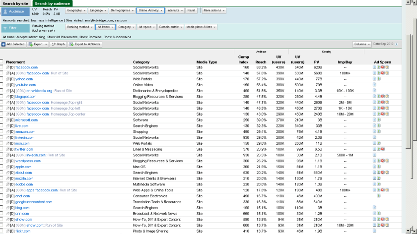
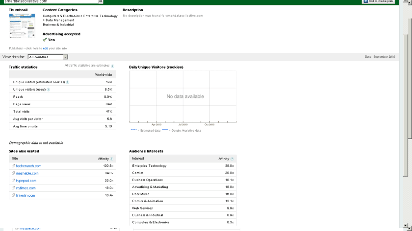
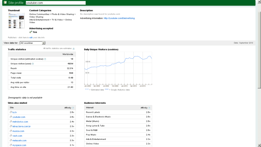
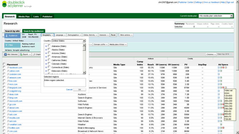
Here are some screenshots-of the new Google Ad Planner-

I found it useful to review traffic for third party websites (even better than Google Trends) and thats a definite plus over Facebooks closed dormitory world of ads.

Click on them for some more views or go straight to http://google.com/adplanner and Enjoy Baby!

Which websites attract your target customers?

View a site listing: 

Ad Planner top 1,000 sites

Refine your online advertising with DoubleClick Ad Planner, a free media planning tool that can help you:

Identify websites your target customers are likely to visit

  • Define audiences by demographics and interests.
  • Search for websites relevant to your target audience.
  • Access unique users, page views, and other data for millions of websites from over 40 countries.

Easily build media plans for yourself or your clients

  • Create lists of websites where you’d like to advertise.
  • Generate aggregated website statistics for your media plan.

and

Take charge of your DoubleClick Ad Planner site listing

View a site listing: 

Ad Planner top 1,000 sites

DoubleClick Ad Planner is a media planning tool where advertisers find sites for their media buys. As a site owner, you can access the DoubleClick Ad Planner Publisher Center and
Market your site
Write a site description to present your audience and unique value to advertisers.
Help advertisers search for you
Choose categories for your site and ad formats you support.
Improve the data that advertisers see
Share your Google Analytics data to reflect the most accurate traffic numbers for your site.


The SEO mess on joining blog aggregators


Mug shot of Paris Hilton.
Image via Wikipedia


If you are an analytics blogger who writes, and is aggregated on an analytical community- read on- Here’s how blog aggregation communities can help you lose 30% of all future traffic long term, while giving you a short term.

The problem is not created by Blogging Communities (like R-Bloggers, or PlanteR, or Smart Data Collective or AnalyticBridge or even BeyeBlogs )

It is created by the way Google Page Rank is structured- you see given exactly the same content on two different we pages- Google Page Rank will place the higher Page Rank results higher. This is counter intutive and quite simple to rectify- The Google Spider can just use the Time Stamp for choosing which article was published where first (Obviously on your blog, AND then later to the aggregator).

How bad is the mess? Well joining ANY blog aggregation will lead to an instant lift of upto 10-50 % of your current traffic as similar bloggers try and read about you. However you can lose the long term 30% proportion which is a benchmark of search engine created traffic for you.

So do you opt out of blog aggregation? No. It’s a SEO mess and it’s unfair to punish your blog aggregator, most of whom are running on ad-supported sponsors or their own funds on dry fumes to publish your content. Most of the fore mentioned communities are created by excellent people I interacted with heavily- and they are genuinely motivated to give readers an easy way to keep up with blogs. Especially Smart Data Collective, Analyticbridge and R-bloggers whose founders I have known personally.

You can do one thing- create manual summaries in the excerpt feature of your blog posts- it’s just below the WordPress page. And switch your RSS feed to summary rather than full. It avoids losing keyword rank to other websites, it prevents the Blog Aggregation from gaining too much influence in key word related searches, and it keeps your whole eco system happy, Best of All it helps readers of Blog Aggregators- since most of them use a summary on the front page anyways.

An additional thought on Google Page Rank- something I have sulked over but not spoken for a long long time.  It ignores the value of reader- If Bill Gates, Steve Jobs, and 500 ceos from Fortune 500 companies read my blog but do not link to it- it will count daily traffic as 500. Probably it will give more weightage to Paris Hilton fans.

A suggestion-humbly- you can use IP Address lookup of visitors to see if traffic is coming from corporate sources or retail sources -Clicky from GetClicky does this. Use it as feedback in Google Analytics as well as Google Trends.

And maybe PageRank needs to add quantity and quality of visitors as additional variables . Do a A/B test guys some Chi Square juice- its not quite Mad Men Adverting but its still good fun.


PageRank
Image via Wikipedia


and the world is one big community as per xkcd


Better Data Visualization in WordPress.com Stats

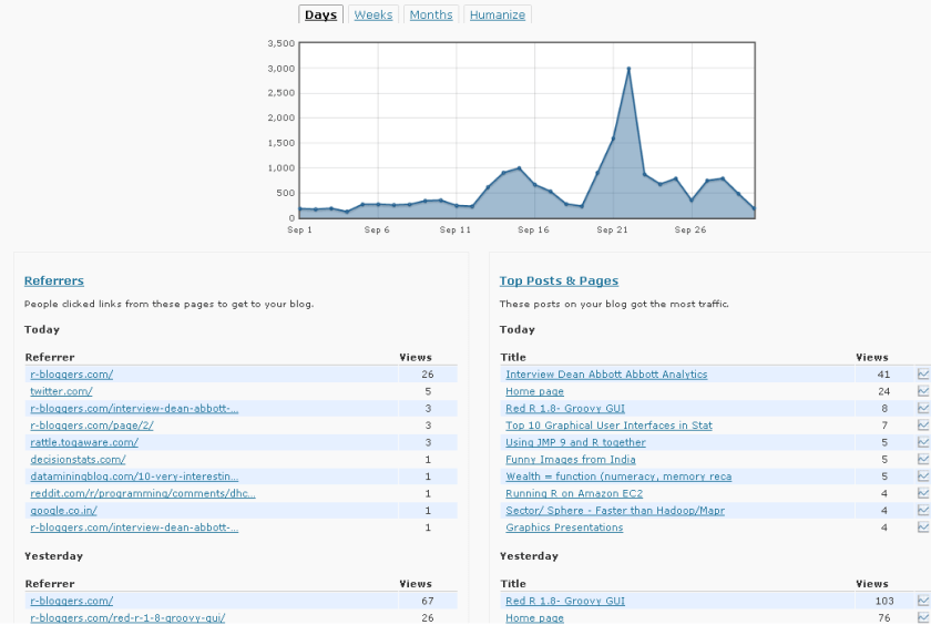
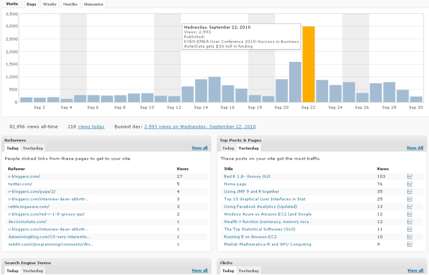
WordPress.com Stats is the analytical software which helps bloggers on WP.com hosted blogs. It recently underwent a revamp in design-

Note a simple change from Line to Histogram charts, and added Tabs can add so much value to data.

However WP.com really needs to addin Geo-Coded Stats (Visitors from where) and Some level of Campaign Tracking (similar to Goals in Google Analytics)

Earlier WP Stats

Now WP Stats

Using Facebook Analytics (Updated)

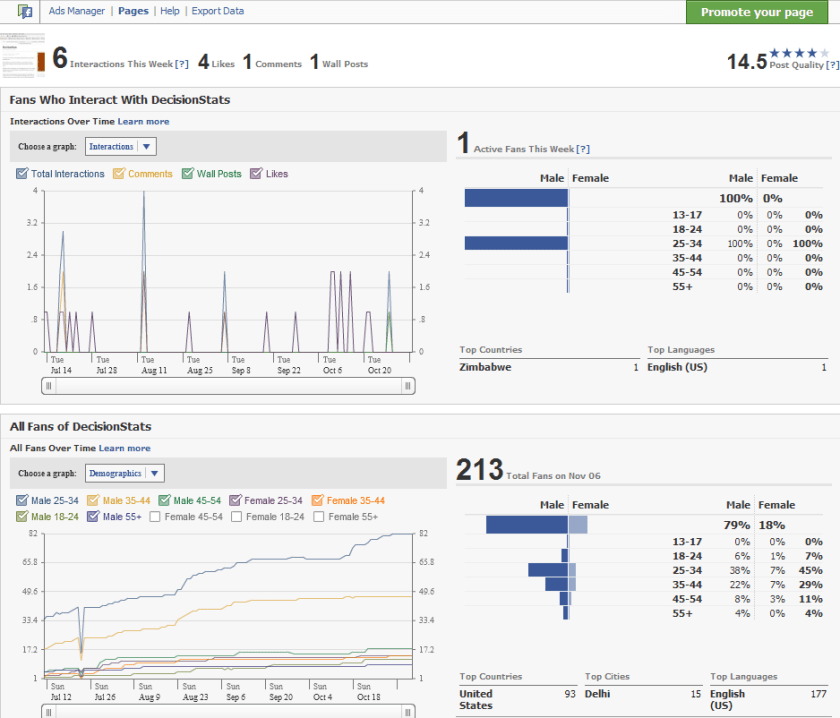
People sceptical of any analytical value of Facebook should see the nice embedded analytics, which is a close rival and even more to Google Analytics for websites. It has recently been updated as well.

It is right there on the button called Insights on left margin of your Facebook Page

Like for the Facebook Page

http://facebook.com/Decisionstats

You can also use Export Data function to run customized analytical and statistical testing on your Corporate Page.

Older View———————————————————————————-

see screenshot of Demographics of 213 Decisionstats fans on Facebook ( FB doesnot allow individual views but only aggregate views for Privacy Reasons)

fb