New RCommander with ggplot #rstats


My favorite GUI (or one of them) R Commander has a relatively new plugin called KMGGplot2. Until now Deducer was the only GUI with ggplot features , but the much lighter and more popular R Commander has been a long champion in people wanting to pick up R quickly.


http://cran.r-project.org/web/packages/RcmdrPlugin.KMggplot2/

RcmdrPlugin.KMggplot2: Rcmdr Plug-In for Kaplan-Meier Plot and Other Plots by Using the ggplot2 Package


As you can see by the screenshot- it makes ggplot even easier for people (like R  newbies and experienced folks alike)


This package is an R Commander plug-in for Kaplan-Meier plot and other plots by using the ggplot2 package.

Version: 0.1-0
Depends: R (≥ 2.15.0), stats, methods, grid, Rcmdr (≥ 1.8-4), ggplot2 (≥ 0.9.1)
Imports: tcltk2 (≥ 1.2-3), RColorBrewer (≥ 1.0-5), scales (≥ 0.2.1), survival (≥ 2.36-14)
Published: 2012-05-18
Author: Triad sou. and Kengo NAGASHIMA
Maintainer: Triad sou. <triadsou at gmail.com>
License: GPL-2
CRAN checks: RcmdrPlugin.KMggplot2 results


----------------------------------------------------------------
NEWS file for the RcmdrPlugin.KMggplot2 package
----------------------------------------------------------------

----------------------------------------------------------------

Changes in version 0.1-0 (2012-05-18)

 o Restructuring implementation approach for efficient
   maintenance.
 o Added options() for storing package specific options (e.g.,
   font size, font family, ...).
 o Added a theme: theme_simple().
 o Added a theme element: theme_rect2().
 o Added a list box for facet_xx() functions in some menus
   (Thanks to Professor Murtaza Haider).
 o Kaplan-Meier plot: added confidence intervals.
 o Box plot: added violin plots.
 o Bar chart for discrete variables: deleted dynamite plots.
 o Bar chart for discrete variables: added stacked bar charts.
 o Scatter plot matrix: added univariate plots at diagonal
   positions (ggplot2::plotmatrix).
 o Deleted the dummy data for histograms, which is large in
   size.

----------------------------------------------------------------

Changes in version 0.0-4 (2011-07-28)

 o Fixed "scale_y_continuous(formatter = "percent")" to
   "scale_y_continuous(labels = percent)" for ggplot2
   (>= 0.9.0).
 o Fixed "legend = FALSE" to "show_guide = FALSE" for
   ggplot2 (>= 0.9.0).
 o Fixed the DESCRIPTION file for ggplot2 (>= 0.9.0) dependency.

----------------------------------------------------------------

Changes in version 0.0-3 (2011-07-28; FIRST RELEASE VERSION)

 o Kaplan-Meier plot: Show no. at risk table on outside.
 o Histogram: Color coding.
 o Histogram: Density estimation.
 o Q-Q plot: Create plots based on a maximum likelihood estimate
   for the parameters of the selected theoretical distribution.
 o Q-Q plot: Create plots based on a user-specified theoretical
   distribution.
 o Box plot / Errorbar plot: Box plot.
 o Box plot / Errorbar plot: Mean plus/minus S.D.
 o Box plot / Errorbar plot: Mean plus/minus S.D. (Bar plot).
 o Box plot / Errorbar plot: 95 percent Confidence interval
   (t distribution).
 o Box plot / Errorbar plot: 95 percent Confidence interval
   (bootstrap).
 o Scatter plot: Fitting a linear regression.
 o Scatter plot: Smoothing with LOESS for small datasets or GAM
   with a cubic regression basis for large data.
 o Scatter plot matrix: Fitting a linear regression.
 o Scatter plot matrix: Smoothing with LOESS for small datasets
   or GAM with a cubic regression basis for large data.
 o Line chart: Normal line chart.
 o Line chart: Line char with a step function.
 o Line chart: Area plot.
 o Pie chart: Pie chart.
 o Bar chart for discrete variables: Bar chart for discrete
   variables.
 o Contour plot: Color coding.
 o Contour plot: Heat map.
 o Distribution plot: Normal distribution.
 o Distribution plot: t distribution.
 o Distribution plot: Chi-square distribution.
 o Distribution plot: F distribution.
 o Distribution plot: Exponential distribution.
 o Distribution plot: Uniform distribution.
 o Distribution plot: Beta distribution.
 o Distribution plot: Cauchy distribution.
 o Distribution plot: Logistic distribution.
 o Distribution plot: Log-normal distribution.
 o Distribution plot: Gamma distribution.
 o Distribution plot: Weibull distribution.
 o Distribution plot: Binomial distribution.
 o Distribution plot: Poisson distribution.
 o Distribution plot: Geometric distribution.
 o Distribution plot: Hypergeometric distribution.
 o Distribution plot: Negative binomial distribution.

Top ten business analytics graphs Bar Charts (3/10)

Bar Charts and Histograms-Bar Charts are one of the most widely used types of Business Charts. Even the ever popular histograms are  special cases of bar charts (but showing frequencies). Histograms are the not the same as bar charts, they are simply bar charts of frequencies.

Basically a bar chart shows rectangular bars with length proportional to the quantities being described. It helps to see relative quantities between various category types.

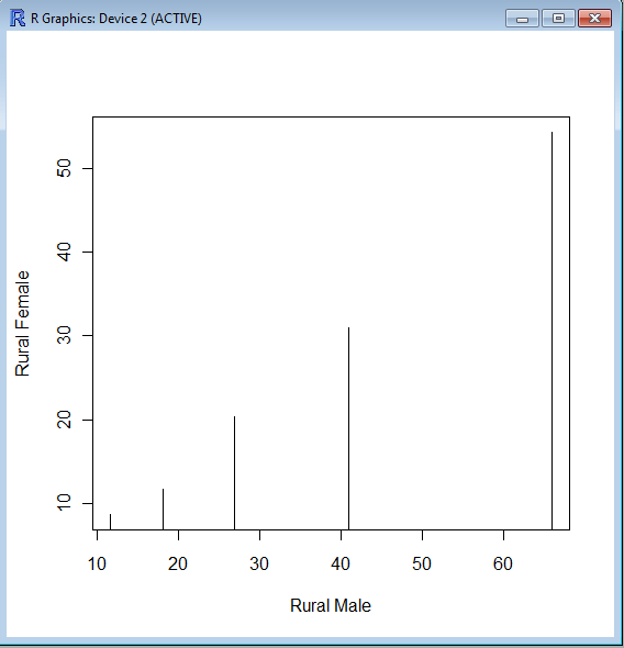
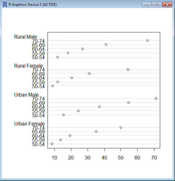
The barplot() command is used for making Bar Plots, while hist() is used for histograms. You can also use the plot() command with type=h to create histograms-The official R manual also suggests that Dot plots using dotchart () are a reasonable substitute for bar plots.
A very simple easy to understand tutorial for basic bar plots is at http://msenux.redwoods.edu/math/R/barplot.php

The difference between the three main functions that can be used for these charts are shown below-

> VADeaths
Rural Male Rural Female Urban Male Urban Female
50-54       11.7          8.7       15.4          8.4
55-59       18.1         11.7       24.3         13.6
60-64       26.9         20.3       37.0         19.3
65-69       41.0         30.9       54.6         35.1
70-74       66.0         54.3       71.1         50.0

> plot(VADeaths,type=”h”)


> dotchart(VADeaths)

Top Ten Graphs for Business Analytics -Pie Charts (1/10)

I have not been really posting or writing worthwhile on the website for some time, as I am still busy writing ” R for Business Analytics” which I hope to get out before year end. However while doing research for that, I came across many types of graphs and what struck me is the actual usage of some kinds of graphs is very different in business analytics as compared to statistical computing.

The criterion of top ten graphs is as follows-

1) Usage-The order in which they appear is not strictly in terms of desirability but actual frequency of usage. So a frequently used graph like box plot would be recommended above say a violin plot.

2) Adequacy- Data Visualization paradigms change over time- but the need for accurate conveying of maximum information in a minium space without overwhelming reader or misleading data perceptions.

3) Ease of creation- A simpler graph created by a single function is more preferrable to writing 4-5 lines of code to create an elaborate graph.

4) Aesthetics– Aesthetics is relative and  in addition studies have shown visual perception varies across cultures and geographies. However , beauty is universally appreciated and a pretty graph is sometimes and often preferred over a not so pretty graph. Here being pretty is in both visual appeal without compromising perceptual inference from graphical analysis.


so When do we use a bar chart versus a line graph versus a pie chart? When is a mosaic plot more handy and when should histograms be used with density plots? The list tries to capture most of these practicalities.

Let me elaborate on some specific graphs-

1) Pie Chart- While Pie Chart is not really used much in stats computing, and indeed it is considered a misleading example of data visualization especially the skewed or two dimensional charts. However when it comes to evaluating market share at a particular instance, a pie chart is simple to understand. At the most two pie charts are needed for comparing two different snapshots, but three or more pie charts on same data at different points of time is definitely a bad case.

In R you can create piechart, by just using pie(dataset$variable)

As per official documentation, pie charts are not  recommended at all.

http://stat.ethz.ch/R-manual/R-patched/library/graphics/html/pie.html

Pie charts are a very bad way of displaying information. The eye is good at judging linear measures and bad at judging relative areas. A bar chart or dot chart is a preferable way of displaying this type of data.

Cleveland (1985), page 264: “Data that can be shown by pie charts always can be shown by a dot chart. This means that judgements of position along a common scale can be made instead of the less accurate angle judgements.” This statement is based on the empirical investigations of Cleveland and McGill as well as investigations by perceptual psychologists.

—-

Despite this, pie charts are frequently used as an important metric they inevitably convey is market share. Market share remains an important analytical metric for business.

The pie3D( ) function in the plotrix package provides 3D exploded pie charts.An exploded pie chart remains a very commonly used (or misused) chart.

From http://lilt.ilstu.edu/jpda/charts/chart%20tips/Chartstip%202.htm#Rules

we see some rules for using Pie charts.


  1. Avoid using pie charts.
  2. Use pie charts only for data that add up to some meaningful total.
  3. Never ever use three-dimensional pie charts; they are even worse than two-dimensional pies.
  4. Avoid forcing comparisons across more than one pie chart


From the R Graph Gallery (a slightly outdated but still very comprehensive graphical repository)

http://addictedtor.free.fr/graphiques/RGraphGallery.php?graph=4

par(bg="gray")
pie(rep(1,24), col=rainbow(24), radius=0.9)
title(main="Color Wheel", cex.main=1.4, font.main=3)
title(xlab="(test)", cex.lab=0.8, font.lab=3)
(Note adding a grey background is quite easy in the basic graphics device as well without using an advanced graphical package)


Common Analytical Tasks

WorldWarII-DeathsByCountry-Barchart
Image via Wikipedia


Some common analytical tasks from the diary of the glamorous life of a business analyst-

1) removing duplicates from a dataset based on certain key values/variables
2) merging two datasets based on a common key/variable/s
3) creating a subset based on a conditional value of a variable
4) creating a subset based on a conditional value of a time-date variable
5) changing format from one date time variable to another
6) doing a means grouped or classified at a level of aggregation
7) creating a new variable based on if then condition
8) creating a macro to run same program with different parameters
9) creating a logistic regression model, scoring dataset,
10) transforming variables
11) checking roc curves of model
12) splitting a dataset for a random sample (repeatable with random seed)
13) creating a cross tab of all variables in a dataset with one response variable
14) creating bins or ranks from a certain variable value
15) graphically examine cross tabs
16) histograms
17) plot(density())
18)creating a pie chart
19) creating a line graph, creating a bar graph
20) creating a bubbles chart
21) running a goal seek kind of simulation/optimization
22) creating a tabular report for multiple metrics grouped for one time/variable
23) creating a basic time series forecast

and some case studies I could think of-


As the Director, Analytics you have to examine current marketing efficiency as well as help optimize sales force efficiency across various channels. In addition you have to examine multiple sales channels including inbound telephone, outgoing direct mail, internet email campaigns. The datawarehouse is an RDBMS but it has multiple data quality issues to be checked for. In addition you need to submit your budget estimates for next year’s annual marketing budget to maximize sales return on investment.

As the Director, Risk you have to examine the overdue mortgages book that your predecessor left you. You need to optimize collections and minimize fraud and write-offs, and your efforts would be measured in maximizing profits from your department.

As a social media consultant you have been asked to maximize social media analytics and social media exposure to your client. You need to create a mechanism to report particular brand keywords, as well as automated triggers between unusual web activity, and statistical analysis of the website analytics metrics. Above all it needs to be set up in an automated reporting dashboard .

As a consultant to a telecommunication company you are asked to monitor churn and review the existing churn models. Also you need to maximize advertising spend on various channels. The problem is there are a large number of promotions always going on, some of the data is either incorrectly coded or there are interaction effects between the various promotions.

As a modeller you need to do the following-
1) Check ROC and H-L curves for existing model
2) Divide dataset in random splits of 40:60
3) Create multiple aggregated variables from the basic variables

4) run regression again and again
5) evaluate statistical robustness and fit of model
6) display results graphically
All these steps can be broken down in little little pieces of code- something which i am putting down a list of.
Are there any common data analysis tasks that you think I am missing out- any common case studies ? let me know.


JMP Genomics 5 released

Animation of the structure of a section of DNA...
Image via Wikipedia

Close to the launch of JMP9 with it’s R integration comes the announcement of JMP Genomics 5 released. The product brief is available here http://jmp.com/software/genomics/pdf/103112_jmpg5_prodbrief.pdf and it has an interesting mix of features. If you want to try out the features you can see http://jmp.com/software/license.shtml

As per me, I snagged some “new”stuff in this release-

  • Perform enrichment analysis using functional information from Ingenuity Pathways Analysis.+
  • New bar chart track allows summarization of reads or intensities.
  • New color map track displays heat plots of information for individual subjects.
  • Use a variety of continuous measures for summarization.
  • Using a common identifier, compare list membership for up tofive groups and display overlaps with Venn diagrams.
  • Filter or shade segments by mean intensity, with an optionto display segment mean intensity and set a reference valuefor shading.
  • Adjust intensities or counts for experimental samples using paired or grouped control samples.
  • Screen paired DNA and RNA intensities for allele-specific expression.
  • Standardize using a shifting factor and perform log2transformation after standardization.
  • Use kernel density information in loess and quantile normalization.
  • Depict partition tree information graphically for standard models with new Tree Viewer
  • Predictive modeling for survival analysis with Harrell’s assessment method and integration with Cross-Validation Model Comparison.

That’s right- that is incorporating the work of our favorite professor from R Project himself- http://biostat.mc.vanderbilt.edu/wiki/Main/FrankHarrell

Apparently Prof Frank E was quite a SAS coder himself (see http://biostat.mc.vanderbilt.edu/wiki/Main/SasMacros)

Back to JMP Genomics 5-

The JMP software platform provides:

• New integration capabilities let R users leverage JMP’s interactivegraphics to display analytic results.

• Tools for R programmers to build and package user interfaces that let them share customized R analytics with a broader audience.•

A new add-in infrastructure that simplifies the integration of external analytics into JMP.


+ For people in life sciences who like new stats software you can also download a trial version of IPA here at http://www.ingenuity.com/products/IPA/Free-Trial-Software.html

%d bloggers like this: