Basically a bar chart shows rectangular bars with length proportional to the quantities being described. It helps to see relative quantities between various category types.
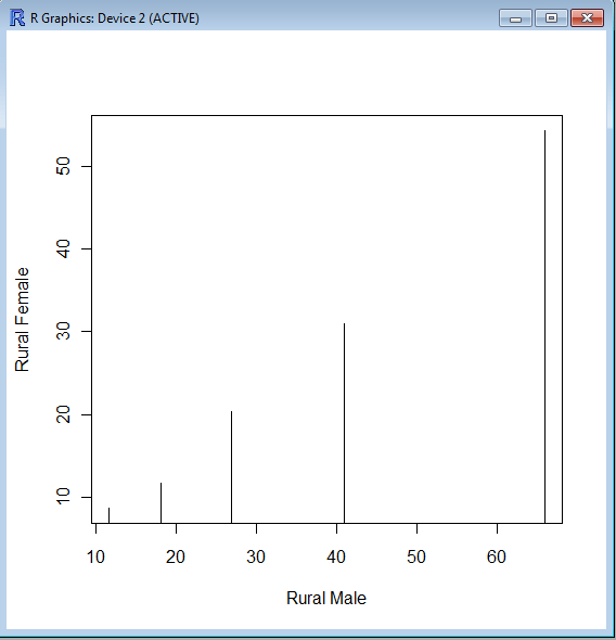
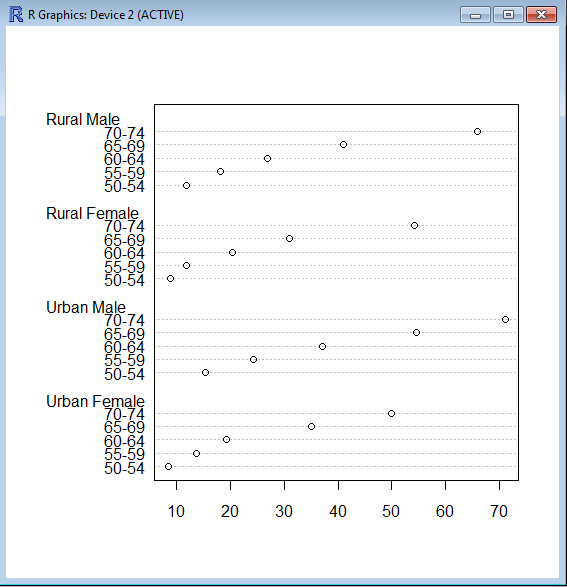
The barplot() command is used for making Bar Plots, while hist() is used for histograms. You can also use the plot() command with type=h to create histograms-The official R manual also suggests that Dot plots using dotchart () are a reasonable substitute for bar plots.
A very simple easy to understand tutorial for basic bar plots is at http://msenux.redwoods.edu/math/R/barplot.php
The difference between the three main functions that can be used for these charts are shown below-
> VADeaths
Rural Male Rural Female Urban Male Urban Female
50-54 11.7 8.7 15.4 8.4
55-59 18.1 11.7 24.3 13.6
60-64 26.9 20.3 37.0 19.3
65-69 41.0 30.9 54.6 35.1
70-74 66.0 54.3 71.1 50.0
> plot(VADeaths,type=”h”)


