Top Ten Graphs for Business Analytics -Pie Charts (1/10)

I have not been really posting or writing worthwhile on the website for some time, as I am still busy writing ” R for Business Analytics” which I hope to get out before year end. However while doing research for that, I came across many types of graphs and what struck me is the actual usage of some kinds of graphs is very different in business analytics as compared to statistical computing.

The criterion of top ten graphs is as follows-

1) Usage-The order in which they appear is not strictly in terms of desirability but actual frequency of usage. So a frequently used graph like box plot would be recommended above say a violin plot.

2) Adequacy- Data Visualization paradigms change over time- but the need for accurate conveying of maximum information in a minium space without overwhelming reader or misleading data perceptions.

3) Ease of creation- A simpler graph created by a single function is more preferrable to writing 4-5 lines of code to create an elaborate graph.

4) Aesthetics– Aesthetics is relative and  in addition studies have shown visual perception varies across cultures and geographies. However , beauty is universally appreciated and a pretty graph is sometimes and often preferred over a not so pretty graph. Here being pretty is in both visual appeal without compromising perceptual inference from graphical analysis.


so When do we use a bar chart versus a line graph versus a pie chart? When is a mosaic plot more handy and when should histograms be used with density plots? The list tries to capture most of these practicalities.

Let me elaborate on some specific graphs-

1) Pie Chart- While Pie Chart is not really used much in stats computing, and indeed it is considered a misleading example of data visualization especially the skewed or two dimensional charts. However when it comes to evaluating market share at a particular instance, a pie chart is simple to understand. At the most two pie charts are needed for comparing two different snapshots, but three or more pie charts on same data at different points of time is definitely a bad case.

In R you can create piechart, by just using pie(dataset$variable)

As per official documentation, pie charts are not  recommended at all.

http://stat.ethz.ch/R-manual/R-patched/library/graphics/html/pie.html

Pie charts are a very bad way of displaying information. The eye is good at judging linear measures and bad at judging relative areas. A bar chart or dot chart is a preferable way of displaying this type of data.

Cleveland (1985), page 264: “Data that can be shown by pie charts always can be shown by a dot chart. This means that judgements of position along a common scale can be made instead of the less accurate angle judgements.” This statement is based on the empirical investigations of Cleveland and McGill as well as investigations by perceptual psychologists.

—-

Despite this, pie charts are frequently used as an important metric they inevitably convey is market share. Market share remains an important analytical metric for business.

The pie3D( ) function in the plotrix package provides 3D exploded pie charts.An exploded pie chart remains a very commonly used (or misused) chart.

From http://lilt.ilstu.edu/jpda/charts/chart%20tips/Chartstip%202.htm#Rules

we see some rules for using Pie charts.


  1. Avoid using pie charts.
  2. Use pie charts only for data that add up to some meaningful total.
  3. Never ever use three-dimensional pie charts; they are even worse than two-dimensional pies.
  4. Avoid forcing comparisons across more than one pie chart


From the R Graph Gallery (a slightly outdated but still very comprehensive graphical repository)

http://addictedtor.free.fr/graphiques/RGraphGallery.php?graph=4

par(bg="gray")
pie(rep(1,24), col=rainbow(24), radius=0.9)
title(main="Color Wheel", cex.main=1.4, font.main=3)
title(xlab="(test)", cex.lab=0.8, font.lab=3)
(Note adding a grey background is quite easy in the basic graphics device as well without using an advanced graphical package)


Protected: Whats behind that pretty SAS Blog?

This content is password-protected. To view it, please enter the password below.

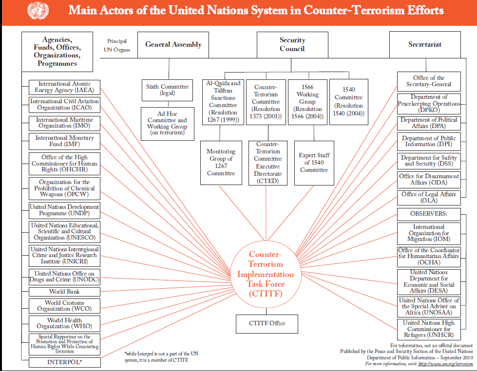
Amazing Data Visualization- UN Counter Terrorism

Here is an amazing organigram depicting the organization of United Nations Task force of Countering Terrorism

source-

http://www.un.org/terrorism/cttaskforce.shtml

so now you know whom to call at 3 am, in case of airline bombing terrorists or just bad guys in general.


Interview Anne Milley JMP

Here is an interview with Anne Milley, a notable thought leader in the world of analytics. Anne is now Senior Director, Analytical Strategy in Product Marketing for JMP , the leading data visualization software from the SAS Institute.

Ajay-What do you think are the top 5 unique selling points of JMP compared to other statistical software in its category?

Anne-

JMP combines incredible analytic depth and breadth with interactive data visualization, creating a unique environment optimized for discovery and data-driven innovation.

With an extensible framework using JSL (JMP Scripting Language), and integration with SAS, R, and Excel, JMP becomes your analytic hub.

JMP is accessible to all kinds of users. A novice analyst can dig into an interactive report delivered by a custom JMP application. An engineer looking at his own data can use built-in JMP capabilities to discover patterns, and a developer can write code to extend JMP for herself or others.

State-of-the-art DOE capabilities make it easy for anyone to design and analyze efficient experiments to determine which adjustments will yield the greatest gains in quality or process improvement – before costly changes are made.

Not to mention, JMP products are exceptionally well designed and easy to use. See for yourself and check out the free trial at www.jmp.com.

Download a free 30-day trial of JMP.

Ajay- What are the challenges and opportunities of expanding JMP’s market share? Do you see JMP expanding its conferences globally to engage global audiences?

Anne-

We realized solid global growth in 2010. The release of JMP Pro and JMP Clinical last year along with continuing enhancements to the rest of the JMP family of products (JMP and JMP Genomics) should position us well for another good year.

With the growing interest in analytics as a means to sustained value creation, we have the opportunity to help people along their analytic journey – to get started, take the next step, or adopt new paradigms speeding their time to value. The challenge is doing that as fast as we would like.

We are hiring internationally to offer even more events, training and academic programs globally.

Ajay- What are the current and proposed educational and global academic initiatives of JMP? How can we see more JMP in universities across the world (say India- China etc)?

Anne-

We view colleges and universities both as critical incubators of future JMP users and as places where attitudes about data analysis and statistics are formed. We believe that a positive experience in learning statistics makes a person more likely to eventually want and need a product like JMP.

For most students – and particularly for those in applied disciplines of business, engineering and the sciences – the ability to make a statistics course relevant to their primary area of study fosters a positive experience. Fortunately, there is a trend in statistical education toward a more applied, data-driven approach, and JMP provides a very natural environment for both students and researchers.

Its user-friendly navigation, emphasis on data visualization and easy access to the analytics behind the graphics make JMP a compelling alternative to some of our more traditional competitors.

We’ve seen strong growth in the education markets in the last few years, and JMP is now used in nearly half of the top 200 universities in the US.

Internationally, we are at an earlier stage of market development, but we are currently working with both JMP and SAS country offices and their local academic programs to promote JMP. For example, we are working with members of the JMP China office and faculty at several universities in China to support the use of JMP in the development of a master’s curriculum in Applied Statistics there, touched on in this AMSTAT News article.

Ajay- What future trends do you see for 2011 in this market (say top 5)?

Anne-

Growing complexity of data (text, image, audio…) drives the need for more and better visualization and analysis capabilities to make sense of it all.

More “chief analytics officers” are making better use of analytic talent – people are the most important ingredient for success!

JMP has been on the vanguard of 64-bit development, and users are now catching up with us as 64-bit machines become more common.

Users should demand easy-to-use, exploratory and predictive modeling tools as well as robust tools to experiment and learn to help them make the best decisions on an ongoing basis.

All these factors and more fuel the need for the integration of flexible, extensible tools with popular analytic platforms.

Ajay-You enjoy organic gardening as a hobby. How do you think hobbies and unwind time help people be better professionals?

Anne-

I am lucky to work with so many people who view their work as a hobby. They have other interests too, though, some of which are work-related (statistics is relevant everywhere!). Organic gardening helps me put things in perspective and be present in the moment. More than work defines who you are. You can be passionate about your work as well as passionate about other things. I think it’s important to spend some leisure time in ways that bring you joy and contribute to your overall wellbeing and outlook.

Btw, nice interviews over the past several months—I hadn’t kept up, but will check it out more often!

Biography–  Source- http://www.sas.com/knowledge-exchange/business-analytics/biographies.html

  • Anne Milley

    Anne Milley

    Anne Milley is Senior Director of Analytics Strategy at JMP Product Marketing at SAS. Her ties to SAS began with bank failure prediction at Federal Home Loan Bank Dallas and continued at 7-Eleven Inc. She has authored papers and served on committees for F2006, KDD, SIAM, A2010 and several years of SAS’ annual data mining conference. Milley is a contributing faculty member for the International Institute of Analytics. anne.milley@jmp.com

R Graphs Resources

Relevant GUI-

GrapheR and Deducer

https://rforanalytics.wordpress.com/graphical-user-interfaces-for-r/

Websites-


Graphics by Examples

. UCLA: Academic Technology Services,  Statistical Consulting Group. from https://www.ats.ucla.edu/stat/R/gbe/default.htm (accessed Feb 10, 2011)

https://www.ats.ucla.edu/stat/R/gbe/default.htm

Quick-R

http://www.statmethods.net/graphs/

Graph Gallery

http://addictedtor.free.fr/graphiques/allgraph.php

Frank McCown

https://www.harding.edu/fmccown/r/

Detailed Tutorial

https://math.illinoisstate.edu/dhkim/rstuff/rtutor.html

Advanced Data Visualization

Hadley Wickham

Courses- http://had.co.nz/stat645/

and Package-  http://had.co.nz/ggplot2/

example-

http://had.co.nz/ggplot2/geom_density.html

OK Cupid Data Visualization- Flow Chart to your Heart

Quite appropriate on a V Day, OK Cupid remains quite innovative how they use data (in this questionnaire data)

Protovis a graphical toolkit for visualization

I just found about a new data visualization tool called Protovis http://vis.stanford.edu/protovis/ex/

Protovis composes custom views of data with simple marks such as bars and dots. Unlike low-level graphics libraries that quickly become tedious for visualization, Protovis defines marks through dynamic properties that encode data, allowing inheritancescales and layouts to simplify construction.

Protovis is free and open-source and is a Stanford project. It has been used in web interface R Node (which I will talk later )

http://squirelove.net/r-node/doku.php

Conventional

While Protovis is designed for custom visualization, it is still easy to create many standard chart types. These simpler examples serve as an introduction to the language, demonstrating key abstractions such as quantitative and ordinal scales, while hinting at more advanced features, including stack layout.

Custom

Many charting libraries provide stock chart designs, but offer only limited customization; Protovis excels at custom visualization design through a concise representation and precise control over graphical marks. These examples, including a few recreations of unusual historical designs, demonstrate the language’s expressiveness.


Try Protovis today 🙂 http://vis.stanford.edu/protovis/

It uses JavaScript and SVG for web-native visualizations; no plugin required (though you will need a modern web browser)! Although programming experience is helpful, Protovis is mostly declarative and designed to be learned by example.