Tag: code
Revolution releases R Windows for Academics for free

Based on the official email from them, God bless the merry coders at Revo-
Revolution Analytics has just released Revolution R Enterprise 4.3 for 32-bit and 64-bit Windows, a significant step forward in enterprise data analytics. It features an updated RevoScaleR package for scalable, fast (multicore), and extensible data analysis with R. Revolution R Enterprise 4.3 for Windows also provides R 2.12.2, and includes an enhanced R Productivity Environment (RPE), a full-featured integrated development environment with visual debugging capabilities. Also available is an updated Windows release of our deployment server solution, RevoDeployR 1.2, designed to help you deliver R analytics via the Web.
As a registered user of the Academic version of Revolution R Enterprise for Windows, you can take advantage of these improvements by downloading and installing Revolution R Enterprise 4.3 today. You can install Revolution R Enterprise 4.3 side-by-side with your existing Revolution R Enterprise installations; there is no need to uninstall previous versions.
Free and Open Source cannot get basic economics correct

Before you rev up those keyboards, and shoot off a snarky comment- consider this statement- there are many ways to run (and ruin economies). But they still have not found a replacement for money. Yes Happiness is important. Search Engine is good.
So unless they start a new branch of economics with lots more motivational theory and psychology and lot less quant especially for open source projects, money ,revenue, sales is the only true measure of success in enterprise software. Particularly if you have competitors who are making more money selling the same class of software.
Popularity contests are for high school quarterbacks —so even if your open source software is popular in downloads, email discussions, stack overflow or Continue reading “Free and Open Source cannot get basic economics correct”
Google releases V1.2 of Google Prediction API

To join the preview group, go to the APIs Console and click the Prediction API slider to “ON,” and then sign up for a Google Storage account.
For the past several months, I have been member of a semi-public beta test/group/forum – that is headed by Travis Green of the Google Prediction API Team (not the hockey player). Basically in helping the Google guys more feedback on the feature list for model building via cloud computing. I couldn’t talk about it much , because it was all NDA hush hush.
Anyways- as of today the version 1.2 of Google Prediction API has been launched. What does this do to the ordinary Joe Modeler? Well it helps gives your models -thats right your plain vanilla logistic regression,arima, arimax, models an added ensemble option of using Google’s Machine Learning Continue reading “Google releases V1.2 of Google Prediction API”
Using Color Palettes in R
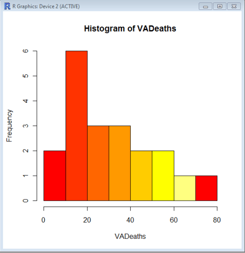
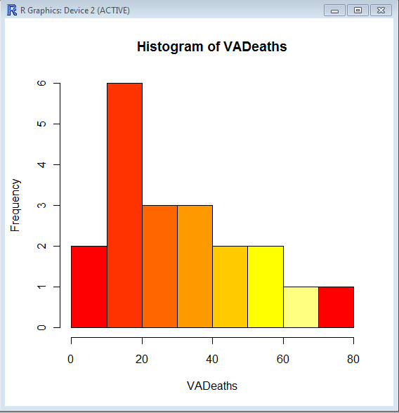
If you like me, are unable to decide whether blue or brown is a better color for graph- color palettes in R are a big help for aesthetically acceptable alternatives.
Using the same graphs, I choose the 5 main kinds of color palettes, using them is as easy as specifying the col= parameter in graphical display in Base Graphs. And I modified the n parameter for number of colors to be used- you can specify more or less depending how much you want the gradient or difference in colors to be.
> hist(VADeaths,col=heat.colors(7))
 > hist(VADeaths,col=terrain.colors(7))
Top ten business analytics graphs Bar Charts (3/10)
Bar Charts and Histograms-Bar Charts are one of the most widely used types of Business Charts. Even the ever popular histograms are special cases of bar charts (but showing frequencies). Histograms are the not the same as bar charts, they are simply bar charts of frequencies.
Basically a bar chart shows rectangular bars with length proportional to the quantities being described. It helps to see relative quantities between various category types.
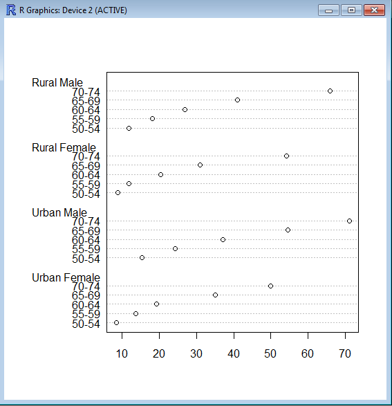
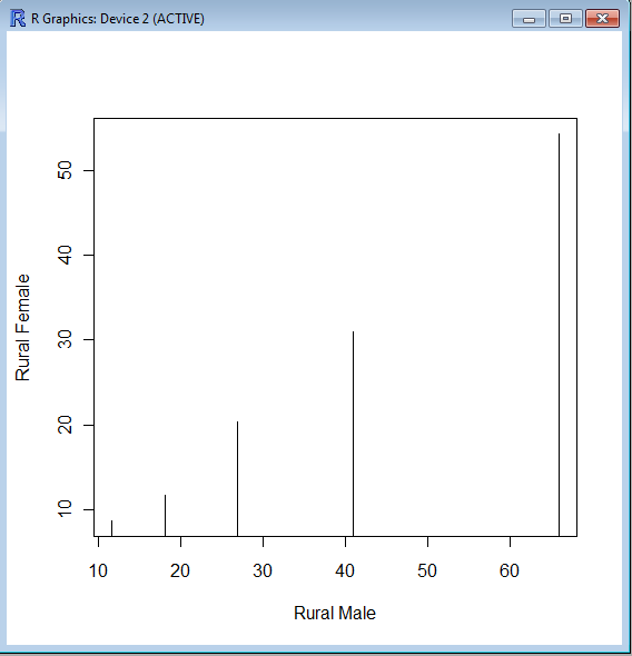
The barplot() command is used for making Bar Plots, while hist() is used for histograms. You can also use the plot() command with type=h to create histograms-The official R manual also suggests that Dot plots using dotchart () are a reasonable substitute for bar plots.
A very simple easy to understand tutorial for basic bar plots is at http://msenux.redwoods.edu/math/R/barplot.php
The difference between the three main functions that can be used for these charts are shown below-
> VADeaths
Rural Male Rural Female Urban Male Urban Female
50-54 11.7 8.7 15.4 8.4
55-59 18.1 11.7 24.3 13.6
60-64 26.9 20.3 37.0 19.3
65-69 41.0 30.9 54.6 35.1
70-74 66.0 54.3 71.1 50.0
> plot(VADeaths,type=”h”)
> dotchart(VADeaths)