How to Measure and Optimize Your Marketing:Tableau

Tired of everyone calling everyone else a social media expert. What seperates the social media men from the fakes.

the grain from the chaff.

Data.

Heres a webcast you may want to think of social media tickles your curiosity on how  to leverage these strange new marketing tools.

https://cc.readytalk.com/cc/schedule/display.do?udc=xu40u1ex8tj8

Notice the form and fields below the screenshot-

is every field required – is each one required to measure

Have they optimized web registration forms yet.

Continue reading “How to Measure and Optimize Your Marketing:Tableau”

Revolution releases R Windows for Academics for free

Logo for R
Image via Wikipedia

Based on the official email from them, God bless the merry coders at Revo-

Revolution Analytics has just released Revolution R Enterprise 4.3 for 32-bit and 64-bit Windows, a significant step forward in enterprise data analytics.  It features an updated RevoScaleR package for scalable, fast (multicore), and extensible data analysis with R. Revolution R Enterprise 4.3 for Windows also provides R 2.12.2, and includes an enhanced R Productivity Environment (RPE), a full-featured integrated development environment with visual debugging capabilities. Also available is an updated Windows release of our deployment server solution, RevoDeployR 1.2, designed to help you deliver R analytics via the Web.

As a registered user of the Academic version of Revolution R Enterprise for Windows, you can take advantage of these improvements by downloading and installing Revolution R Enterprise 4.3 today. You can install Revolution R Enterprise 4.3 side-by-side with your existing Revolution R Enterprise installations; there is no need to uninstall previous versions.


High Performance Analytics

Marry Big Data Analytics to High Performance Computing, and you get the buzzword of this season- High Performance Analytics.

It basically consists of Parallelized code to run in parallel on custom hardware, in -database analytics for speed, and cloud computing /high performance computing environments. On an operational level, it consists of software (as in analytics) partnering with software (as in databases, Map reduce, Hadoop) plus some hardware (HP or IBM mostly). It is considered a high margin , highly profitable, business with small number of deals compared to say desktop licenses.

As per HPC Wire- which is a great tool/newsletter to keep updated on HPC , SAS Institute has been busy on this front partnering with EMC Greenplum and TeraData (who also acquired  SAS Partner AsterData to gain a much needed foot in the MR/SQL space) Continue reading “High Performance Analytics”

Broad Guidelines for Graphs

Here are some broad guidelines for Graphs from EIA.gov , so you can say these are the official graphical guidelines of USA Gov

They can be really useful for sites planning to get into the Tableau Software/NYT /Guardian Infographic mode- or even for communities of blogs that have recurrent needs to display graphical plots- particularly since communication, statistical and design specialists are different areas/expertise/people.

Energy Information Administration Standard

Broad Guidelines for Graphs-I am reproducing an example from EIA ‘s guidelines for graphs-
http://www.eia.gov/about/eia_standards.cfm#Standard25

Energy Information Administration Standard 2009-25

Title: Statistical Graphs
Superseded Version: Standard 2002-25
Purpose: To ensure the utility (usefulness to intended users) and objectivity (accuracy, clarity, completeness, and lack of bias) of energy information presented in statistical graphs.
Applicability: All EIA information products.
Required Actions:

  1. Graphs should be used to show and compare changes, trends and/or relationships, and to assist users in visualizing the conclusions drawn from the data represented.
  2. A graph should contain sufficient Continue reading “Broad Guidelines for Graphs”

Using Color Palettes in R

If you like me, are unable to decide whether blue or brown is a better color for graph- color palettes in R are a big help for aesthetically acceptable alternatives.

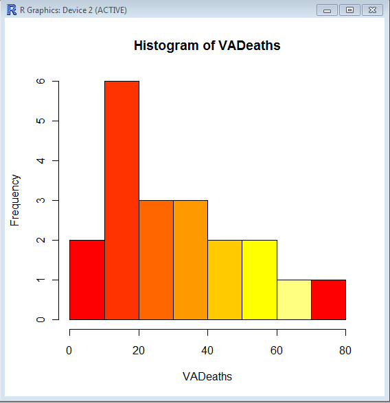
Using the same graphs, I choose the 5 main kinds of color palettes, using them is as easy as specifying the col= parameter in graphical display in Base Graphs. And I modified the n parameter for number of colors to be used- you can specify more or less depending how much you want the gradient or difference in colors to be.

> hist(VADeaths,col=heat.colors(7))

> hist(VADeaths,col=terrain.colors(7))

Continue reading “Using Color Palettes in R”

Top ten business analytics graphs Bar Charts (3/10)

Bar Charts and Histograms-Bar Charts are one of the most widely used types of Business Charts. Even the ever popular histograms are  special cases of bar charts (but showing frequencies). Histograms are the not the same as bar charts, they are simply bar charts of frequencies.

Basically a bar chart shows rectangular bars with length proportional to the quantities being described. It helps to see relative quantities between various category types.

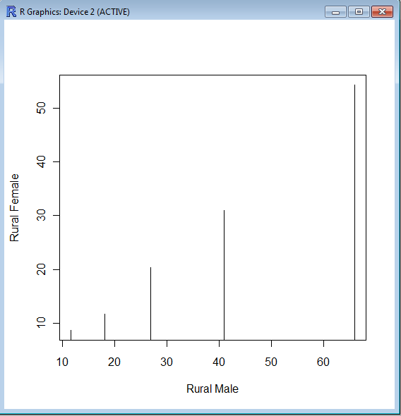
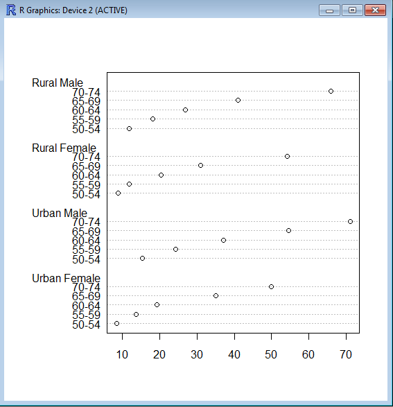
The barplot() command is used for making Bar Plots, while hist() is used for histograms. You can also use the plot() command with type=h to create histograms-The official R manual also suggests that Dot plots using dotchart () are a reasonable substitute for bar plots.
A very simple easy to understand tutorial for basic bar plots is at http://msenux.redwoods.edu/math/R/barplot.php

The difference between the three main functions that can be used for these charts are shown below-

> VADeaths
Rural Male Rural Female Urban Male Urban Female
50-54       11.7          8.7       15.4          8.4
55-59       18.1         11.7       24.3         13.6
60-64       26.9         20.3       37.0         19.3
65-69       41.0         30.9       54.6         35.1
70-74       66.0         54.3       71.1         50.0

> plot(VADeaths,type=”h”)


> dotchart(VADeaths)