Broad Guidelines for Graphs

Here are some broad guidelines for Graphs from EIA.gov , so you can say these are the official graphical guidelines of USA Gov

They can be really useful for sites planning to get into the Tableau Software/NYT /Guardian Infographic mode- or even for communities of blogs that have recurrent needs to display graphical plots- particularly since communication, statistical and design specialists are different areas/expertise/people.

Energy Information Administration Standard

Broad Guidelines for Graphs-I am reproducing an example from EIA ‘s guidelines for graphs-
http://www.eia.gov/about/eia_standards.cfm#Standard25

Energy Information Administration Standard 2009-25

Title: Statistical Graphs
Superseded Version: Standard 2002-25
Purpose: To ensure the utility (usefulness to intended users) and objectivity (accuracy, clarity, completeness, and lack of bias) of energy information presented in statistical graphs.
Applicability: All EIA information products.
Required Actions:

  1. Graphs should be used to show and compare changes, trends and/or relationships, and to assist users in visualizing the conclusions drawn from the data represented.
  2. A graph should contain sufficient Continue reading “Broad Guidelines for Graphs”

Using Color Palettes in R

If you like me, are unable to decide whether blue or brown is a better color for graph- color palettes in R are a big help for aesthetically acceptable alternatives.

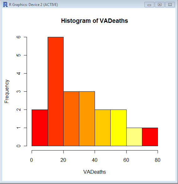
Using the same graphs, I choose the 5 main kinds of color palettes, using them is as easy as specifying the col= parameter in graphical display in Base Graphs. And I modified the n parameter for number of colors to be used- you can specify more or less depending how much you want the gradient or difference in colors to be.

> hist(VADeaths,col=heat.colors(7))

> hist(VADeaths,col=terrain.colors(7))

Continue reading “Using Color Palettes in R”

Top ten business analytics graphs Bar Charts (3/10)

Bar Charts and Histograms-Bar Charts are one of the most widely used types of Business Charts. Even the ever popular histograms are  special cases of bar charts (but showing frequencies). Histograms are the not the same as bar charts, they are simply bar charts of frequencies.

Basically a bar chart shows rectangular bars with length proportional to the quantities being described. It helps to see relative quantities between various category types.

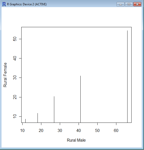
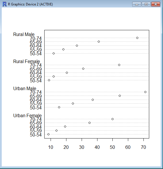
The barplot() command is used for making Bar Plots, while hist() is used for histograms. You can also use the plot() command with type=h to create histograms-The official R manual also suggests that Dot plots using dotchart () are a reasonable substitute for bar plots.
A very simple easy to understand tutorial for basic bar plots is at http://msenux.redwoods.edu/math/R/barplot.php

The difference between the three main functions that can be used for these charts are shown below-

> VADeaths
Rural Male Rural Female Urban Male Urban Female
50-54       11.7          8.7       15.4          8.4
55-59       18.1         11.7       24.3         13.6
60-64       26.9         20.3       37.0         19.3
65-69       41.0         30.9       54.6         35.1
70-74       66.0         54.3       71.1         50.0

> plot(VADeaths,type=”h”)


> dotchart(VADeaths)

Microsoft works on ad supported desktop programs

3 years ago, in a mock article I speculated what happened if Microsoft followed Google, and gave away Windows/Office for free while showing you ads. Basically whats the value of a single customer for 3-4 years worth of ads.

https://decisionstats.com/2008/02/02/ballmer-yahoo-googles-boo-hoo-2/

Well it seems like Windows 7, and Microsoft Word have  made a quiet move to showing ads OUT of the browser and into the desktop program.

See screnshot on Windows 7, when even a simple Rich text document shows an ad for slidefest/powerpoint. Continue reading “Microsoft works on ad supported desktop programs”

Top Ten Business Analytics Graphs-Line Charts (2/10)

A line chart is one of the most commonly used charts in business analytics and metrics reporting. It basically consists of two variables plotted along the axes with the adjacent points being joined by line segments. Most often used with time series on the x-axis, line charts are simple to understand and use.
Variations on the line graph can include fan charts in time series which include joining line chart of historic data with ranges of future projections. Another common variation is to plot the linear regression or trend line between the two variables  and superimpose it on the graph.
The slope of the line chart shows the rate of change at that particular point , and can also be used to highlight areas of discontinuity or irregular change between two variables.

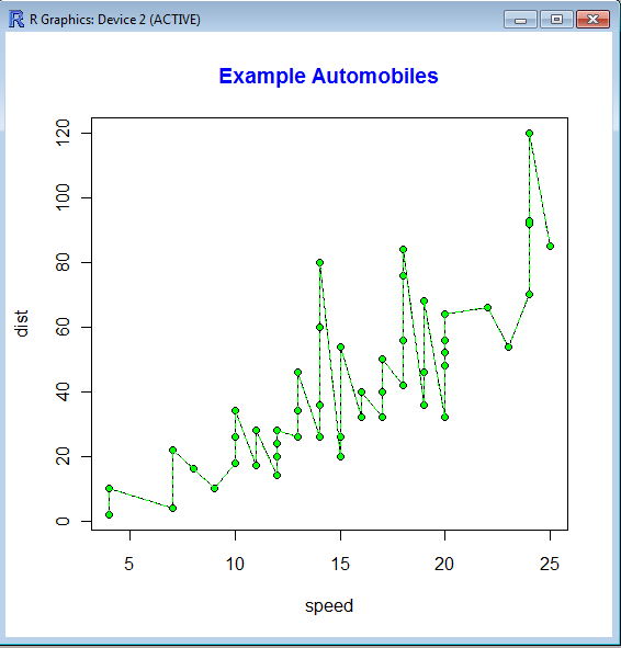
The basic syntax of line graph is created by first using Plot() function to plot the points and then lines () function to plot the lines between the points.

> str(cars)
‘data.frame’:   50 obs. of  2 variables:
$ speed: num  4 4 7 7 8 9 10 10 10 11 …
$ dist : num  2 10 4 22 16 10 18 26 34 17 …
> plot(cars)
> lines(cars,type=”o”, pch=20, lty=2, col=”green”)
> title(main=”Example Automobiles”, col.main=”blue”, font.main=2)

An example of Time Series Forecasting graph  or fan chart is http://addictedtor.free.fr/graphiques/RGraphGallery.php?graph=51

Predictive Analytics World Conference –New York City and London, UK

Please use the following code  to get a 15% discount on the 2 Day Conference Pass:  AJAYNY11.

Predictive Analytics World Conference –New York City and London, UK
October 17-21, 2011 – New York City, NY (pawcon.com/nyc)
Nov 30 – Dec 1, 2011 – London, UK (pawcon.com/london)

Predictive Analytics World (pawcon.com) is the business-focused event for predictive analytics
professionals, managers and commercial practitioners, covering today’s commercial deployment of
predictive analytics, across industries and across software vendors. The conference delivers case
studies, expertise, and resources to achieve two objectives:

1) Bigger wins: Strengthen the business impact delivered by predictive analytics

2) Broader capabilities: Establish new opportunities with predictive analytics

Case Studies: How the Leading Enterprises Do It

Predictive Analytics World focuses on concrete examples of deployed predictive analytics. The leading
enterprises have signed up to tell their stories, so you can hear from the horse’s mouth precisely how
Fortune 500 analytics competitors and other top practitioners deploy predictive modeling, and what
kind of business impact it delivers.

PAW NEW YORK CITY 2011

PAW’s NYC program is the richest and most diverse yet, featuring over 40 sessions across three tracks
– including both X and Y tracks, and an “Expert/Practitioner” track — so you can witness how predictive
analytics is applied at major companies.

PAW NYC’s agenda covers hot topics and advanced methods such as ensemble models, social data,
search marketing, crowdsourcing, blackbox trading, fraud detection, risk management, survey analysis,
and other innovative applications that benefit organizations in new and creative ways.

WORKSHOPS: PAW NYC also features five full-day pre- and post-conference workshops that
complement the core conference program. Workshop agendas include advanced predictive modeling
methods, hands-on training, an intro to R (the open source analytics system), and enterprise decision
management.

For more see http://www.predictiveanalyticsworld.com/newyork/2011/

PAW LONDON 2011

PAW London’s agenda covers hot topics and advanced methods such as risk management, uplift
(incremental lift) modeling, open source analytics, and crowdsourcing data mining. Case study
presentations cover campaign targeting, churn modeling, next-best-offer, selecting marketing channels,
global analytics deployment, email marketing, HR candidate search, and other innovative applications
that benefit organizations in new and creative ways.

Join PAW and access the best keynotes, sessions, workshops, exposition, expert panel, live demos,
networking coffee breaks, reception, birds-of-a-feather lunches, brand-name enterprise leaders, and

industry heavyweights in the business.

For more see http://www.predictiveanalyticsworld.com/london

CROSS-INDUSTRY APPLICATIONS

Predictive Analytics World is the only conference of its kind, delivering vendor-neutral sessions across
verticals such as banking, financial services, e-commerce, education, government, healthcare, high
technology, insurance, non-profits, publishing, social gaming, retail and telecommunications

And PAW covers the gamut of commercial applications of predictive analytics, including response
modeling, customer retention with churn modeling, product recommendations, fraud detection, online
marketing optimization, human resource decision-making, law enforcement, sales forecasting, and
credit scoring.

Why bring together such a wide range of endeavors? No matter how you use predictive analytics, the
story is the same: Predicatively scoring customers optimizes business performance. Predictive analytics
initiatives across industries leverage the same core predictive modeling technology, share similar project
overhead and data requirements, and face common process challenges and analytical hurdles.

RAVE REVIEWS:

“Hands down, best applied, analytics conference I have ever attended. Great exposure to cutting-edge
predictive techniques and I was able to turn around and apply some of those learnings to my work
immediately. I’ve never been able to say that after any conference I’ve attended before!”

Jon Francis
Senior Statistician
T-Mobile

Read more: Articles and blog entries about PAW can be found at http://www.predictiveanalyticsworld.com/
pressroom.php

VENDORS. Meet the vendors and learn about their solutions, software and service. Discover the best
predictive analytics vendors available to serve your needs – learn what they do and see how they
compare

COLLEAGUES. Mingle, network and hang out with your best and brightest colleagues. Exchange
experiences over lunch, coffee breaks and the conference reception connecting with those professionals
who face the same challenges as you.

GET STARTED. If you’re new to predictive analytics, kicking off a new initiative, or exploring new ways
to position it at your organization, there’s no better place to get your bearings than Predictive Analytics
World. See what other companies are doing, witness vendor demos, participate in discussions with the
experts, network with your colleagues and weigh your options!

For more information:
http://www.predictiveanalyticsworld.com

View videos of PAW Washington DC, Oct 2010 — now available on-demand:
http://www.predictiveanalyticsworld.com/online-video.php

What is predictive analytics? See the Predictive Analytics Guide:
http://www.predictiveanalyticsworld.com/predictive_analytics.php

If you’d like our informative event updates, sign up at:
http://www.predictiveanalyticsworld.com/signup-us.php

To sign up for the PAW group on LinkedIn, see:
http://www.linkedin.com/e/gis/1005097

For inquiries e-mail regsupport@risingmedia.com or call (717) 798-3495.

Augustus- a PMML model producer and consumer. Scoring engine.

A Bold GNU Head
Image via Wikipedia

I just checked out this new software for making PMML models. It is called Augustus and is created by the Open Data Group (http://opendatagroup.com/) , which is headed by Robert Grossman, who was the first proponent of using R on Amazon Ec2.

Probably someone like Zementis ( http://adapasupport.zementis.com/ ) can use this to further test , enhance or benchmark on the Ec2. They did have a joint webinar with Revolution Analytics recently.

https://code.google.com/p/augustus/

Recent News

  • Augustus v 0.4.3.1 has been released
  • Added a guide (pdf) for including Augustus in the Windows System Properties.
  • Updated the install documentation.
  • Augustus 2010.II (Summer) release is available. This is v 0.4.2.0. More information is here.
  • Added performance discussion concerning the optional cyclic garbage collection.

See Recent News for more details and all recent news.

Augustus

Augustus is a PMML 4-compliant scoring engine that works with segmented models. Augustus is designed for use with statistical and data mining models. The new release provides Baseline, Tree and Naive-Bayes producers and consumers.

There is also a version for use with PMML 3 models. It is able to produce and consume models with 10,000s of segments and conforms to a PMML draft RFC for segmented models and ensembles of models. It supports Baseline, Regression, Tree and Naive-Bayes.

Augustus is written in Python and is freely available under the GNU General Public License, version 2.

See the page Which version is right for me for more details regarding the different versions.

PMML

Predictive Model Markup Language (PMML) is an XML mark up language to describe statistical and data mining models. PMML describes the inputs to data mining models, the transformations used to prepare data for data mining, and the parameters which define the models themselves. It is used for a wide variety of applications, including applications in finance, e-business, direct marketing, manufacturing, and defense. PMML is often used so that systems which create statistical and data mining models (“PMML Producers”) can easily inter-operate with systems which deploy PMML models for scoring or other operational purposes (“PMML Consumers”).

Change Detection using Augustus

For information regarding using Augustus with Change Detection and Health and Status Monitoring, please see change-detection.

Open Data

Open Data Group provides management consulting services, outsourced analytical services, analytic staffing, and expert witnesses broadly related to data and analytics. It has experience with customer data, supplier data, financial and trading data, and data from internal business processes.

It has staff in Chicago and San Francisco and clients throughout the U.S. Open Data Group began operations in 2002.


Overview

The above example contains plots generated in R of scoring results from Augustus. Each point on the graph represents a use of the scoring engine and a chart is an aggregation of multiple Augustus runs. A Baseline (Change Detection) model was used to score data with multiple segments.

Typical Use

Augustus is typically used to construct models and score data with models. Augustus includes a dedicated application for creating, or producing, predictive models rendered as PMML-compliant files. Scoring is accomplished by consuming PMML-compliant files describing an appropriate model. Augustus provides a dedicated application for scoring data with four classes of models, Baseline (Change Detection) ModelsTree ModelsRegression Models and Naive Bayes Models. The typical model development and use cycle with Augustus is as follows:

  1. Identify suitable data with which to construct a new model.
  2. Provide a model schema which proscribes the requirements for the model.
  3. Run the Augustus producer to obtain a new model.
  4. Run the Augustus consumer on new data to effect scoring.

Separate consumer and producer applications are supplied for Baseline (Change Detection) models, Tree models, Regression models and for Naive Bayes models. The producer and consumer applications require configuration with XML-formatted files. The specification of the configuration files and model schema are detailed below. The consumers provide for some configurability of the output but users will often provide additional post-processing to render the output according to their needs. A variety of mechanisms exist for transmitting data but user’s may need to provide their own preprocessing to accommodate their particular data source.

In addition to the producer and consumer applications, Augustus is conceptually structured and provided with libraries which are relevant to the development and use of Predictive Models. Broadly speaking, these consist of components that address the use of PMML and components that are specific to Augustus.

Post Processing

Augustus can accommodate a post-processing step. While not necessary, it is often useful to

  • Re-normalize the scoring results or performing an additional transformation.
  • Supplements the results with global meta-data such as timestamps.
  • Formatting of the results.
  • Select certain interesting values from the results.
  • Restructure the data for use with other applications.