A line chart is one of the most commonly used charts in business analytics and metrics reporting. It basically consists of two variables plotted along the axes with the adjacent points being joined by line segments. Most often used with time series on the x-axis, line charts are simple to understand and use.
Variations on the line graph can include fan charts in time series which include joining line chart of historic data with ranges of future projections. Another common variation is to plot the linear regression or trend line between the two variables and superimpose it on the graph.
The slope of the line chart shows the rate of change at that particular point , and can also be used to highlight areas of discontinuity or irregular change between two variables.
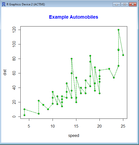
The basic syntax of line graph is created by first using Plot() function to plot the points and then lines () function to plot the lines between the points.
> str(cars)
‘data.frame’: 50 obs. of 2 variables:
$ speed: num 4 4 7 7 8 9 10 10 10 11 …
$ dist : num 2 10 4 22 16 10 18 26 34 17 …
> plot(cars)
> lines(cars,type=”o”, pch=20, lty=2, col=”green”)
> title(main=”Example Automobiles”, col.main=”blue”, font.main=2)
 An example of Time Series Forecasting graph or fan chart is http://addictedtor.free.fr/graphiques/RGraphGallery.php?graph=51
Additional tutorials for creating line graphs are at http://www.statmethods.net/graphs/line.html ,http://www.phaget4.org/R/plot.html and http://www.harding.edu/fmccown/r/#linecharts
Related Articles
- Top Ten Graphs for Business Analytics -Pie Charts (1/10) (decisionstats.com)
