Using JMP 9 and R together

An interesting blog post at http://blogs.sas.com/jmp/index.php?/archives/298-JMP-Into-R!.html on using the new JMP 9 with R, and quite possibly using SAS as well.

Example Code-

Here’s the R integration JSL code used to run the bootstrap

rconn = R Connect();
rconn << Submit(“\[
library(boot)

# Load Boot package
library(boot)

RStatFctn <- function(x,d) {return(mean(x[d]))}

b.basic = matrix(data=NA, nrow=1000, ncol=2)
b.normal = matrix(data=NA, nrow=1000, ncol=2)
b.percent =matrix(data=NA, nrow=1000, ncol=2)
b.bca =matrix(data=NA, nrow=1000, ncol=2)

for(i in 1:1000){
rnormdat = rnorm(30,0,1)
b <- boot(rnormdat, RStatFctn, R = 1000)
b.ci=boot.ci(b, conf =095,type=c(“basic”,”norm”,”perc”,”bca”)) b.basic[i,] = b.ci$basic[,4:5]
b.normal[i,] = b.ci$normal[,2:3]
b.percent[i,] = b.ci$percent[,4:5]
b.bca[i,] = b.ci$bca[,4:5]
}
]\”));
b_basic= rconn << Get(b.basic);
b_normal = rconn << Get(b.normal);
b_percent= rconn << Get(b.percent);
b_bca = rconn << Get(b.bca);
rconn << Disconnect();

Using the R Connect() JSL command and assigning it to the object “rconn”, the code sends messages to the JSL scriptable object “rconn” to submit R code via the Submit() command and to retrieve R matrices containing the bootstrap confidence intervals back via the Get() commands.

and I also found interesting what the write has to say about using JMP (for visual analysis) and SAS (bigger datasets handling) and R (for advanced statistics) together

Other standard JMP tools such as the Data Filter can help to explore these results in ways that cannot easily and quickly be done in R

and

With a little JSL and the statistical and graphics platforms of JMP coupled with the breadth and variety of packages and functions in R, one can build complete easy-to-use applications for statistical analysis.

JMP can also integrate with SAS, which adds the ability to work with large-scale data through the file-based system as well as the depth and advanced capabilities of SAS procedures. With these seamless integrations, JMP can become a hub that enables you to connect with both SAS and R, as well as provide unique statistical features such as the JMP Profiler and interactive graphic features such as Graph Builder

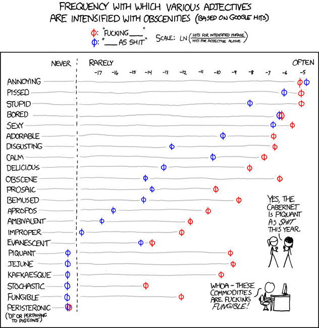
and in the meanwhile here is a data visualization of a frequency analysis of various words bundled together from xkcd.com
Red R 1.8- Pretty GUI

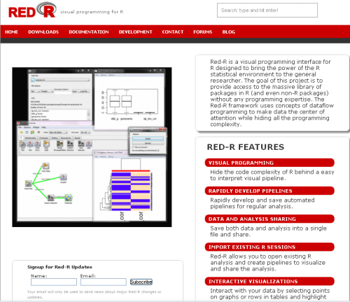
Red R 1.8 has been compiled and is available for download.

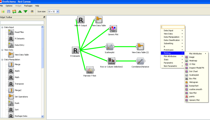
If you have seen Red R, well it resembles software like Enterprise Miner or Rapid Miner in the visual sense as it basically has a work-flow style of showing and setting up data analysis.

I played a bit with it, and this version is a definite improvement over the last ones.- Here is one more really groovy GUI for R- and it’s quite professionally done.

And a Youtube tutorial as well

Take a bow- Kyle and Anup- nice coding indeed.


PAW Reception and R Meetup

New DC meetup for R Users-

source- http://www.meetup.com/R-users-DC/calendar/14236478/

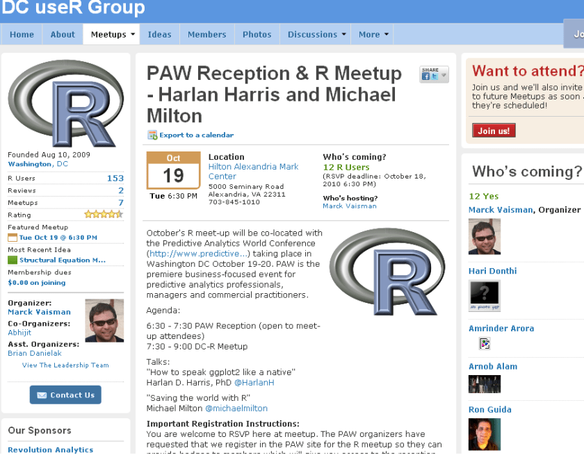
October’s R meet-up will be co-located with the Predictive Analytics World Conference (http://www.predictive…) taking place in Washington DC October 19-20. PAW is the premiere business-focused event for predictive analytics professionals, managers and commercial practitioners.

Agenda:

6:30 – 7:30 PAW Reception (open to meet-up attendees)
7:30 – 9:00 DC-R Meetup

Talks:
“How to speak ggplot2 like a native”
Harlan D. Harris, PhD @HarlanH

“Saving the world with R”
Michael Milton @michaelmilton

Important Registration Instructions:
You are welcome to RSVP here at meetup. The PAW organizers have requested that we register in the PAW site for the R meetup so they can provide badges to members which will give you access to the reception. There is no charge to register using the PAW site. Please click here to register.


Speaker Bios

Harlan D. Harris, PhD, is a statistical data scientist working for Kaplan Test Prep and Admissions in New York City. He has degrees from the University of Wisconsin-Madison and the University of Illinois at Urbana-Champaign. Prior to turning to the private sector, he worked as a researcher and lecturer in various areas of Artificial Intelligence and Cognitive Science at the University of Illinois, Columbia University, the University of Connecticut, and New York University.

Harlan’s talk is titled “How to speak ggplot2 like a native.”. One of the most innovative ideas in data visualization in recent years is that graphical images can be described using a grammar. Just as a fluent speaker of a language can talk more precisely and clearly than someone using a tourist phrasebook, graphics based on a grammar can yield more insights than graphics based on a limited set of templates (bar chart, pie graph, etc.). There are at least two implementations of the Grammar of Graphics idea in R, of which the most popular is the ggplot2 package written by Prof. Hadley Wickham. Just as with natural languages, ggplot2 has a surface structure made up of R vocabulary elements, as well as a deep structure that mediates the link between the vocabulary and the “semantic” representation of the data shown on a computer screen. In this introductory presentation, the links among these levels of representation are demonstrated, so that new ggplot2 users can build the mental models necessary for fluent and creative visualization of their data.

Michael Milton is a Client Manager at Blue State Digital. When he’s not saving the world by designing interactive marketing strategies that connect passionate users with causes and organizations, he writes about data and analytics. For O’Reilly Media, he wrote Head First Data Analysis and Head First Excel and has created the videos Great R: Level 1 and Getting the Most Out of Google Apps for Business.

Michael’s talk is called “How to Save the World Using R.” In this wide-ranging discussion, Michael will highlight individuals and organizations who are using R to help others as well as ways in which R can be used to promote good statistical thinking.

JMP 9 releasing on Oct 12

JMP 9 releases on Oct 12- it is a very good reliable data visualization and analytical tool ( AND available on Mac as well)

AND IT is advertising R Graphics as well (lol- I can visualize the look on some ahem SAS fans in the R Project)

Updated Pricing- note I am not sure why they are charging US academics 495$ when SAS On Demand is free for academics. Shouldnt JMP be free to students- maybe John Sall and his people can do a tradeoff analysis for this given JMP’s graphics are better than Base SAS (which is under some pressure from WPS and R)

http://www.sas.com/govedu/edu/programs/soda-account-setup.html

and http://www.enterpriseinnovation.net/content/sas-delivers-free-data-management-and-analytics-solutions-academe

*Offer good in the U.S. only.

OFFER PRICING DETAILS
New Corporate Customer

$1,595

Save $300.

No special requirements.
ORDER NOW (WIN) ORDER NOW (MAC)
Corporate Upgrade

$795

Save $155.

Complete the form below or call 1-877-594-6567. Requires valid JMP® 8 serial number.
New Academic

$495

Save $100.

Complete the form below or call 1-877-594-6567. Requires campus street address and campus e-mail address.
Academic Upgrade

$250

Save $45.

Complete the form below or call 1-877-594-6567. Requires campus street address and campus e-mail address.

From- the mailer-

Be First in Line for JMP® 9
Save up to $300 when you pre-order a
single-user license by Oct. 11

Pre-Order JMP 9

Make JMP your analytic hub for visual data discovery with this special offer, good through Oct. 11, 2010. Pre-order a single-user license of JMP 9 – for a discount of up to $300 – and get ready for a leap in data interactivity.

Order now and enjoy the compelling new features of JMP 9 when the software is released Oct. 12. New capabilities in JMP 9 let you:

  • Optimize and simulate using your Microsoft Excel spreadsheets.
  • Use maps to find patterns in your geographic data.
  • Enjoy the updated look and flexibility of JMP 9 on Microsoft Windows.
  • Create and share custom add-ins that extend JMP.
  • Leverage an expanded array of advanced statistical methodologies.
  • Display analytic results from R using interactive graphics.

PRE-ORDER JMP 9

What if I already have a JMP 8 single-user license?
Great news! You can upgrade to JMP 9 for less than half the regular price.

What if I’m an annual license customer?
Don’t worry, we’ve got you covered. Annual license customers enjoy priority access to all the latest JMP releases as soon as they become available. JMP 9 will be shipped to you automatically.

What if I work or study in the academic world?
Call 1-877-594-6567 to learn about significant discounts for students and professors through the JMP Academic Program.

Please feel free to forward this offer to interested colleagues.


Got two or more users?
A JMP® annual license is the way to go. Call for details.
1-877-594-6567

Remember: Act by Oct. 11!

JMP runs on Macintosh and Windows

How crowded is the neighborhood?

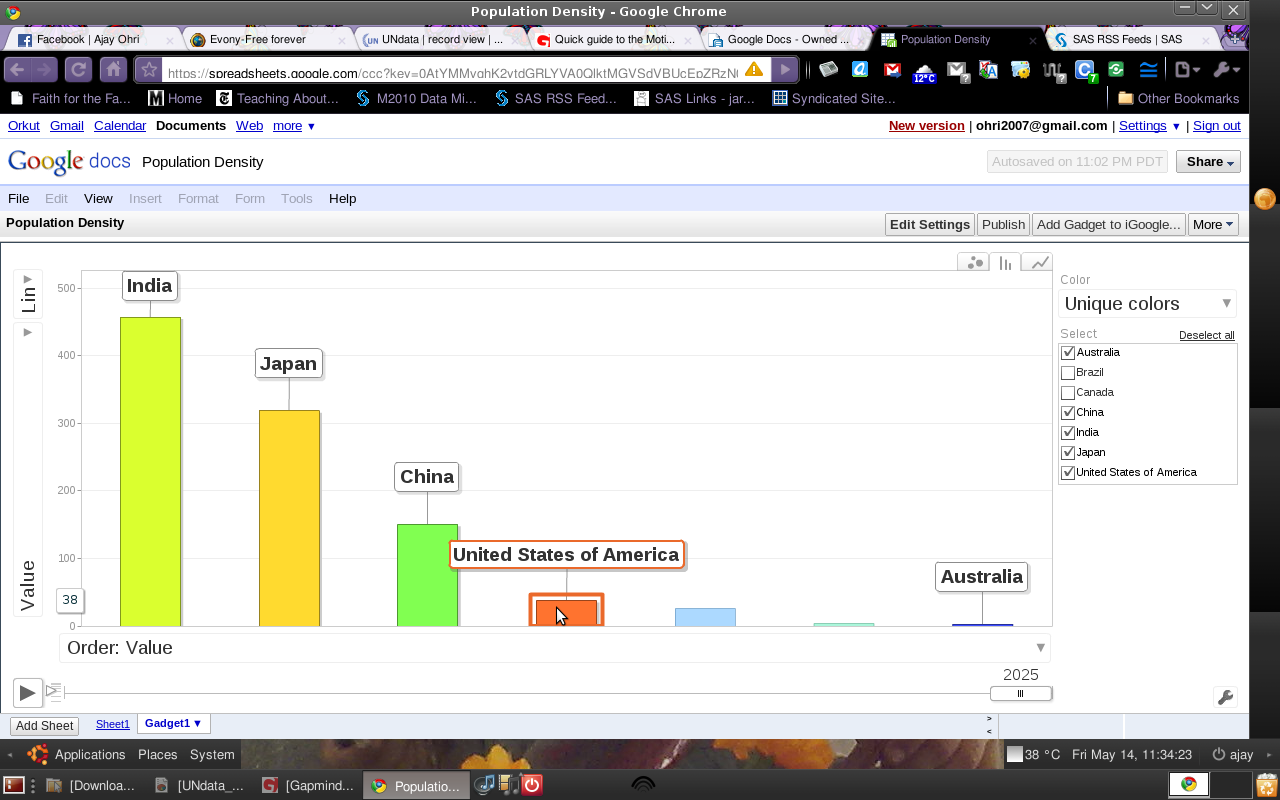
How crowded is India compared to the United States? Around 11 times. Thats based on number of person per square km.

How crowded is India compared to China? Around 2.5 times.

– Based on the following procedure-

  1. Data Sources – http://bit.ly/densityUN . With Pivotable tables, downloaded the CSV file.
  2. Creating a new spreadsheet in Google Docs, I copied and pasted data in the csv file
  3. Using Gadgets- I inserted the Gadget for Motion Chart which is based on Hans Rosling’s famous Gapminder Bubble Chart.

– Some Thoughts

It is not surprising that most immigration (legal and illegal) occurs from high population density countries with stretched resources to lower density countries with higher levels of living. Generally smaller sized countries like Japan, Singapore, Macau (china) have outlier densities as well.

– Also, the Adobe AIR desktop application by Gapminder is quite the best application for this as well. Speaking of which_ I hope other Linux application developers can learn from Adobe AIR’s way of graphics /data visualization.

Interesting Data Visualization:Friendwheels

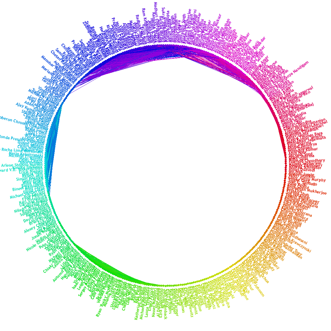
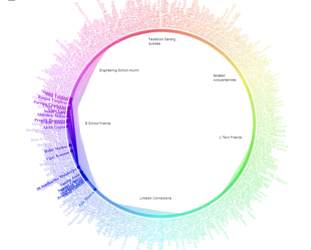
Here is an interesting Facebook Application that I used to generate clusters among my 900( or 400 top) Facebook Connections. What is interesting is the way it drew lines in a circle showing which friends I am most connected with – a bit like analysis of my own social network. It could be interesting if we could apply this to business cases like organizational resource planning or even client relationship management ( or quite traditionally even credit card fraud or risk /marketing analysis)

Thats my network

and this is the main clusters I could draw ( note the number represents the number of common friends/connections)

The FB app was at http://apps.facebook.com/friendwheel/