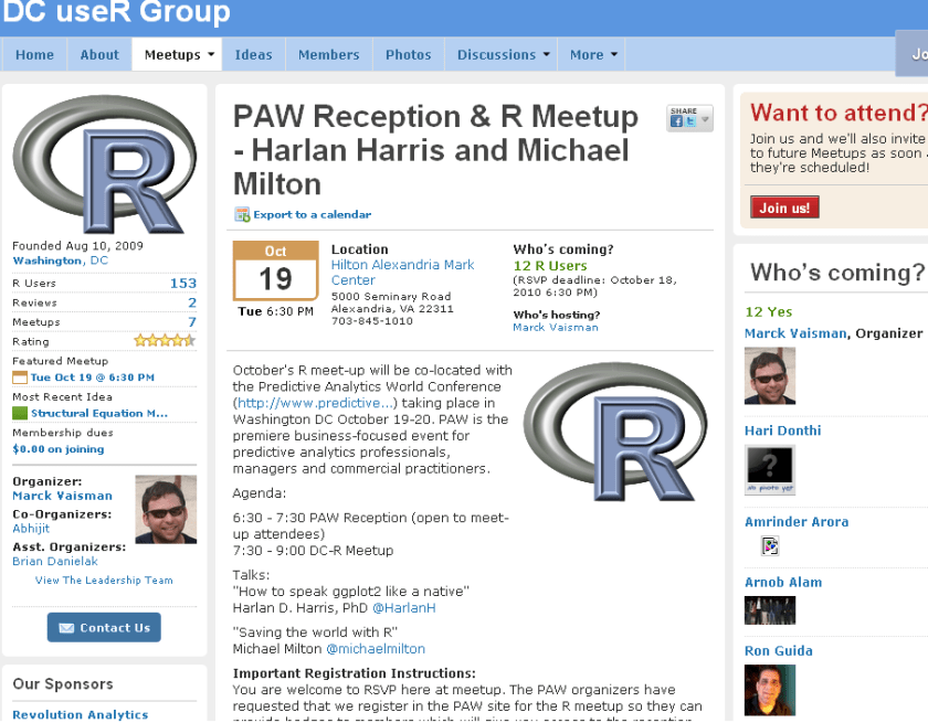
New DC meetup for R Users-
source- http://www.meetup.com/R-users-DC/calendar/14236478/
October’s R meet-up will be co-located with the Predictive Analytics World Conference (http://www.predictive…) taking place in Washington DC October 19-20. PAW is the premiere business-focused event for predictive analytics professionals, managers and commercial practitioners.
Agenda:
6:30 – 7:30 PAW Reception (open to meet-up attendees)
7:30 – 9:00 DC-R Meetup
Talks:
“How to speak ggplot2 like a native”
Harlan D. Harris, PhD @HarlanH
“Saving the world with R”
Michael Milton @michaelmilton
Important Registration Instructions:
You are welcome to RSVP here at meetup. The PAW organizers have requested that we register in the PAW site for the R meetup so they can provide badges to members which will give you access to the reception. There is no charge to register using the PAW site. Please click here to register.
Harlan D. Harris, PhD, is a statistical data scientist working for Kaplan Test Prep and Admissions in New York City. He has degrees from the University of Wisconsin-Madison and the University of Illinois at Urbana-Champaign. Prior to turning to the private sector, he worked as a researcher and lecturer in various areas of Artificial Intelligence and Cognitive Science at the University of Illinois, Columbia University, the University of Connecticut, and New York University.
Harlan’s talk is titled “How to speak ggplot2 like a native.”. One of the most innovative ideas in data visualization in recent years is that graphical images can be described using a grammar. Just as a fluent speaker of a language can talk more precisely and clearly than someone using a tourist phrasebook, graphics based on a grammar can yield more insights than graphics based on a limited set of templates (bar chart, pie graph, etc.). There are at least two implementations of the Grammar of Graphics idea in R, of which the most popular is the ggplot2 package written by Prof. Hadley Wickham. Just as with natural languages, ggplot2 has a surface structure made up of R vocabulary elements, as well as a deep structure that mediates the link between the vocabulary and the “semantic” representation of the data shown on a computer screen. In this introductory presentation, the links among these levels of representation are demonstrated, so that new ggplot2 users can build the mental models necessary for fluent and creative visualization of their data.
Michael Milton is a Client Manager at Blue State Digital. When he’s not saving the world by designing interactive marketing strategies that connect passionate users with causes and organizations, he writes about data and analytics. For O’Reilly Media, he wrote Head First Data Analysis and Head First Excel and has created the videos Great R: Level 1 and Getting the Most Out of Google Apps for Business.
Michael’s talk is called “How to Save the World Using R.” In this wide-ranging discussion, Michael will highlight individuals and organizations who are using R to help others as well as ways in which R can be used to promote good statistical thinking.

