Graphs in Statistical Analysis

One of the seminal papers establishing the importance of data visualization (as it is now called) was the 1973 paper by F J Anscombe in http://www.sjsu.edu/faculty/gerstman/StatPrimer/anscombe1973.pdf

It has probably the most elegant introduction to an advanced statistical analysis paper that I have ever seen-

1. Usefulness of graphs

Most textbooks on statistical methods, and most statistical computer programs, pay too little attention to graphs. Few of us escape being indoctrinated with these notions:

(1) numerical calculations are exact, but graphs are rough;

(2) for any particular kind of statistical data there is just one set of calculations constituting a correct statistical analysis;

(3) performing intricate calculations is virtuous, whereas actually looking at the data is cheating.

A computer should make both calculations and graphs. Both sorts of output should be studied; each will contribute to understanding.

Of course the dataset makes it very very interesting for people who dont like graphical analysis too much.

From http://en.wikipedia.org/wiki/Anscombe%27s_quartet

 The x values are the same for the first three datasets.

Anscombe’s Quartet
I II III IV
x y x y x y x y
10.0 8.04 10.0 9.14 10.0 7.46 8.0 6.58
8.0 6.95 8.0 8.14 8.0 6.77 8.0 5.76
13.0 7.58 13.0 8.74 13.0 12.74 8.0 7.71
9.0 8.81 9.0 8.77 9.0 7.11 8.0 8.84
11.0 8.33 11.0 9.26 11.0 7.81 8.0 8.47
14.0 9.96 14.0 8.10 14.0 8.84 8.0 7.04
6.0 7.24 6.0 6.13 6.0 6.08 8.0 5.25
4.0 4.26 4.0 3.10 4.0 5.39 19.0 12.50
12.0 10.84 12.0 9.13 12.0 8.15 8.0 5.56
7.0 4.82 7.0 7.26 7.0 6.42 8.0 7.91
5.0 5.68 5.0 4.74 5.0 5.73 8.0 6.89

For all four datasets:

Property Value
Mean of x in each case 9 exact
Variance of x in each case 11 exact
Mean of y in each case 7.50 (to 2 decimal places)
Variance of y in each case 4.122 or 4.127 (to 3 d.p.)
Correlation between x and y in each case 0.816 (to 3 d.p.)
Linear regression line in each case y = 3.00 + 0.500x (to 2 d.p. and 3 d.p. resp.)
But see the graphical analysis –
While R has always been great in emphasizing graphical analysis, thanks in part due to work by H Wickham and others, SAS products and  language has also modified its approach at http://www.sas.com/technologies/analytics/statistics/datadiscovery/
 SAS Visual Data Discovery combines top-selling SAS products (Base SASSAS/STAT® and SAS/GRAPH®), along with two interfaces (SAS® Enterprise Guide® for guided tasks and batch analysis and JMP® software for discovery and exploratory analysis).
 and  ODS Statistical Graphs at
While ODS Statistical graphs is still not as smooth as say R’s GGPLOT2 http://tinyurl.com/ggplot2-book, it still is a progressive step
Pretty graphs make for better decisions too !


JMP 9 releasing on Oct 12

JMP 9 releases on Oct 12- it is a very good reliable data visualization and analytical tool ( AND available on Mac as well)

AND IT is advertising R Graphics as well (lol- I can visualize the look on some ahem SAS fans in the R Project)

Updated Pricing- note I am not sure why they are charging US academics 495$ when SAS On Demand is free for academics. Shouldnt JMP be free to students- maybe John Sall and his people can do a tradeoff analysis for this given JMP’s graphics are better than Base SAS (which is under some pressure from WPS and R)

http://www.sas.com/govedu/edu/programs/soda-account-setup.html

and http://www.enterpriseinnovation.net/content/sas-delivers-free-data-management-and-analytics-solutions-academe

*Offer good in the U.S. only.

OFFER PRICING DETAILS
New Corporate Customer

$1,595

Save $300.

No special requirements.
ORDER NOW (WIN) ORDER NOW (MAC)
Corporate Upgrade

$795

Save $155.

Complete the form below or call 1-877-594-6567. Requires valid JMP® 8 serial number.
New Academic

$495

Save $100.

Complete the form below or call 1-877-594-6567. Requires campus street address and campus e-mail address.
Academic Upgrade

$250

Save $45.

Complete the form below or call 1-877-594-6567. Requires campus street address and campus e-mail address.

From- the mailer-

Be First in Line for JMP® 9
Save up to $300 when you pre-order a
single-user license by Oct. 11

Pre-Order JMP 9

Make JMP your analytic hub for visual data discovery with this special offer, good through Oct. 11, 2010. Pre-order a single-user license of JMP 9 – for a discount of up to $300 – and get ready for a leap in data interactivity.

Order now and enjoy the compelling new features of JMP 9 when the software is released Oct. 12. New capabilities in JMP 9 let you:

  • Optimize and simulate using your Microsoft Excel spreadsheets.
  • Use maps to find patterns in your geographic data.
  • Enjoy the updated look and flexibility of JMP 9 on Microsoft Windows.
  • Create and share custom add-ins that extend JMP.
  • Leverage an expanded array of advanced statistical methodologies.
  • Display analytic results from R using interactive graphics.

PRE-ORDER JMP 9

What if I already have a JMP 8 single-user license?
Great news! You can upgrade to JMP 9 for less than half the regular price.

What if I’m an annual license customer?
Don’t worry, we’ve got you covered. Annual license customers enjoy priority access to all the latest JMP releases as soon as they become available. JMP 9 will be shipped to you automatically.

What if I work or study in the academic world?
Call 1-877-594-6567 to learn about significant discounts for students and professors through the JMP Academic Program.

Please feel free to forward this offer to interested colleagues.


Got two or more users?
A JMP® annual license is the way to go. Call for details.
1-877-594-6567

Remember: Act by Oct. 11!

JMP runs on Macintosh and Windows

SAS and JMP : Visual Data Discovery

While R packagers have a lot to be proud of in the graphics packages of R, the truth of the matter is that the lack of GUI even for Graphical Analysis hinders the ease of usage in adopting R’s powerful graphics for statistical analysis. As a contrast , SAS and JMP have been combined together in the SAS Visual Data Discovery Environment

[tweetmeme source=”decisionstats”]

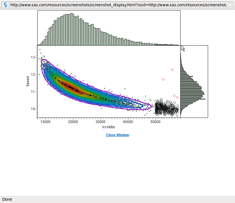
I really liked the GUI of JMP ( which is very rich in stats testing) and with the powerful data handling capabilities on the desktop of SAS, this is clearly an outstanding effort to create terrific graphics ( see below)

Note the combination of the two- Great Graphics WITH a GUI. in R the GUI that comes closest to matching JMP is R Commander, but it’s graphical capabilities are kept basic as it is not meant for replacement of the beloved Kommand prompt

( maybe an expanded plugin for graphics or hexabin would help)

It would be interesting to see an on demand  Ec2 cloud hosted version of visual data discovery by SAS (with JMP as the front end) even for a limited pilot of six months and targeted at the SMB segment. Or a Salesforce.com application that integrates Salesforce.com data with the tests and standard procedures in SAS and JMP.

Note of Discontent- The JMP Website is terrible. It has a different font from the SAS Website ( they could atleast use the same CSS ) and overall is the worst part of the otherwise excellently elegant JMP. Hope they upgrade their website soon ( they havent done it this year atleast).

Scrennshot Citation-

http://www.sas.com/technologies/analytics/statistics/datadiscovery/index.html