I have not been really posting or writing worthwhile on the website for some time, as I am still busy writing ” R for Business Analytics” which I hope to get out before year end. However while doing research for that, I came across many types of graphs and what struck me is the actual usage of some kinds of graphs is very different in business analytics as compared to statistical computing.
The criterion of top ten graphs is as follows-
1) Usage-The order in which they appear is not strictly in terms of desirability but actual frequency of usage. So a frequently used graph like box plot would be recommended above say a violin plot.
2) Adequacy- Data Visualization paradigms change over time- but the need for accurate conveying of maximum information in a minium space without overwhelming reader or misleading data perceptions.
3) Ease of creation- A simpler graph created by a single function is more preferrable to writing 4-5 lines of code to create an elaborate graph.
4) Aesthetics– Aesthetics is relative and in addition studies have shown visual perception varies across cultures and geographies. However , beauty is universally appreciated and a pretty graph is sometimes and often preferred over a not so pretty graph. Here being pretty is in both visual appeal without compromising perceptual inference from graphical analysis.
so When do we use a bar chart versus a line graph versus a pie chart? When is a mosaic plot more handy and when should histograms be used with density plots? The list tries to capture most of these practicalities.
Let me elaborate on some specific graphs-
1) Pie Chart- While Pie Chart is not really used much in stats computing, and indeed it is considered a misleading example of data visualization especially the skewed or two dimensional charts. However when it comes to evaluating market share at a particular instance, a pie chart is simple to understand. At the most two pie charts are needed for comparing two different snapshots, but three or more pie charts on same data at different points of time is definitely a bad case.
In R you can create piechart, by just using pie(dataset$variable)
As per official documentation, pie charts are not recommended at all.
http://stat.ethz.ch/R-manual/R-patched/library/graphics/html/pie.html
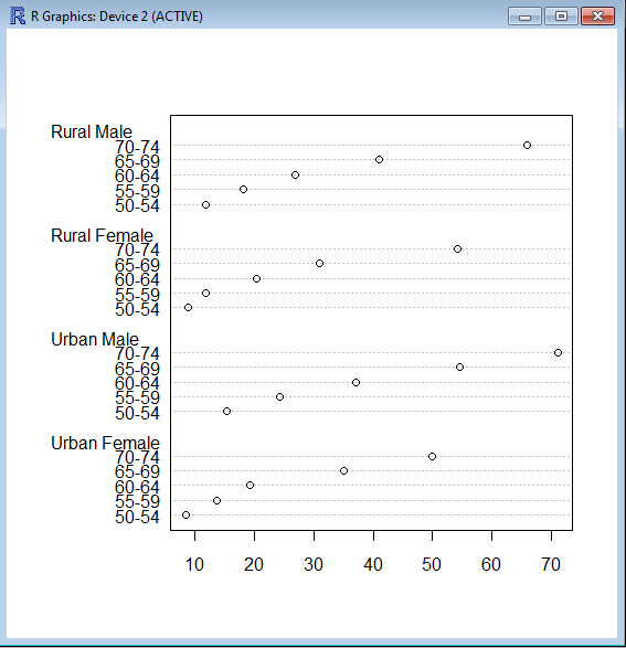
Pie charts are a very bad way of displaying information. The eye is good at judging linear measures and bad at judging relative areas. A bar chart or dot chart is a preferable way of displaying this type of data.
Cleveland (1985), page 264: “Data that can be shown by pie charts always can be shown by a dot chart. This means that judgements of position along a common scale can be made instead of the less accurate angle judgements.” This statement is based on the empirical investigations of Cleveland and McGill as well as investigations by perceptual psychologists.
—-
Despite this, pie charts are frequently used as an important metric they inevitably convey is market share. Market share remains an important analytical metric for business.
The pie3D( ) function in the plotrix package provides 3D exploded pie charts.An exploded pie chart remains a very commonly used (or misused) chart.
From http://lilt.ilstu.edu/jpda/charts/chart%20tips/Chartstip%202.htm#Rules
we see some rules for using Pie charts.
- Avoid using pie charts.
- Use pie charts only for data that add up to some meaningful total.
- Never ever use three-dimensional pie charts; they are even worse than two-dimensional pies.
- Avoid forcing comparisons across more than one pie chart
|
From the R Graph Gallery (a slightly outdated but still very comprehensive graphical repository)
http://addictedtor.free.fr/graphiques/RGraphGallery.php?graph=4
par(bg="gray")
pie(rep(1,24), col=rainbow(24), radius=0.9)
title(main="Color Wheel", cex.main=1.4, font.main=3)
title(xlab="(test)", cex.lab=0.8, font.lab=3)
(Note adding a grey background is quite easy in the basic graphics device as well without using an advanced graphical package)

28.635308
77.224960


