Here is an interview with Dominic Pouzin, CEO of http://www.data-applied.com which is a startup making waves in the fields of Data Visualization.
 Ajay – Describe your career in applied science. What made you decide to pursue a career in science? Some people think that careers in science are boring. How would you convince a high school student to choose a career in science?
Dominic- It’s important to realize that we are surrounded by products of science and engineering. By products of science, I mean bridges we cross on our way to work, video games we play for entertainment, or even the fabric of clothes we wear. Anyone who is curious should want to know how things really work. In that case, a scientific education makes sense, because it provides the tools necessary to understand and improve our world. I would also argue that a scientific training can also be a stepping stone towards high levels of achievements in other fields. For example, to become a financial wizard, a top patent attorney, or direct large clinical trials, a scientific education serves as a strong foundation. In addition, it’s probably easier to switch from science to another field than the other way round. Who wants to learn about matrix calculus in their forties? In my case, I graduated with a Masters in Computer Science degree, and spent 10 years at Microsoft leading software development teams for the Windows server, Exchange server, and Dynamics CRM product lines. I wish that, along the way, I had found time for a PhD in data mining, but years of practical software engineering experience also has its advantages.
Ajay- What advice would you give to someone who just got laid off, and is pondering whether he should / should not start a business?
Dominic- Working for a large company used to mean trading some autonomy for more stability and access to a wide array of resources. However, in this economy, the terms of the equation have changed. Many workers who lost their jobs found that this stability had disappeared. Others found that resources have become scarcer due to shrinking budgets. With this shift in the balance, entrepreneurship starts becoming more appealing.
Creating your own business might sound daunting, but for example creating a US Washington State LLC takes about 15 minutes, costs 200 dollars, and only requires an Internet connection. Managing payroll may sound like a big headache, but again specialized companies can handle all payroll matters on your behalf for only a few dollars a month. So while this part is relatively easy, you also need two things which are more difficult to come by:
a/ an unshakable belief in what you are trying to achieve, and
b/ a willingness to handle anything that comes your way.
You need to think like a commando solider who just landed on a beach: you’ve got great skills, but you’re alone, and can’t afford to fail. Practically, you may find yourself working for weeks or months with little or no income, and friends and family thinking that you are wasting your time. So, if necessary, try finding a co-founder to boost your confidence and motivate one another. Also, unless you want to spend most of your time chasing people for money, personal savings are a must.
Ajay- So describe your company. How does data visualization work? What differentiates your company from so many data visualization companies?
Dominic- We’re trying to stir things up a bit in terms of making it easier for regular business users to benefit from data mining. For example, we enable new “BI in the cloud” scenarios by allowing users to simply point a browser to access analysis results, or by allowing applications to submit and analyze data using an XML-based API. Built-in collaboration features, and more interactive visualizations, are also definitely part of our story.
Finally, while we focus on data mining (ex: time series forecasting, association rule mining, decision trees, etc.), we also make available other things such as pivot charts or tree maps. No data mining algorithm there, but why should business users care as long as the insight is there?

To answer your question about visualization, most packages offer basic features such as the ability to pick colors, or to change labels, etc. For differences to emerge, you have to ask the right questions.
*
Access: does visualization require an application to be installed on each computer? Our visualization work directly from a web page, so there is nothing to install (and upgrades are automatic).
*
Search: can visualization results be searched, so as to enable drill-down scenarios? In the age of Google, we enable search everywhere, so that views can be constrained to what the user is looking for.
*
Collaboration: can visualization results be tagged using comments, or shared with other users while securely controlling access, etc.? Visualization is only a starting point – chances are that you will need to talk to someone before analysis is complete – so we offer plenty of collaboration features.
*
Export:how easy is it for a business user to present analysis results to management in a way that is understandable? We make it easy to export visualization content to a shared gallery, and as presentation-ready images.
There are a couple of other things we do as well in terms of interaction (ex: zoom, select, focus, smart graph layout), and a couple we don’t have yet (ex: geo-mapping, export to PDF).
But in conclusion, I would say that useful data visualization is as much about the way you present data (and that must be compelling!), as it is about how one accesses, searches, secures, shares, or exports visualizations.
Ajay- The technology sector was hit the hardest by the immigration of skilled workers. As a technology worker, what do you have to say about immigration? What do you have to say about outsourcing? Do you have any plans for selling your products outside the United States?
Dominic- I am a US permanent resident, half French, half British, and my wife is Indian. So you won’t find it surprising to hear that I am in favor of immigration. In 1996, as an engineering student in France, I made the unusual choice to study one year at the Indian Institute of Technology (Delhi).
In fact, I was the only one in my engineering college (France’s largest) to select India as a destination (my friends all went to the US, UK, Australia, Germany, etc.). Now that India has become a recognized player in the IT field, several dozen students from the same engineering college chose India as a destination. So I guess the immigration is starting to flow both ways!
Also, among the people I used to work with at Microsoft and who left to start a company, a good proportion are immigrants. So it’s important to recognize that immigrants not only help fill high-tech positions, but also create jobs.
Finally, as an entrepreneur trying to keep costs low, outsourcing is a tool you can’t afford to ignore. For example, websites such as http://www.elance.com provide easy access to the global marketplace. For those worried about quality, it’s possible to review customer ratings and portfolios. We keep track of visitors coming to our website, and the majority of the visitors to date have been from outside the US.
Ajay- �What is the basic science used by your company’s product?
Dominic – We use a client / server model. On the server, at the lowest level, we use SQL databases (accessed using ODBC), acting as data and configuration repositories.
Immediately above that sits a computing layer, which offers scalable, distributed data mining algorithms. We implement algorithms which scale well with the number of rows and attributes, but also properly handle a mix of discrete / numeric / missing values.
For example, just for clustering, the literature has some incredibly powerful algorithms (ex: WaveCluster, an algorithm based on wavelet transforms), but which also fail as soon as you enter real-world situations (ex: some fields are discrete).
On top of the computing layer sits a rich, secure web-based XML API, which allows users to manipulate analysis and collaboration objects, while enforcing security.
For the client, we built a web-based visualization application using Microsoft Silverlight. To ensure client / server communications are as efficient as possible, we use a fair amount of data compression and caching.
Ajay- �Who are your existing clients and what is the product launch plan for next year?
Dominic- We’re only in alpha mode right now, so our next customers are in fact beta testers. We’re still busy adding new features. It’s good to be small and nimble, it allows us to move quickly. Sorry, I can’t confirm any launch date yet!
Ajay- �What does the CEO of a startup company do, when he has free time (assuming he has any)?
Dominic- When you spend most of your time working on analytics, it’s sometimes hard to leave your analytical brain at work.
For example, I am sure that readers who come to your website and visit a casino can’t help themselves and immediately start calculating the exact odds of winning (instead of just having fun).
Among other things, I enjoy challenging friends to programming puzzles (actually, they’re recycled Microsoft interview questions). My current bedtime reading is a book about data compression. I think you got the picture!
******************************************************************
Dominic is currently making promising data visualization products at�http://data-applied.com/ .To read more about him, please visit his profile page�http://www.analyticbridge.com/profile/DominicPouzin
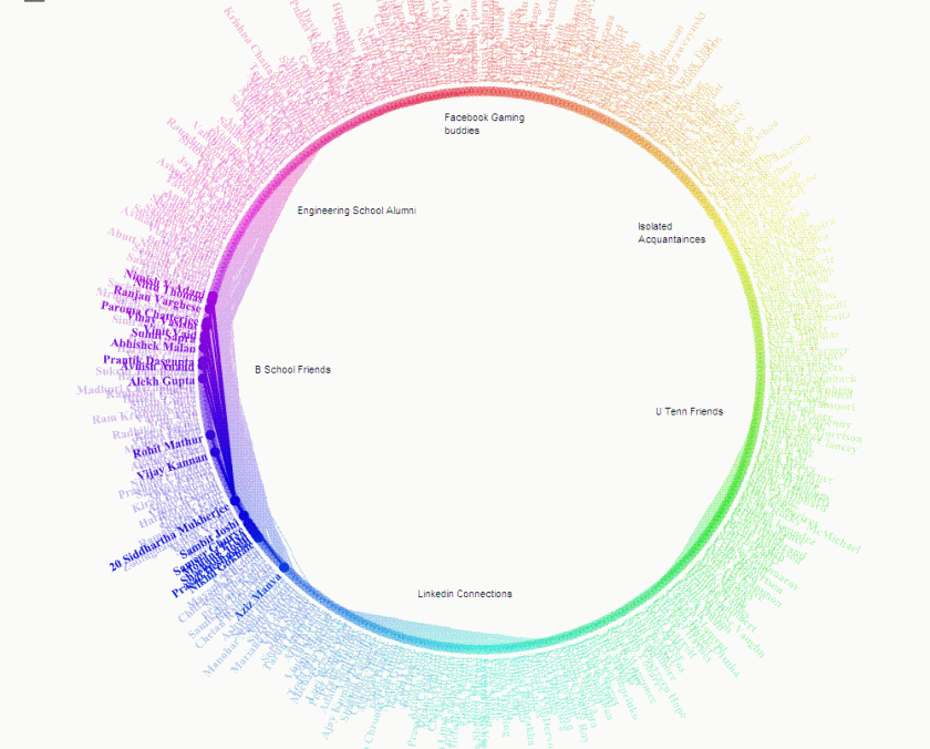 The FB app was at http://apps.facebook.com/friendwheel/



 Ajay – Describe your career in applied science. What made you decide to pursue a career in science? Some people think that careers in science are boring. How would you convince a high school student to choose a career in science?