Kill Analytics

I rarely write on Politics- rather I mostly present statistics on poverty, third world, offshoring etc and would rather invite people to draw their own conclusions. But something I read in the New York Times, yes , THAT liberal and well written newspaper causes me to remember a rather obscure branch of analytics- related to defence personnel operations. It’s kill ratios- or the ratio of  number of casualties on each side in a war.

While it is easier to estimate, define and measure kill ratios in conventional warfare, kill ratios can be sometimes misleading as predictors of victory (i.e Tet Offensive was a massive victory for the United States in terms of kill ratios, but the number of US casualties hastened the decision to end that war).

When it comes to Terrorism, kill ratios are even more skewed. 19 Terrorists caused September 11 that killed 3000 people, nearly all civilians. An unmanned drone attack kills 20 people in Pakistan, but causes some people to become car bomb terrorists,thus creating some terrorists and killing some.

An excerpt from the book, ” The Age of the Unthinkable” comes to mind in which the Israeli defence statisticians even came up with a precise number for ratio of innocents killed to terrorists killed, which is acceptable for a military solution. That along with some network analysis in Terror organizations, in which nodes to kill or disrupt for maximum ratio of benefit/cost is a very lucrative and secretive branch , called Security Analysis or what I term as kill analytics. Some of those hitherto secret kill algorithms would be better used in product marketing- however I wish the opposite was true (selling terrorists shampoo and get them hooked on Facebook rather than go with the flow). But thats an ideal world !

How crowded is the neighborhood?

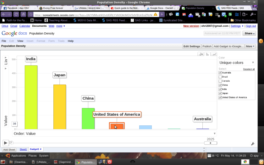
How crowded is India compared to the United States? Around 11 times. Thats based on number of person per square km.

How crowded is India compared to China? Around 2.5 times.

– Based on the following procedure-

  1. Data Sources – http://bit.ly/densityUN . With Pivotable tables, downloaded the CSV file.
  2. Creating a new spreadsheet in Google Docs, I copied and pasted data in the csv file
  3. Using Gadgets- I inserted the Gadget for Motion Chart which is based on Hans Rosling’s famous Gapminder Bubble Chart.

– Some Thoughts

It is not surprising that most immigration (legal and illegal) occurs from high population density countries with stretched resources to lower density countries with higher levels of living. Generally smaller sized countries like Japan, Singapore, Macau (china) have outlier densities as well.

– Also, the Adobe AIR desktop application by Gapminder is quite the best application for this as well. Speaking of which_ I hope other Linux application developers can learn from Adobe AIR’s way of graphics /data visualization.

Creating a Blog Aggregator for free

I discovered an increasing trend of Blog Aggregators ( Blog Lists have been around for a long time). Several sites come in this category- http://bigdatanews.com/ (which is a GreenPlum /AsterData sponsored site on Big Data) , http://mapreduce.org/ (which is a site on MapReduce that has an inbuilt blog aggregator but is more of a community website – I will explain the difference below) , http://www.r-bloggers.com/ (which is an excellent aggregation of 69 R Bloggers sites that is built by Tal and is currently not sponsored/independent) and http://smartdatacollective.com/ which is sponsored by Teradata and uses http://wordframe.com which is a paid software) and some others like http://www.biblogs.com/ (which is Adsense supported 🙂 ) and http://javablogs.com/Welcome.jspa (an aggregator on Java) (or even http://feministblogs.org/).

CMS Based Blog Aggregator

CMS Based Blog Aggregator/ Community Site

CMS Based Community Site with an inbuilt Blog Aggregator feed

I am noting blog aggregator as a distinct website that pulls in automated content from RSS feeds , may or maynot be moderated, and usually revolves around a certain domain or topic. It is slightly different from community websites which have Lists of Blogs as part of many other features, and boutique collection of blogs like http://www.b-eye-network.com/blogs/index.php

and Intelligent Enterprise ( http://intelligent-enterprise.informationweek.com/blog/index.jhtml) as they have selected authors and have more than Blogs as their featured content including News etc. Since community is a buzz word- many websites claim to be community websites while retaining the look and feel of a CMS- Blog Aggregator.

WordPress Enabled Blog Aggregator

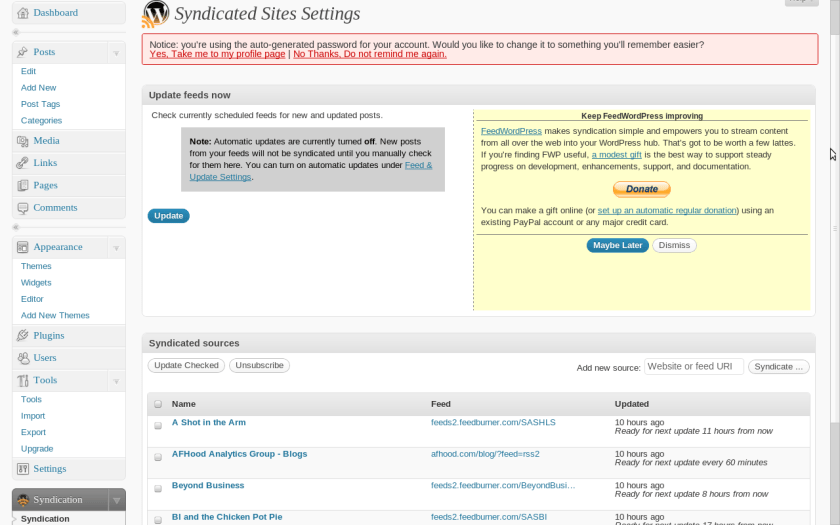
Anyways, if you have a WordPress Installation- you can create a Blog Aggregator for free. Basically there is a wordpress-plugin called FeedWordPress http://wordpress.org/extend/plugins/feedwordpress/

Doing so you can simply addin as many RSS feeds as you like –

(see a screenshot below).

Of course – you can use Twitterfeed to create a Twitter Aggregator/ Fire Hose that simply pulls in Post Titles, and can link them using Facebook-LinkedIn-Twitter apps to your RSS feed of the aggregated website. 🙂

Building a website /content aggregator is just a few clicks away and free for anyone with a website and some passion for a topic. It is really free and painless 🙂

Color of Statistics

A short analysis on the ASA Directory at http://www.amstat.org/membership/directory/search.cfm

and http://www.amstat.org/minorities/index.cfm

There are 15904 Total Members out of which if broken done by Race/Color

  • 172 Minority Statisticians
  • 68 Black
  • 12 Hispanic (this looks too less so I suspect the directory is incomplete)

Even optimistically the color of statisticians is overwhelmingly as follows (assuming that minority data is under counted by 10X- so multiplying the minority data by 10 and then taking percentage)

89 % White

4 % Black and

7% Non Black Minorities (presumably Indian, Chinese, Hispanic).

I tried to find some statistics on fresh maths/stats graduates by race but did not find some. Surely this calls for some thought ? 😉

Graphs

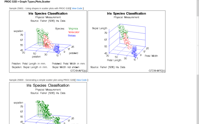
Some graphs from the Official Graphs Gallery at sas.com

http://support.sas.com/sassamples/graphgallery/PROC_G3D_Graph_Types_Plots_Scatter.html

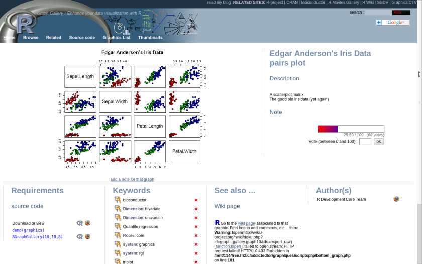
From R’s Graph Gallery Here is the same-

http://addictedtor.free.fr/graphiques/RGraphGallery.php?graph=10

Which one do you like? Sometimes graphics is about imagination and not just software.

Aster Data Webinar on Analytics /Mapreduce

Covers the following usual suspects-

  • Time-series analysis – Applied to price optimization and fraud detection
  • Graph analysis – Applied to social networks and physical networks (IT/Telco/Cable)
  • Behavioral analysis – Applied to clickstream behavior and market basket analys

For more click here-

Software- Appls and Bugs

Some time ago I had written on a Twitter application bubble (actually it was a year ago here at https://decisionstats.wordpress.com/2009/04/05/tweets-viruses-and-bubbles/)

The automatic Twitter follow /unfollow (or atleast the automated unfollow ) was used by Twitter App Refollow.com (which is quite old- so it was a surprise when Twitter blamed the recent 0 followers 0 floowing on a bug which allows automated following) and the RSS automated reader is used by Twitterfeed.com (among others). I accidently created/revealed a bug in 2009  with the hash command #rstats which is used as a search index in twitter’s search engine) when I basically married a lot of RSS feeds pertaining to R and added the #rstats with them to the alternative twitter handle (Rarchive) . I did the same with the #sas with Sascommunity (which I later donated on request back to that community sascommunity.org). Basically this had the temporary effect of skewing search results for these search terms for a day (till Twitter fixed it).

As Twitter evolves from a well funded startup to a business- and tries to become more structured from chaotic flux, such bugs will continue to evolve. Bugs and especially software bugs are meant to be fixed (or squashed). This by no means should be a relection on the health of the software service (here- Twitter). Indeed the biggest worry is a mainstream software that has no flexibility for creative third party applications and thinks that it is bug-free. Perfect software exists in a perfect world- and delusional perfection can be dangerous thinking especially for software with clients (even more for statistical software).

Which stats softwares are you using and how confident you are that the bugs are being resolved openly?

%d bloggers like this: