
I quite like Google’s monthly email on account activity. It is the Google way to offer free services, as well as treat users as special, that continues to command loyalty despite occasional exasperation with corporate thingies.
See this dashboard-
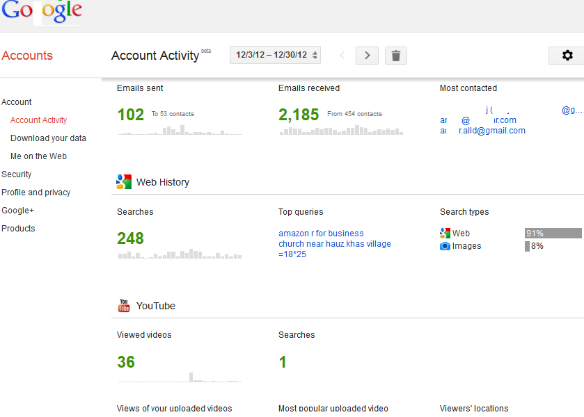 Notice the use of Bigger Font for overall number of emails as well as smaller bar plots- I would say they are almost spark lines or spark bar plots if you excuse my Tufte.
The medium range font shows persons sent/from statistics, and the color shades are done to empahsize or de-emphasize the metric
Colors used are black/grey, green and blue coincident with the Corporate Logo.
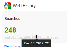
However some of the JS for visualizations need to be tweaked. Clearly the hover script ( an integral part of Dashboard design ) needs better elucidiation or formatting)
I would also venture my neck and suggest that rather than just monthly snapshots, atleast some way of comparing snapshots across periods or even the total time period be enabled- rather than be in seperate views. This may give the user a bit more analytical value.
Overall, a nice and simple dashboard which may be of some use to the business user who makes or views a lot of reports on online properties. Minimal and effective- and in keeping with Open Data- Data Liberation Principles. I guess Google is secure in the knowledge that users do not view time spent on Google services as a total waste , unlike some of the other more social 😉 websites they spend time on.
