I did a search for ” samsung 4g mobile” across the following – Google Search, Askmebazaar.com, Amazon.in, Snapdeal.com, Flipkart.com and got following results.
I wanted to compare user interface, the search results, the navigation experience, and lastly any price arbitrage opportunities. Part One of this series just looks at initial search results for a single keyword and compares it across websites.
Findings-
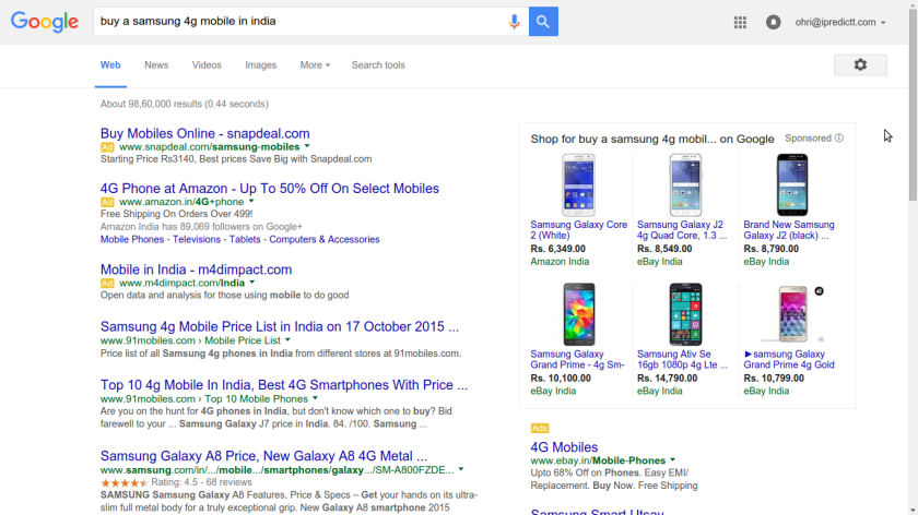
- Apparently FlipKart does not believe in Adwords, or SEO
 2) Amazon has a clean interface and good graphic icons for the product
http://www.amazon.in/s/ref=nb_sb_noss?url=search-alias%3Daps&field-keywords=samsung+4g+mobile
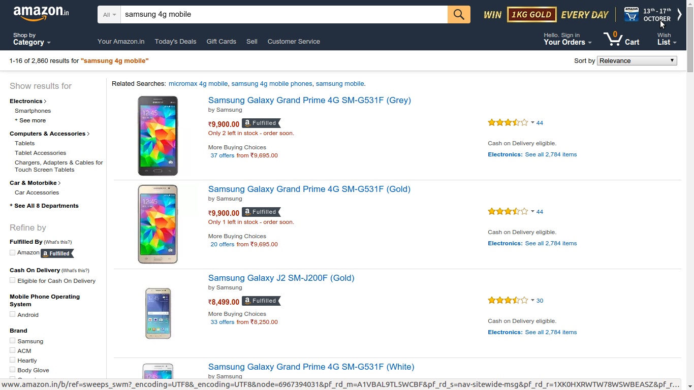
Surprisingly it suggested in associated products – a beard trimmer for me. Amazon also prompts saying how the item is limited and only X are left in stock.
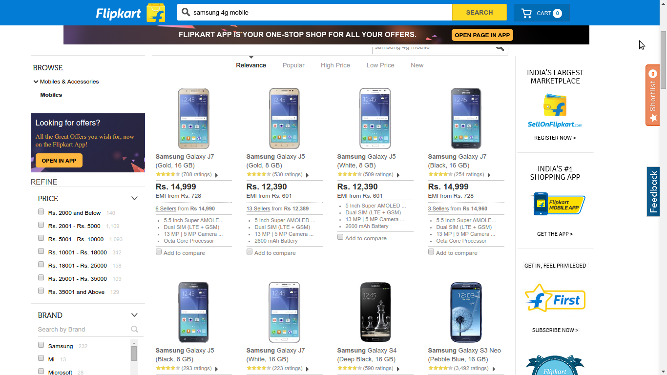
3) Flipkart sells FlipKart itself (of apps etc) in half the page and has no associated results ( you may also buy this- or add to cart)
However I liked the ordering of the filters in left margin, with price on top, then brand etc. Quite clearly price is the top filter in such sites.
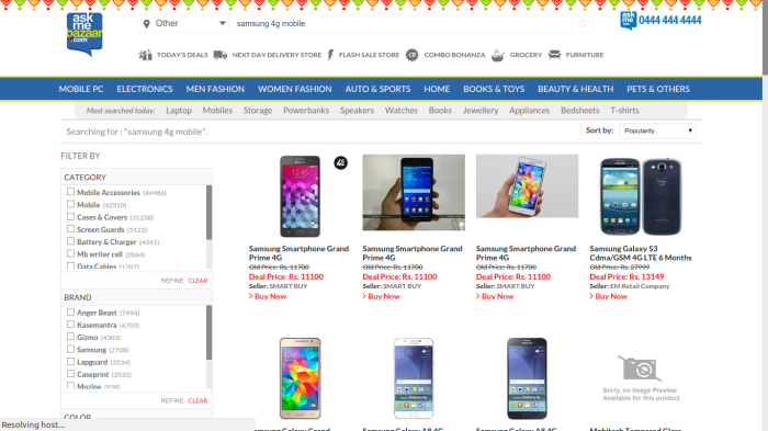
4) Askmebazaar has a menu layout in horizontal rows and columns than a list layout. Interesting to see the Indian origin interfaces had menu layout while the US derived websites had a list (top to bottom layout)
It was interesting to see that every price in it had a discount with a strikethrough in the initial prices. Striking and interesting as its different.
http://www.askmebazaar.com/index.php?
Filters in right margin were Category first, then brand ( both irrelevant since I am askign for Samsung Mobile) and price at bottom. Price was a dropdown filter than a radio button or checkbox
filterapp_data=c2VhcmNoX3F1ZXJ5PXNhbXN1bmcgNGcgbW9iaWxlJmRlZlNlYXJjaD0w
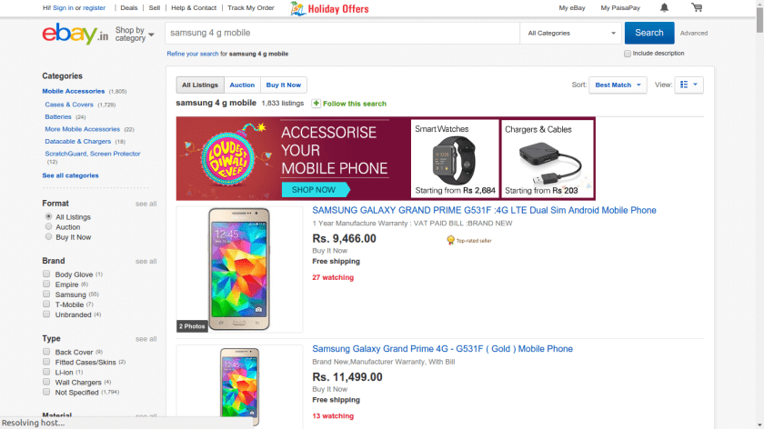
5) Ebay has really awesomely long URLS and is a mix of Amazon and Askmebazaar interface
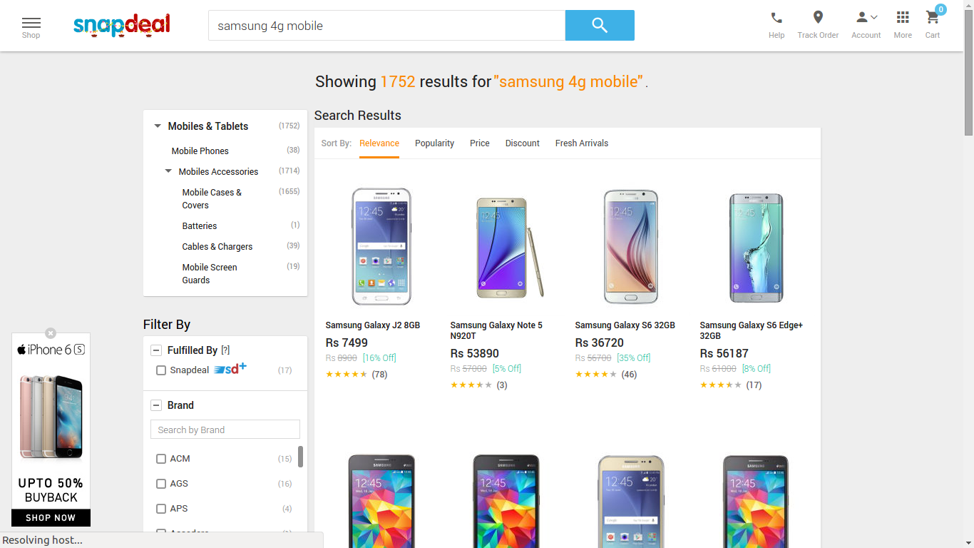
6) Lastly Snapdeal had a nice clean interface and it was less cluttered than some of the other sites. I was also interested that they showed a prompt to buy iPhone so an interesting association analysis result.
Which e commerce company in India has the best user interface? You decide. Beauty and ease lie in the eye of the beholder.